
-
Please stop embedding files/images from Discord. Discord has anti-hotlinking logic in place that breaks links to Discord hosted files and images when linked to from anywhere outside of Discord. There are a multitude of file/image hosting sites you can use instead.
(more info here)
You are using an out of date browser. It may not display this or other websites correctly.
You should upgrade or use an alternative browser.
You should upgrade or use an alternative browser.
Mod Art Help
- Thread starter HyMyNameIsMatt
- Start date


Mar 7, 2013 at 5:43 PM

Join Date: Aug 21, 2012
Location: At a computer
Posts: 338
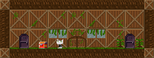
Ugh, the TILES THAT LOOK LIKE SMALL ROCKS AND HIEROGLYPHS ARE BACKGROUND TILES, AND THE PRTCAVE BLOCKS AND ROCKS(RHYME NOT INTENDED) ARE SOLID!!!
Mar 7, 2013 at 5:49 PM
Join Date: Jan 18, 2013
Location: Somewhere quiet with many birds
Posts: 1118
Age: 27
Pronouns: she/her
Ah, I see.
That's not very obvious, looking at the tileset. It's a bit confusing...
Perhaps you should work on that.
That's not very obvious, looking at the tileset. It's a bit confusing...
Perhaps you should work on that.
Mar 7, 2013 at 8:16 PM

Jeez liam this is "mod art help" not "mod art COMPLIMENT ME I'M FUCKING PERFECT"
Anyway if you're going to have background tiles then you should make them a darker shade of orange at least, or a less saturated colour or something. You don't want to give your players the feeling that they're phasing through walls. It's kind of a bad thing.
Anyway if you're going to have background tiles then you should make them a darker shade of orange at least, or a less saturated colour or something. You don't want to give your players the feeling that they're phasing through walls. It's kind of a bad thing.

Mar 7, 2013 at 9:25 PM

Join Date: Aug 9, 2010
Location: Greener Pastures
Posts: 1188
Age: 32
That's much better, since everything was the same color everything looked solid regardless of their texture. A good rule from color theory would be that, as objects go further back in space, they become less saturated out more gray. They essentially blend with the background more. Also, objects further away aren't just darker, but the shading is a bit different too. Say you use pure white as the highlight of a rock in front, for a rock in back you would use a slightly darker white. The black shadow also becomes a bit brighter. Basically the further away things get the more posts of them blend together and the harder it is to see detail.
Apr 6, 2013 at 3:43 PM

Join Date: Apr 5, 2013
Location: In my mind and of my body.
Posts: 1643
Age: 28
well. here is my picture so far. . .
Quote + Demon crown
View attachment 354
does is look to plain?
and yes, I know that quote himself was ripped from Ballos story. :/
Quote + Demon crown
View attachment 354
does is look to plain?
and yes, I know that quote himself was ripped from Ballos story. :/
Apr 6, 2013 at 3:49 PM
The crown doesn't look too bad, but the shading is a bit unbalanced since you're using a ripped Quote sprite.
If you're planning to use that sprite by the way, I hope you've asked the owner of the mod. That is, if he's even still here (I've never looked at ballos story so)
If you're planning to use that sprite by the way, I hope you've asked the owner of the mod. That is, if he's even still here (I've never looked at ballos story so)
Apr 6, 2013 at 7:01 PM

Join Date: Apr 15, 2012
Location: Tralfamadore
Posts: 74
Age: 30
Pronouns: he/him
I beg for your advice.
View attachment 355
View attachment 355
Apr 6, 2013 at 9:45 PM
Join Date: Aug 9, 2010
Location: Greener Pastures
Posts: 1188
Age: 32
Oh god perspective. The crown needs to be tilted more with the direction quote is facing and yes he needs to be reshaded with the shadow of the crown.Bombchu Link said:well. here is my picture so far. . .
Quote + Demon crown
Face.bmp
does is look to plain?
and yes, I know that quote himself was ripped from Ballos story. :/
Later I'll put up a quick thing on heads, add that seems to be the theme for today.
Apr 21, 2013 at 4:08 PM

Join Date: Apr 8, 2013
Location:
Posts: 16
Age: 31
Pronouns: he/him
Hi there,
I´m working on some graphics and would like to know what
you think about it.
And I´m sure you can see the mistake in the third picture. Is it possible to fix that?
I´m working on some graphics and would like to know what
you think about it.
And I´m sure you can see the mistake in the third picture. Is it possible to fix that?
Apr 21, 2013 at 4:58 PM
Join Date: Aug 21, 2012
Location: At a computer
Posts: 338
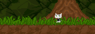
To make a tile go over the player, make it the tile type that isn't solid but has the green triangle.
(Actually, theres that tree in that tile too, which would make the tree in front of the player as well.)also that. looks. amazing.
(Actually, theres that tree in that tile too, which would make the tree in front of the player as well.)also that. looks. amazing.
Apr 21, 2013 at 5:20 PM
Join Date: Aug 21, 2012
Location: At a computer
Posts: 338
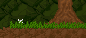
Maybe you could use a big npc(i dont know which one) and makes its sprites the tree and then put it behind the grass?
Illusion said:so it´s not possible to get the player between the tree and the grass?
Apr 21, 2013 at 5:23 PM
Join Date: Aug 9, 2010
Location: Greener Pastures
Posts: 1188
Age: 32
Okay, look at the flowers from the farm. Replace the flowers with the tiles you want to place, like the back where the tree is.
Also, the tree is in the back ground so it should not be the same color as the ground. Since the ground is the same it makes the tree look like some word peice of ground sticking out and that it will stop you. Your palette in general needs a bit of work because all the colors are too close together and the should ground isn't very bold. Composition in general needs improvement, but you're new to this so I'll try just a few instructions for now.
On the solid objects make the brought colors brighter and the dark colors darker, this makes them seem closer. You can also make them different shades of color. Pixel usually made his darkest color a really dark blue even when the tile set was red or some other color. A decent color theory rule is that; red compliments green, blue compliments orange, and yellow compliments purple. If an object is green the shadow is slightly red and if it is yellow the shadow is purple. So the colors in between fade into it. When I get a chance I'll make some image to show it off.
Try looking at pixel art from other games, maybe ones that are stylized. Yoshi's Island or Sonic the Hedgehog have lots of style so you can look there.
Apr 21, 2013 at 7:04 PM
Join Date: Aug 21, 2012
Location: At a computer
Posts: 338
Uh, no. its pretty damn obvious its background.Since the ground is the same it makes the tree look like some word peice of ground sticking out and that it will stop you.
Apr 21, 2013 at 7:37 PM
Join Date: Aug 9, 2010
Location: Greener Pastures
Posts: 1188
Age: 32
Find one picture on an actual game where the background objects use the same color as the foreground objects.liammillay said:Uh, no. its pretty damn obvious its background.
Apr 21, 2013 at 8:44 PM
Join Date: Aug 21, 2012
Location: At a computer
Posts: 338
DONT EDIT MY QUOTES ASSHOLE!
HyMyNameIsMatt said:Uh, no. its pretty damn obvious its background.Find one picture on an actual game where the background objects use the same color as the foreground objects.