Mod Art Help

Feb 24, 2013 at 6:31 PM
I don't anymore.
"I'm sorry Mario, but your princess is in another castle."
Join Date: Aug 9, 2010
Location: Greener Pastures
Posts: 1190
Age: 30
p159770-0-mm3proto16.png


Go look at that. Cause you have a decent idea but you're not there yet.
 
Feb 24, 2013 at 10:51 PM
Junior Member
"Fresh from the Bakery"
Join Date: Feb 3, 2013
Location:
Posts: 10
Tpcool said:
Hello. I'm working on a tileset for my mod and so far I've gotten mixed feedback for this one.
Milon-1_zpsfcff81bd.png

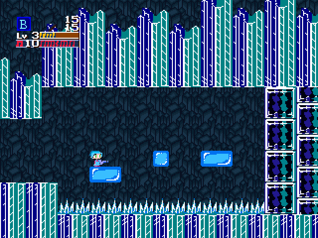
Noxid gave me the background (I just recolored it) and I ripped the foreground from Mega Man 5 and slightly edited it.
Maybe somebody can tell me what looks off with the foreground and background art? Dunc2403 told me that the background contrasts too much.
Be careful that megaman is done in a different style from cave story. Cave story doesn't use outlines. Megaman does. Having different art styles within a game starts creating a feeling of fakeness. If you've ever seen a cartoon character pasted into a photo, I think we'll understand :p

Also, your background tiles are pillow shaded. Flat areas are conveyed with flat colors. Here's what I think may be more suitable for your mod:

Image2.png

And yes, the tiles contrasts too much so it starts attracting attention to itself. So I took the harsh outlines from the crystal tiles and changed the art style to be read as crystals, and be closer to Pixel's outlineless art style. I think these might make for more suitable crystal wall tiles.

Image15.png


I believe a good game artist should be able to choose their colors very wisely to make important things very visible, while it's easy to not pay attention to less important things. Consider Cave Story. I think Pixel shows that he knows something about coloring and was wise to give Quote a red hat and very white 'skin' in a game with mostly dark, cool-colored backgrounds. With that in mind, I would also suggest a character design with more magenta for better contrast against the blue-colored world you're playing in.

Also be aware that my edits are probably not the most optimal. The tiles and the background might still be too different to look like they belong in a cohesive whole.
 
Feb 25, 2013 at 8:37 PM
Senior Member
"I, Ikachan. The Life and Documentary of the OrigiNAL SQuiD."
Join Date: Oct 29, 2012
Location: England
Posts: 178
Age: 26
Any thoughts on this? This is the first world in the mod, the Forest Zone [Name in Progress]. Again, like before I am following the MSX palette seen below and am only allowed two colours per 8x1 pixel area. The tileset is still unfinished but just thought I would see what needs to be changed now. Thanks in advance.

MSX Palette:
diph.php


World 01 Tileset:
diph.php
 
Feb 25, 2013 at 10:43 PM
Senior Member
"I, Ikachan. The Life and Documentary of the OrigiNAL SQuiD."
Join Date: Oct 29, 2012
Location: England
Posts: 178
Age: 26
Dunc2403 said:
You'd think a forest zone would be greener.
Yeah, but this is mainly the inside temple-fortress section using more red brown tones because it is in a tree, the outside will be more green, but I will try and incorporate more green into the inside as well, thanks.
 
Feb 25, 2013 at 11:44 PM
I don't anymore.
"I'm sorry Mario, but your princess is in another castle."
Join Date: Aug 9, 2010
Location: Greener Pastures
Posts: 1190
Age: 30
Those spikes are a tad generic. I don't know if this is intentional or not, but that's the case. I like the style and the composition, this is clearly the work of an experienced artist. Which means you probably won't need to worry about your art as much as your music and design.


Edit: are those torches in the right? Cause they look like hearts. If your gonna keep them that color I'd change the shape to be more obvious.
 
Feb 25, 2013 at 11:59 PM
Junior Member
"Fresh from the Bakery"
Join Date: Feb 3, 2013
Location:
Posts: 10
It's generally a bad habit to be detailing with pixel dots, especially not at small scales when pixels start being huge. Pixel dots also tends to be extremely high in contrast so what is supposed to be a tiny detail is made very prominent. Stuff like composition and form is more important than texturing.

Pixel dots are also very good for attracting a ton of attention, which is not what you want for background work. Reserve pixel-dot detailing for stuff that's arguably important. Tossing out noise also tends to make things easier to read.

Image15.png

Aside for condensing some of the dithers, I also tweaked the brick tiles so they are not all the same size, to avoid needless redundancy. I am also not entirely sure what to do with the dark noisy brick wall tiles.

I also toyed around with the fire. The red fires are what you probably wanna use mostly but the blue fires should be pretty cool to use to show that an area is important and deserves attention. I feel there could be a better way to do the fire but I mostly exaggerated the size for readability reasons.
 
Feb 26, 2013 at 8:32 AM
Senior Member
"I, Ikachan. The Life and Documentary of the OrigiNAL SQuiD."
Join Date: Oct 29, 2012
Location: England
Posts: 178
Age: 26
Those spikes are a tad generic. I don't know if this is intentional or not, but that's the case.
Yeah, they're intentionally that way.

Edit: are those torches in the right? Cause they look like hearts. If your gonna keep them that color I'd change the shape to be more obvious.
I will change them, thanks for the help.

Pix3M said:
It's generally a bad habit to be detailing with pixel dots, especially not at small scales when pixels start being huge. Pixel dots also tends to be extremely high in contrast so what is supposed to be a tiny detail is made very prominent. Stuff like composition and form is more important than texturing.

Pixel dots are also very good for attracting a ton of attention, which is not what you want for background work. Reserve pixel-dot detailing for stuff that's arguably important. Tossing out noise also tends to make things easier to read.

View attachment 268

Aside for condensing some of the dithers, I also tweaked the brick tiles so they are not all the same size, to avoid needless redundancy. I am also not entirely sure what to do with the dark noisy brick wall tiles.

I also toyed around with the fire. The red fires are what you probably wanna use mostly but the blue fires should be pretty cool to use to show that an area is important and deserves attention. I feel there could be a better way to do the fire but I mostly exaggerated the size for readability reasons.
Cool, I like what you did with it, thanks for the advice.
 
Last edited by a moderator:
Feb 27, 2013 at 5:58 AM
I don't anymore.
"I'm sorry Mario, but your princess is in another castle."
Join Date: Aug 9, 2010
Location: Greener Pastures
Posts: 1190
Age: 30
Pix3M said:
It's generally a bad habit to be detailing with pixel dots, especially not at small scales when pixels start being huge. Pixel dots also tends to be extremely high in contrast so what is supposed to be a tiny detail is made very prominent. Stuff like composition and form is more important than texturing.

Pixel dots are also very good for attracting a ton of attention, which is not what you want for background work. Reserve pixel-dot detailing for stuff that's arguably important. Tossing out noise also tends to make things easier to read.
I completely disagree and find that the refusal to use single pixel dots is more a matter of style than necessity. The point being here it looked good and the two squared tiles you cleaned looked significantly more boring as a result. It's really a manner of how clean you want the environment to look and I find myself constantly switching from one tactic to the other based on the need of the project.

If something is important it's composition and contrast is what should make it stand out, and detail is not the main factor of it's composition. Lighting can also play a huge role in this along with color and use of surrounding tiles in the actual map.

The rest of the advice is nice but I think you would be more helpful with some of the other members here if you spoke in a more matteroffact way because even I find it hard to understand what you're trying to say with so little detail about the specific art. It becomes hard to understand just how something is a problem and it probably needs to worded a bit differently.
 
Feb 28, 2013 at 4:06 AM
Junior Member
"Fresh from the Bakery"
Join Date: Feb 3, 2013
Location:
Posts: 10
HyMyNameIsMatt said:
I completely disagree and find that the refusal to use single pixel dots is more a matter of style than necessity. The point being here it looked good and the two squared tiles you cleaned looked significantly more boring as a result. It's really a manner of how clean you want the environment to look and I find myself constantly switching from one tactic to the other based on the need of the project.

If something is important it's composition and contrast is what should make it stand out, and detail is not the main factor of it's composition. Lighting can also play a huge role in this along with color and use of surrounding tiles in the actual map.

The rest of the advice is nice but I think you would be more helpful with some of the other members here if you spoke in a more matteroffact way because even I find it hard to understand what you're trying to say with so little detail about the specific art. It becomes hard to understand just how something is a problem and it probably needs to worded a bit differently.

I said it was generally a bad habit but I was certain that I gave reasons. The reasons being:

1. Dots have a tendency to attract attention to themselves, sometimes more than what's needed. Again, probably not the best thing for background work, especially not if the dot is at a very high contrast which is hard to avoid with the given palette.

2. Dots tend to be bad at conveying information. I've come to think that if you can't point at a pixel dot and explain what that dot is supposed to do for the piece, you can't really call it a detail. Consider this particular artist: http://fool.deviantart.com/gallery/ He generally doesn't detail with pixel dots unless he uses them for a tiny highlight; he details by drawing simple shapes with his pixel clusters and he results in a reputation for being considered a contemporary master of pixel art.

3. The dots can be used to dither, but dithering is less effective the larger the pixel, and it's even less effective if you have a higher contrast between the dithered colors. I dunno about PixelVortex's monitor, but the darkest red and the black has a huge, huge color contrast which IMO is very difficult to dither with.

4. The more pixel clusters you use in a given space, the harder it is to make out what it is. I feel a difference in ease of being able to make out what the tiles are supposed to represent when I removed the noise. I honestly had difficulties telling that the wooden block tiles to the bottom left were supposed to be wood of some sort. The pixel dot 'detailing' also chops up that block into pieces so it becomes more visually confusing.

Besides, I think that rendering abilities are part of the art itself since pixels are so huge at this scale. Every pixel matters by a lot.

And I should probably share these awesome links which talks about rendering techniques:

http://pixel.schlet.net/
http://www.pixeljoint.com/forum/forum_posts.asp?TID=11299


I come from a background where I'm familiar with pixel rendering techniques from the 'snobbier' pixel artists. I guess I unavoidably become one of the snobbier guys by understanding and sticking with them but I've started to really understand the rules they set up.


I also don't think it's fair to say there is anything I would call a necessity in art. There are good things to follow, and often there are good reasons why an artist would want bend the rules for an intended artistic effect. Sure, PixelVortex can keep the single-pixel detailing in his work but it still makes his work look messier, and a wee bit harder to make out what it is.
 
Feb 28, 2013 at 4:43 AM
I don't anymore.
"I'm sorry Mario, but your princess is in another castle."
Join Date: Aug 9, 2010
Location: Greener Pastures
Posts: 1190
Age: 30
It still doesn't seem like a valid criticism against the entire tileset. I find it difficult to give examples because it really should be posted along with an example image to show each piece as part of a composition. But I wouldn't use that deviant art page as an example because the rendering here is in a much more limited perspective to go on an even further limited engine.

But I must say that I don't believe the goal here is to be necessarily smooth at this high display. Dithering would in all honesty serve not much to blend but more to highlight the pixels themselves. This is pixel art for the sake of the viewer knowing that it's pixel art and seeing it, otherwise a different color palette and style would have been used. Not that one style is above another, but that is the purpose and I think it would be more helpful to point out how that can be done more effectively.
 
Mar 2, 2013 at 4:36 AM
Administrator
Forum Administrator
"Life begins and ends with Nu."
Join Date: Jul 15, 2007
Location: Australia
Posts: 6212
Age: 38
JonSpider said:
Attempting trying to make the following fit (as in "look right") in the standard 48x48, but I might leave it as a 48x36. Oh yeah, first attempt at trying to make a mugshot from scratch, thoughts?
p159758-0-20582hi.png

I'm thinking the right eye (from Jenn's perspective) needs to be a bit more "squished", or maybe lowered a pixel or two. Still trying my hand on this POV and original content. Also the scarf/mask thing is (at least attempting to) covering her mouth, neck, and such. Probably might need to raise that in order to bring more focus to the eyes and not look like it suddenly became oversized. At least, from my perspective.
You went a little overboard with the anti-aliasing in my opinion, except for the black outlines that could do with some minor anti-aliasing.

EDIT: I was trying to make an example of what I meant, but I may have overdone it a little...

blondegirlx5_zpse9680809.gif
blondegirl_zpsdc517040.gif
 
Mar 3, 2013 at 8:53 AM
Junior Member
"Fresh from the Bakery"
Join Date: Feb 3, 2013
Location:
Posts: 10
HyMyNameIsMatt said:
It still doesn't seem like a valid criticism against the entire tileset. I find it difficult to give examples because it really should be posted along with an example image to show each piece as part of a composition. But I wouldn't use that deviant art page as an example because the rendering here is in a much more limited perspective to go on an even further limited engine.

But I must say that I don't believe the goal here is to be necessarily smooth at this high display. Dithering would in all honesty serve not much to blend but more to highlight the pixels themselves. This is pixel art for the sake of the viewer knowing that it's pixel art and seeing it, otherwise a different color palette and style would have been used. Not that one style is above another, but that is the purpose and I think it would be more helpful to point out how that can be done more effectively.
It seems we have some pretty ideological disagreements about pixel art. Pixel art does not need to plainly show that it is made of pixels any more than a painting needs to be painterly.
 
Mar 3, 2013 at 3:05 PM
Been here way too long...
Discord Group Admin
Org Discord Moderator
"Life begins and ends with Nu."
Join Date: Oct 18, 2011
Location:
Posts: 2337
So? Regardless of whether or not it needs to be, this guy is doing that. If you seriously think he's using the MSX palette and rules without wanting to make it obvious that it's made of pixels you're pretty much wrong.
 
Mar 3, 2013 at 5:05 PM
I don't anymore.
"I'm sorry Mario, but your princess is in another castle."
Join Date: Aug 9, 2010
Location: Greener Pastures
Posts: 1190
Age: 30
Pix3M said:
It seems we have some pretty ideological disagreements about pixel art. Pixel art does not need to plainly show that it is made of pixels any more than a painting needs to be painterly.
No, I said that was the objective here. It's not the only thing to do with pixel at and I'm even working on something where I try to keep it as Smooth as possible. Nowadays where pixel art is mostly thought of as a fad its common to see art styles that highlight that. Now obviously that stigma isn't right but that's the most common application and worth acknowledging.
 
Mar 3, 2013 at 6:05 PM
Junior Member
"Fresh from the Bakery"
Join Date: Feb 3, 2013
Location:
Posts: 10
Dunc2403 said:
So? Regardless of whether or not it needs to be, this guy is doing that. If you seriously think he's using the MSX palette and rules without wanting to make it obvious that it's made of pixels you're pretty much wrong.

HyMyNameIsMatt said:
No, I said that was the objective here. It's not the only thing to do with pixel at and I'm even working on something where I try to keep it as Smooth as possible. Nowadays where pixel art is mostly thought of as a fad its common to see art styles that highlight that. Now obviously that stigma isn't right but that's the most common application and worth acknowledging.
What I meant by 'plainly obvious it's made of pixels' is this:


Image1.png

The version on the right is plainly obvious it's made of pixels by having pixel dots sprayed all over the place. The version on the left uses no pixel-dot detailing, and in a sense still sort of obvious because of the square edges revealing the pixel grid.

On the left, is clearly a wood texture. On the right, is a lot more difficult to tell what it is. The dots do not represent anything, so all they are to me is a pixel dot, not something like "oh, that's a highlight.'

Again, pixel clusters are better than pixel dots for detailing, and that is the point I felt was necessary to bring up. I suppose I would also add that black definitely doesn't seem to be the best color for dithering anyways because it's the color of the background. With that in mind, Pixelvortex's use of black for dithering creates an illusion of chopping up his wooden blocks into pieces so it's difficult to tell it's a wooden block. The black pixels essentially pushes pieces of an object into the background.
 
Mar 7, 2013 at 5:02 PM
Veteran Member
"Wacka-Wacka-Wacka-Wacka-Wacka-Wacka-Wacka-Wacka-BLEIUP"
Join Date: Aug 21, 2012
Location: At a computer
Posts: 333
Does this look good? Its for a "secret chamber" area i'm making in my mod.chamberv1jpg.JPG
 
Mar 7, 2013 at 5:25 PM
I don't anymore.
"I'm sorry Mario, but your princess is in another castle."
Join Date: Aug 9, 2010
Location: Greener Pastures
Posts: 1190
Age: 30
liammillay said:
Does this look good? Its for a "secret chamber" area i'm making in my mod.View attachment 270
What is anything? I don't know what's solid and whats not. The only thing I think when I see this is orange. I don't see a place or a setting, I just see orange.
 
Last edited by a moderator:
Mar 7, 2013 at 5:40 PM
Veteran Member
"Wacka-Wacka-Wacka-Wacka-Wacka-Wacka-Wacka-Wacka-BLEIUP"
Join Date: Aug 21, 2012
Location: At a computer
Posts: 333
...it is soooooooooooo obvious what is solid and whats not.
 
Top