Mod Art Help

Nov 10, 2012 at 3:09 AM
I don't anymore.
"I'm sorry Mario, but your princess is in another castle."
Join Date: Aug 9, 2010
Location: Greener Pastures
Posts: 1190
Age: 30
Hi.

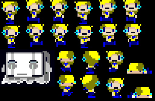
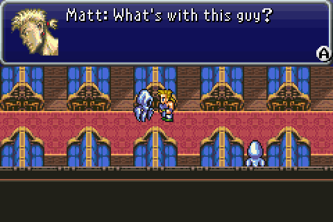
If you're making customized art for your mod and are having trouble, or want advice on how to make it better, post it here to get some feedback. Likewise, if you have any artistic skill and see someone needing assistance, be a good person and help out. Give some advice or even offer to touch up what you see.

Don't be afraid to just ask about general quality of your art, check here to see if it's consistent with your other art, or is stylized in a neat way. This includes Tilesets, Facepics, characters/enemies, gui and whatever else.
 
Nov 10, 2012 at 4:56 AM
Melon Lord
"Wacka-Wacka-Wacka-Wacka-Wacka-Wacka-Wacka-Wacka-BLEIUP"
Join Date: Sep 20, 2011
Location: Rialto
Posts: 337
Age: 27
Well I might as well put up what I have so far.
p159671-0-se0mit.png

The main character (Jenn) is mostly done (Just need about 4 more recolored) and the Balrog ghost is a work-in progress.

So far I'm not sure if I should keep the ghost area slanted like so, almost as if there is wind coming from behind or just keep it straight down since he may or may not actually fight Jenn.
 
Nov 10, 2012 at 5:31 AM
I don't anymore.
"I'm sorry Mario, but your princess is in another castle."
Join Date: Aug 9, 2010
Location: Greener Pastures
Posts: 1190
Age: 30
Hm... I'd work on the hair colors a bit more, they seem a bit dirty. Trying bringing the yellow closer to orange.

The ghost's eyes are a bit strange as the pupils should be really darker than the rest of the eye, you could even make he eyes one solid color. The colors ar okay, but they are still shades of grey. I'm sure you could find something in a light green to use, also don't be afraid to trry diffrent ghost types if that makes you unhappy. There are tons!

p159672-0-53ffvi12325.png

Here we have wrapped up ghost.
diph.php

Here we have floaty objects guy.

Try out some stuff if the dsign dosn't make you happy.
 
Nov 10, 2012 at 5:41 AM
daughter of chivalry
"Bleep, Bloop, Bleep, Bloop"
Join Date: Jun 12, 2009
Location: Edge of the universe
Posts: 1564
Pretty much what Matt said. Mostly it's the poopy gold color that you used for the shading. I don't mean that as an insult, by the way.

I found a nice orange color that I think fits for the shade. Let me know what you think
p159673-0-cotyk.png

I find that with shading, it looks good to move down a hue and then make it a tad darker, but still saturated. Orange tones generally look better for shading with yellow as a base color.
 
Nov 10, 2012 at 5:47 AM
Melon Lord
"Wacka-Wacka-Wacka-Wacka-Wacka-Wacka-Wacka-Wacka-BLEIUP"
Join Date: Sep 20, 2011
Location: Rialto
Posts: 337
Age: 27
Thanks for the feedback, after remembering that I did the hair before I remembered to save the image as a 24-bit bitmap, I left that "poopy gold" color in there and kinda forgot about it.

So far I can't decide between Desu's design or the original hair color I had in mind at the time. Plus I wanted to contrast the hair from the shirt, ascot/scarf thing, and the earrings.
 
Nov 10, 2012 at 5:50 AM
daughter of chivalry
"Bleep, Bloop, Bleep, Bloop"
Join Date: Jun 12, 2009
Location: Edge of the universe
Posts: 1564
I like yours better. I mostly just focused on fixing the shaded color instead of matching the yellow. I'd say stick with the one you posted.
 
Nov 10, 2012 at 6:10 AM
Little Bitch in Sheep Clothing
"..."
Join Date: Nov 16, 2011
Location: New Zealand/ Thailand
Posts: 352
Age: 25
Can I also add that the mouth looks pretty weird.
 
Nov 10, 2012 at 6:22 PM
I don't anymore.
"I'm sorry Mario, but your princess is in another castle."
Join Date: Aug 9, 2010
Location: Greener Pastures
Posts: 1190
Age: 30
I kinda liked the mouth actually. Made the character kinda funny. Unless that's not supposed to happen, then you would want to consider removinga pixel.

EDIT: hey, for gthe ghost you can try out a color pallette similar to the ones on this page: http://forums.tigsource.com/index.php?topic=23816.0
Should make it seem a bit more ghostly.
 
Nov 12, 2012 at 8:51 PM
Melon Lord
"Wacka-Wacka-Wacka-Wacka-Wacka-Wacka-Wacka-Wacka-BLEIUP"
Join Date: Sep 20, 2011
Location: Rialto
Posts: 337
Age: 27
Alright, so I did a redesign of a certain item in order to correspond with the fact Jenn is human and not a robot.
p159678-0-sv6t91.png

The Left is the icon that appears on pickup, the right is the in-game sprite. Now, I want to know if you can tell what this is supposed to be.

What it is and suggestions to maybe make it noticeable
The Watermelon functions as a Life Capsule, and no, it won't be shoved up anyone's butts.
Do you think I should just leave this as a inanimate object in the environment or maybe add something like water drops flowing down or some reflective properties in order to make it stand out? Does it look fine the way it is?
 
Nov 12, 2012 at 11:47 PM
daughter of chivalry
"Bleep, Bloop, Bleep, Bloop"
Join Date: Jun 12, 2009
Location: Edge of the universe
Posts: 1564
Ooh watamelon. It looks fine but what are the pink-white squiggles? And maybe have it sparkling a bit? Water drops work too but they might be harder to do
 
Nov 12, 2012 at 11:54 PM
Melon Lord
"Wacka-Wacka-Wacka-Wacka-Wacka-Wacka-Wacka-Wacka-BLEIUP"
Join Date: Sep 20, 2011
Location: Rialto
Posts: 337
Age: 27
Ooh watamelon. It looks fine but what are the pink-white squiggles? And maybe have it sparkling a bit? Water drops work too but they might be harder to do

I literally based the watermelon off of a newly bought watermelon in our house. The inside had little pink-red lines in a way like the sprite above. I could always just take it off if I decide to just go with classic red-and-black.

Edit: Want to make things noticeable? Just add sparkly stars.
p159680-0-2nai9er.png

(Though, maybe I should've made them green....then again it's a light-blue white on top of dark-green)
 
Nov 13, 2012 at 1:55 AM
I don't anymore.
"I'm sorry Mario, but your princess is in another castle."
Join Date: Aug 9, 2010
Location: Greener Pastures
Posts: 1190
Age: 30
The melon is a bit busy. Try making it simpler. Like, you don't need the lines to go the whole way across if they fade out.

p159681-0-4jetw.png
 
Nov 13, 2012 at 2:40 AM
Professional Whatever
"Life begins and ends with Nu."
Join Date: Jan 13, 2011
Location: Lasagna
Posts: 4481
I've been trying to make new tiles for my mod, but I'm having trouble adding detail.
p159682-0-q7gdw.png

I'm sure you can see the new tiles. Any suggestions? Everything I've tried doesn't loop well or just looks stupid.
 
Nov 13, 2012 at 4:26 AM
I don't anymore.
"I'm sorry Mario, but your princess is in another castle."
Join Date: Aug 9, 2010
Location: Greener Pastures
Posts: 1190
Age: 30
Try composing your slopes out of different shapes than just flat. Experimentation and becoming comfortable is key. A slope should also blend in nicely with your floor, so if the slope seems uninteresting maybe it's because the floor isn't either or because it doesn't blend. You shouldn't use a slope as frquently as you are there though. Some parts can be flat. For reference:
p159683-0-maturestairs.png
 
Nov 16, 2012 at 5:12 AM
Melon Lord
"Wacka-Wacka-Wacka-Wacka-Wacka-Wacka-Wacka-Wacka-BLEIUP"
Join Date: Sep 20, 2011
Location: Rialto
Posts: 337
Age: 27
Deciding to put this up before I sleep tonight. Right here I have 3 Enemy Concepts that will take the form of the bats. I will probably just animate them Space Invaders style, they will probably have seizures when actually animated in-game.
p159684-0-24b8eme.png


Think I should just split them up and use one for every different bat re-color or something? Drop it entirely?

The Concept behind it in the spoiler
These are actually my attempt at drawing restless Mimiga souls in the form of well, Mimiga Skulls
 
Nov 16, 2012 at 6:15 AM
I don't anymore.
"I'm sorry Mario, but your princess is in another castle."
Join Date: Aug 9, 2010
Location: Greener Pastures
Posts: 1190
Age: 30
Don't be too drastic in changes in each frame. The bottoms and eyes can stay nearly the same.
 
Nov 22, 2012 at 6:16 PM
I don't anymore.
"I'm sorry Mario, but your princess is in another castle."
Join Date: Aug 9, 2010
Location: Greener Pastures
Posts: 1190
Age: 30
This thing rocks

I found this neat little application. you can use it to generate color palletes. The way it works is, you click a box, select the color you want to use as the brightest one, then you click the box a certain amount of spaces below, "depending on how many shades you want" pick a color there, and press up on the keyboard and it will fill in the missing colors. It's pretty neat.

EDIT: Also I was bored so I made what might be the cutest character ever.
http://gyazo.com/353aba95f942e4c3354bc71afdfcae28
Anyone have thoughts?
 
Nov 28, 2012 at 12:57 AM
Melon Lord
"Wacka-Wacka-Wacka-Wacka-Wacka-Wacka-Wacka-Wacka-BLEIUP"
Join Date: Sep 20, 2011
Location: Rialto
Posts: 337
Age: 27
Putting one of the first NPC's I have here, how does it look? Just for note, this is supposed to be a mourning bride wearing a veil (Though, she has no husband, but I like the design)

p159688-0-3310o5j.png


Thoughts?

Edit: Though, looking at it again, it looks like she is in the shadows....gotta think of a way to make it look like an actual veil.
 
Nov 28, 2012 at 2:03 AM
I don't anymore.
"I'm sorry Mario, but your princess is in another castle."
Join Date: Aug 9, 2010
Location: Greener Pastures
Posts: 1190
Age: 30
The back of her head is really dark in comparison to the veil.
 
Top