
-
Please stop embedding files/images from Discord. Discord has anti-hotlinking logic in place that breaks links to Discord hosted files and images when linked to from anywhere outside of Discord. There are a multitude of file/image hosting sites you can use instead.
(more info here)
You are using an out of date browser. It may not display this or other websites correctly.
You should upgrade or use an alternative browser.
You should upgrade or use an alternative browser.
Mod Art Help
- Thread starter HyMyNameIsMatt
- Start date

Feb 16, 2013 at 1:20 AM

Join Date: Feb 15, 2013
Location:
Posts: 3
To be completely honest I have no idea what you just said other than "Have a supply of art", which I assume means yes it is possible.HyMyNameIsMatt said:If you mean doubling the games resolution then you can apply to have a back applied to your mod I believe. It does require that you have a supply of art in that format already available to prove you'll make use of it and some problems of your mod done even if it uses placeholder art. I'd ask Noxid if he's still willing to distribute.
Time to work.

Feb 16, 2013 at 1:44 AM
Oh yes, some explanation is in order.
Because of the copyrighted material made by Nicalis, you cannot double res Cave Story's graphics without permission. Noxid previously "fought" with them to allow double res mods, but you still have to ask him to do it for you, as you need his permission now, and also it's a lot of complicated coding.
There used to be a form but I think he took it down so you should just ask him via PM or something. Just remember that it will destroy your game so wait until your mod is finished before actually getting the hack from Noxid.
Feb 16, 2013 at 2:00 AM
Join Date: Aug 28, 2009
Location: The Purple Zone
Posts: 5998
Pronouns: he/him
If I'm reading your post right you want to make it *bigger* than the CS+ graphics? That's not going to happen.
Also the only way someone gets the original hack is if they are A) god's gift to spriting and b) catch me when I'm not in a pissy mood.
Also the only way someone gets the original hack is if they are A) god's gift to spriting and b) catch me when I'm not in a pissy mood.
Feb 16, 2013 at 2:55 AM
Join Date: Feb 15, 2013
Location:
Posts: 3
Haha, well I am not. Still was fun to mess with though, considering I haven't sprited in probably close to 8 years.

Feb 16, 2013 at 4:56 AM

Join Date: Aug 9, 2010
Location: Greener Pastures
Posts: 1188
Age: 32
Dat face.
Feb 18, 2013 at 12:06 AM

Join Date: Jan 18, 2013
Location: Somewhere quiet with many birds
Posts: 1118
Age: 27
Pronouns: she/her
No offense but that's...a little scary.
Assuming you want critique, Illustrated, I say make his head less square and change his face and right arm.
Also,I have no idea how a sprite like that could be in even a double-res mod...
Assuming you want critique, Illustrated, I say make his head less square and change his face and right arm.
Also,I have no idea how a sprite like that could be in even a double-res mod...
Feb 22, 2013 at 5:07 AM

Join Date: Sep 20, 2011
Location: Rialto
Posts: 337
Age: 29
Pronouns: he/him
Attempting trying to make the following fit (as in "look right") in the standard 48x48, but I might leave it as a 48x36. Oh yeah, first attempt at trying to make a mugshot from scratch, thoughts?
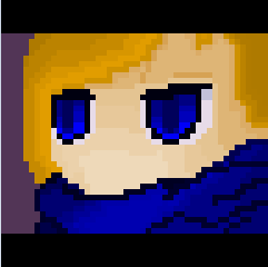
I'm thinking the right eye (from Jenn's perspective) needs to be a bit more "squished", or maybe lowered a pixel or two. Still trying my hand on this POV and original content. Also the scarf/mask thing is (at least attempting to) covering her mouth, neck, and such. Probably might need to raise that in order to bring more focus to the eyes and not look like it suddenly became oversized. At least, from my perspective.
I'm thinking the right eye (from Jenn's perspective) needs to be a bit more "squished", or maybe lowered a pixel or two. Still trying my hand on this POV and original content. Also the scarf/mask thing is (at least attempting to) covering her mouth, neck, and such. Probably might need to raise that in order to bring more focus to the eyes and not look like it suddenly became oversized. At least, from my perspective.
Feb 22, 2013 at 5:33 AM
Join Date: Aug 9, 2010
Location: Greener Pastures
Posts: 1188
Age: 32
Okay so.
The shape is actually good. A bit round, but I don't really mind that. I have 2 recommendations. 1st is that the skin colors need to be brighter and darker. Brighter highlights and darker shadows cause they all look too similar. Second is that the scarf needs better shading. You're over complicating it a tad. Basically you have the light source hitting the center by the head which is wrong. The light will hit each fold in the fabric. I might add that you already have the fabric folds in the right place. It's really good still, I like how the face is a tad orange, which looks nice.
The shape is actually good. A bit round, but I don't really mind that. I have 2 recommendations. 1st is that the skin colors need to be brighter and darker. Brighter highlights and darker shadows cause they all look too similar. Second is that the scarf needs better shading. You're over complicating it a tad. Basically you have the light source hitting the center by the head which is wrong. The light will hit each fold in the fabric. I might add that you already have the fabric folds in the right place. It's really good still, I like how the face is a tad orange, which looks nice.
Feb 22, 2013 at 5:52 AM

Join Date: Oct 29, 2012
Location: England
Posts: 178
Age: 28
Pronouns: he/him
I think it's okay to keep it at that size as long as you fill in the black bars, they are quite ugly.
Also, on the image itself the colours aren't very good, the tones are very similar and end up making somewhat of a gradient effect, this never looks good on pixel art and they
are very dull colours the fluorescent blue, muddy orange etc. I suggest looking at the colours Pixel used or even colour palettes from other games, there is nothing wrong with
borrowing a good palette.
Another thing is something done quite often in pixel art called jaggies, this is where your lines are jagged and create a rough looking effect. An example being the right side of
the jaw, it goes 7px, 3px ,3px, 8px making the jagged effect. A smooth transition on the jaw should be something like 6px, 4px, 3px, 2px, 2px, 1px, 1px, 1px, 1px. This gives the curve
a nice gradual effect.
Also there is little contrast, an important part of pixel art is contrast it is what makes a good pixel art pop. Another word for contrast would be values and a good way of checking values
is by occasionally making the image greyscale. Currently if you do that you can see that the hair and face have very similar values meaning that the image looks flat, here is an example
look at the Kazuma picture it looks normal and is well defined even if you put it in greyscale, this means the image is not relying on the colours to differentiate the different parts (hair, face etc) it is
instead relying on the contrast.

From a character design point I think you need to add a nose or a slight indication of a nose, because prior to reading the text it was quite hard to tell whether it was a scarf covering the face or just
the top of some sort of robe the character was wearing.
Finally the line work on your image is quite thick and visible, notice on the Kazuma picture there is no real line work, this makes the face nicer to look at and makes it seem more soft and
flowing, like a human face would be.
I hope this helps , good luck!
Also, on the image itself the colours aren't very good, the tones are very similar and end up making somewhat of a gradient effect, this never looks good on pixel art and they
are very dull colours the fluorescent blue, muddy orange etc. I suggest looking at the colours Pixel used or even colour palettes from other games, there is nothing wrong with
borrowing a good palette.
Another thing is something done quite often in pixel art called jaggies, this is where your lines are jagged and create a rough looking effect. An example being the right side of
the jaw, it goes 7px, 3px ,3px, 8px making the jagged effect. A smooth transition on the jaw should be something like 6px, 4px, 3px, 2px, 2px, 1px, 1px, 1px, 1px. This gives the curve
a nice gradual effect.
Also there is little contrast, an important part of pixel art is contrast it is what makes a good pixel art pop. Another word for contrast would be values and a good way of checking values
is by occasionally making the image greyscale. Currently if you do that you can see that the hair and face have very similar values meaning that the image looks flat, here is an example
look at the Kazuma picture it looks normal and is well defined even if you put it in greyscale, this means the image is not relying on the colours to differentiate the different parts (hair, face etc) it is
instead relying on the contrast.
From a character design point I think you need to add a nose or a slight indication of a nose, because prior to reading the text it was quite hard to tell whether it was a scarf covering the face or just
the top of some sort of robe the character was wearing.
Finally the line work on your image is quite thick and visible, notice on the Kazuma picture there is no real line work, this makes the face nicer to look at and makes it seem more soft and
flowing, like a human face would be.
I hope this helps , good luck!
Feb 22, 2013 at 6:20 AM
Join Date: Aug 21, 2012
Location: At a computer
Posts: 338
The facepic is ok, but the scarf looks a bit weird.
http://postimage.org/
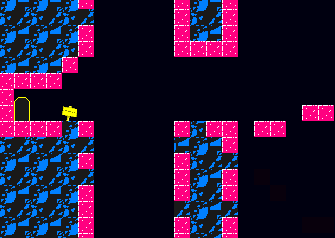
This istotally not a ripoff of the CMYKaves in fez a level im making in my mod, do the tiles look good?
http://postimage.org/
This is
Feb 22, 2013 at 6:26 AM
Join Date: Oct 29, 2012
Location: England
Posts: 178
Age: 28
Pronouns: he/him
But are you going for the look of the CMYK colour palette?
Feb 22, 2013 at 6:28 AM
Join Date: Aug 21, 2012
Location: At a computer
Posts: 338
Yeah.PixelVortex said:But are you going for the look of the CMYK colour palette?
Feb 22, 2013 at 6:50 AM
Join Date: Oct 29, 2012
Location: England
Posts: 178
Age: 28
Pronouns: he/him
Here is what I've done, I made the black in the rocks match the background so it looks like there is only one shade of black, otherwise
it somewhat breaks the illusion. I also added shadow under the Magenta tiles to add depth. Made the sign one shade of yellow and made
it more straight to suit the techno feel of CMYK. Made the Magenta more glossy to make it stand out and add more detail. I, finally, added
a white line to all the top tiles (the ones you will be standing on) this makes stuff more clear.

Hope this helps, it looks interesting I have always been a fan of very simple palettes.
it somewhat breaks the illusion. I also added shadow under the Magenta tiles to add depth. Made the sign one shade of yellow and made
it more straight to suit the techno feel of CMYK. Made the Magenta more glossy to make it stand out and add more detail. I, finally, added
a white line to all the top tiles (the ones you will be standing on) this makes stuff more clear.
Hope this helps, it looks interesting I have always been a fan of very simple palettes.
Feb 22, 2013 at 6:58 AM
Join Date: Aug 21, 2012
Location: At a computer
Posts: 338
Thanks! Can i use you're version of the tiles in the mod?PixelVortex said:Here is what I've done, I made the black in the rocks match the background so it looks like there is only one shade of black, otherwise
it somewhat breaks the illusion. I also added shadow under the Magenta tiles to add depth. Made the sign one shade of yellow and made
it more straight to suit the techno feel of CMYK. Made the Magenta more glossy to make it stand out and add more detail. I, finally, added
a white line to all the top tiles (the ones you will be standing on) this makes stuff more clear.
Hope this helps, it looks interesting I have always been a fan of very simple palettes.
Feb 22, 2013 at 7:00 AM
Join Date: Oct 29, 2012
Location: England
Posts: 178
Age: 28
Pronouns: he/him
Yeah, sure.Thanks! Can i use you're version of the tiles in the mod?
Feb 23, 2013 at 10:25 PM
Join Date: Feb 3, 2013
Location:
Posts: 10
May as well add my input while I'm poking around for help with modding.
The rocks to not read as rocks, since the clusters are kind of ill defined. Presuming that the rock tiles are transformed from ones used in cave story, be aware that Pixel's art style looks very, very sketchy especially to a pixel artist. Often Pixel's tile work has plenty of unsmooth areas which can be smoothed out. Also be aware that it's not a good practice to be detailing with single pixel dots. Pixel clusters often do a better job of detailing.
What I did to the rocks is toss out spots I felt weren't necessary, and polished up some of the clusters.

I also like Pixelvortex's change to the magenta tiles. The saturated magentas used to clash with the blues, but the addition of more white pixels helps buffer the colors so they don't clash nearly as hard. However, the magenta tiles start being read as something a bit like glass so there may be a better possible edit. However, I'm a bit clueless myself on how to detail rocky textures as I haven't been working on rocks often enough.
For the sake of offering other possible viewpoints, assymetry is more interesting than symmetry, so I had a bit of creative freedom with the sign. My design of the sign is also starting to make this mockup more interesting my actually pointing at a direction, which can be used to make more interesting compositions. You can use a sign to point at a particular direction =)
I can stick around and offer more critique, but gotta go. I hope I offered some interesting insight.
The rocks to not read as rocks, since the clusters are kind of ill defined. Presuming that the rock tiles are transformed from ones used in cave story, be aware that Pixel's art style looks very, very sketchy especially to a pixel artist. Often Pixel's tile work has plenty of unsmooth areas which can be smoothed out. Also be aware that it's not a good practice to be detailing with single pixel dots. Pixel clusters often do a better job of detailing.
What I did to the rocks is toss out spots I felt weren't necessary, and polished up some of the clusters.
I also like Pixelvortex's change to the magenta tiles. The saturated magentas used to clash with the blues, but the addition of more white pixels helps buffer the colors so they don't clash nearly as hard. However, the magenta tiles start being read as something a bit like glass so there may be a better possible edit. However, I'm a bit clueless myself on how to detail rocky textures as I haven't been working on rocks often enough.
For the sake of offering other possible viewpoints, assymetry is more interesting than symmetry, so I had a bit of creative freedom with the sign. My design of the sign is also starting to make this mockup more interesting my actually pointing at a direction, which can be used to make more interesting compositions. You can use a sign to point at a particular direction =)
I can stick around and offer more critique, but gotta go. I hope I offered some interesting insight.
Feb 24, 2013 at 5:56 PM
Tommy Thunder
Discord Group Admin
Org Discord Moderator

"Run, rabbit run. Dig that hole, forget the sun."
Join Date: Jan 24, 2011
Location: Coquitlam, BC
Posts: 1368
Age: 30
Pronouns: he/him
Hello. I'm working on a tileset for my mod and so far I've gotten mixed feedback for this one.
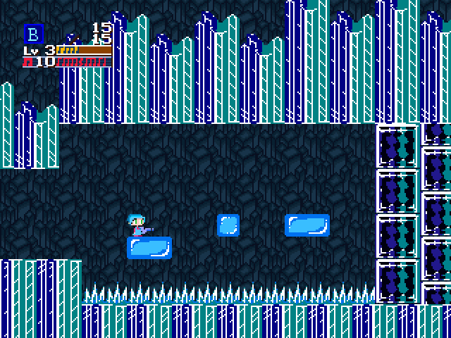
Noxid gave me the background (I just recolored it) and I ripped the foreground from Mega Man 5 and slightly edited it.
Maybe somebody can tell me what looks off with the foreground and background art? Dunc2403 told me that the background contrasts too much.
Noxid gave me the background (I just recolored it) and I ripped the foreground from Mega Man 5 and slightly edited it.
Feb 24, 2013 at 6:13 PM
I think the foreground is a little too shiny,it kind of hurts to look at.
I'm happy that this is still in development. If you're still using my face sets, I can probably make you a better version if you want.
I'm happy that this is still in development. If you're still using my face sets, I can probably make you a better version if you want.