-
Please stop embedding files/images from Discord. Discord has anti-hotlinking logic in place that breaks links to Discord hosted files and images when linked to from anywhere outside of Discord. There are a multitude of file/image hosting sites you can use instead.
(more info here)
You are using an out of date browser. It may not display this or other websites correctly.
You should upgrade or use an alternative browser.
You should upgrade or use an alternative browser.
Mod Art Help
- Thread starter HyMyNameIsMatt
- Start date
May 28, 2013 at 7:52 AM
Join Date: Jan 18, 2013
Location: Somewhere quiet with many birds
Posts: 1118
Age: 27
Pronouns: she/her
So I've been doing a little more work on this...kinda. As much as circumstances would allow me, anyhow.
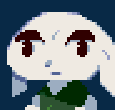
Using ZarroTsu's beautiful shading, and trying to incorporate the stuff MagicDoors and HyMyNameIsMatt were saying(though I probably failed), I came up with this thingy. The older versions are below it for comparison.


I had to reverse a few of Zarro's minor edits, which I'll list here.
★Sure, le bigger hat is pretty and all, but I downsized it back to normal size. The bigger hat simply wouldn't fit on the MyChar, and it also makes no sense. Why would Quote's hat suddenly get bigger for no particular reason?
That sounds really dumb coming from me, but oh well.
I decided to keep the shading on the hat, though in retrospect I'm not sure why. The hat's the same, so shouldn't it keep the same (lack of) shading? I might change that later.
★I can see why Zarro changed the eye color and made the old color the shading, but I kind of intended for the eyes to be that shade of red, so I changed them back and made a slightly darker version of the red for the shading.
★Again, removing the random yellow pixel is a sensible decision, but I intended for that to be there. It's supposed to represent a...um, necklace, thing.
It's a rather reckless and unwise decision, considering the lack of detail or space in sprites, but I sort of liked how it looked, so I'm keeping it in for now.
★There weren't really any recognizable arms in Zarro's sprite, oddly enough. (Then again, the sprite isn't finished...) There was shading there, though, so I decided to whip up a lighter variant of the shading color in order to make the arm without blending in with the hair. I probably need to make it a smidge darker, though.
That's about it! Anything else to do before I work on the down-facing sprites?
Using ZarroTsu's beautiful shading, and trying to incorporate the stuff MagicDoors and HyMyNameIsMatt were saying(though I probably failed), I came up with this thingy. The older versions are below it for comparison.


I had to reverse a few of Zarro's minor edits, which I'll list here.
★Sure, le bigger hat is pretty and all, but I downsized it back to normal size. The bigger hat simply wouldn't fit on the MyChar, and it also makes no sense. Why would Quote's hat suddenly get bigger for no particular reason?
That sounds really dumb coming from me, but oh well.
I decided to keep the shading on the hat, though in retrospect I'm not sure why. The hat's the same, so shouldn't it keep the same (lack of) shading? I might change that later.
★I can see why Zarro changed the eye color and made the old color the shading, but I kind of intended for the eyes to be that shade of red, so I changed them back and made a slightly darker version of the red for the shading.
★Again, removing the random yellow pixel is a sensible decision, but I intended for that to be there. It's supposed to represent a...um, necklace, thing.
I'm so cheesy 

It's a rather reckless and unwise decision, considering the lack of detail or space in sprites, but I sort of liked how it looked, so I'm keeping it in for now.
★There weren't really any recognizable arms in Zarro's sprite, oddly enough. (Then again, the sprite isn't finished...) There was shading there, though, so I decided to whip up a lighter variant of the shading color in order to make the arm without blending in with the hair. I probably need to make it a smidge darker, though.
That's about it! Anything else to do before I work on the down-facing sprites?
May 28, 2013 at 7:25 PM
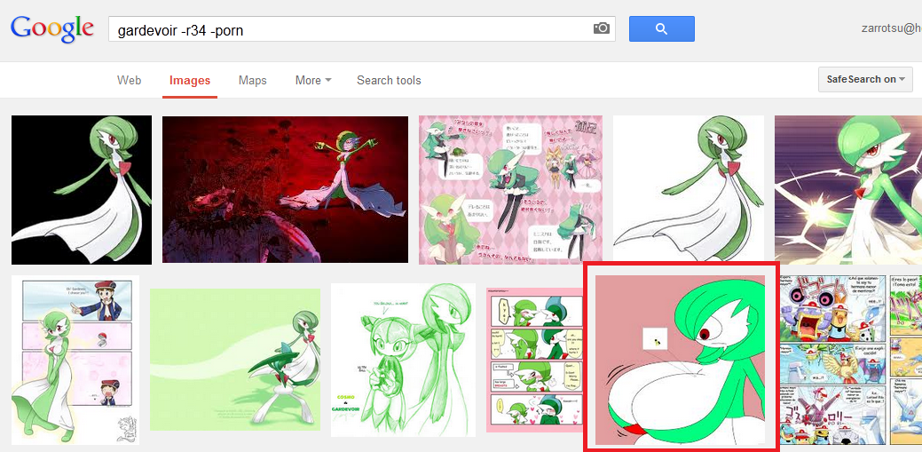
I wouldn't call it beautiful when I had effectively no reference pic due to doing it over lunchtime at work and not wanting to look up gardevoir on google due to the obscene amounts of R34 surrounding it.Polaris said:ZarroTsu's beautiful shading
I didn't even know it had arms at all.There weren't really any recognizable arms in Zarro's sprite, oddly enough.
May 28, 2013 at 8:03 PM
Join Date: Jan 18, 2013
Location: Somewhere quiet with many birds
Posts: 1118
Age: 27
Pronouns: she/her
It's a lot better than my shading, anyway.ZarroSue said:I wouldn't call it beautiful when I had effectively no reference pic due to doing it over lunchtime at work and not wanting to look up gardevoir on google due to the obscene amounts of R34 surrounding it.

And I guess you didn't know about the 68-image-long gallery here with almost no R34, which is fair enough.

...Zorro said:I didn't even know it had arms at all.

May 28, 2013 at 10:35 PM
Here, I did both.MagicDoors said:you could cut it down by searching gardevoir -r34 -porn
or you know
turn safe search on

SERIOUSLY THE FIST FUCKING PAGE.
May 28, 2013 at 11:17 PM
Join Date: Aug 28, 2009
Location: The Purple Zone
Posts: 5998
Pronouns: he/him
That's not healthy.ZarroTsu said:FIST FUCKING
Jun 10, 2013 at 2:19 AM
Join Date: Apr 15, 2012
Location: Tralfamadore
Posts: 74
Age: 30
Pronouns: he/him
MagicDoors said:you could cut it down by searching gardevoir -r34 -porn
or you know
turn safe search on
I'm not so sure. Whenever I try using minus signs on google it always seems like there is more of what I put after the minus sign.
That was really articulate wasn't it.
Jun 10, 2013 at 7:25 AM
Join Date: Jul 15, 2007
Location: Australia
Posts: 6257
Age: 40
Pronouns: he/him
Plus the anti-aliasing is either absent or overdone at times and the steps in your curves are somewhat inconsistent (especially from the neck down).
I'm assuming that you used an upscaled sprite as a base?
I'm assuming that you used an upscaled sprite as a base?
Jun 10, 2013 at 10:45 PM
Join Date: Apr 5, 2013
Location: In my mind and of my body.
Posts: 1643
Age: 28
MagicDoors said:Well uh
It's not bad but his chin is really flat and he has a braindead stare.

Is that better?
@ andwhyisit:
Yeah, it's an upscale, and looking back I should fix the Anti-alising. (had to look up that term
 )
)Jun 11, 2013 at 2:19 AM
Join Date: Apr 15, 2012
Location: Tralfamadore
Posts: 74
Age: 30
Pronouns: he/him
I looked at pixel's facepics a few months ago and realized that they had bigger eyes and mouths. Because his are less terrible than mine I changed them. I think that they look even more like serial killers than before if that is at all possible. i am undecided on weather they are more or less shitty.
also I added a new title screen thing which I am unsure about.
-----------------------------------------------------------------------------------------------
-----------------------------------------------------------------------------------------------
also I added a new title screen thing which I am unsure about.
-----------------------------------------------------------------------------------------------
Jun 11, 2013 at 3:41 AM
Join Date: Apr 5, 2013
Location: In my mind and of my body.
Posts: 1643
Age: 28
Here, I scaled it down somewhat.andwhyisit said:Plus the anti-aliasing is either absent or overdone at times and the steps in your curves are somewhat inconsistent (especially from the neck down).
I'm assuming that you used an upscaled sprite as a base?

Still don't know what do do with his right arm though. . . (left side of the photo)
Jul 7, 2013 at 9:29 PM
Join Date: Apr 5, 2013
Location: In my mind and of my body.
Posts: 1643
Age: 28
So, I've done some art. . .
Momorin:
View attachment Momorin Face.bmp
Shadow: (don't ask)
View attachment Shadow's face.bmp
I can't seem to point out exactly what's wrong. . .
Momorin:
View attachment Momorin Face.bmp
Shadow: (don't ask)
View attachment Shadow's face.bmp
I can't seem to point out exactly what's wrong. . .
Jul 8, 2013 at 11:48 AM
Join Date: Mar 15, 2013
Location:
Posts: 229
Pronouns: he/him
When people cry, they usually keep their mouths shut. And if the eyes are closed they usually aren't relaxed, but are tensely shut during intense moments of sorrow/anger. But please, don't use this advice at heart and look up some people crying on the internet instead, it helps way more then mere words can do: http://commons.wikimedia.org/wiki/File:Hilda_Dokubo_crying_1.jpgBombchu Link said:So, I've done some art. . .
Momorin:
Shadow: (don't ask)
I can't seem to point out exactly what's wrong. . .
Your Shadow one is pretty good, though.
A bit late on this one, but you should also look at the way the heads are shaped in Pixel's artwork. The big anime eyes work because the figure is entirely cartoony, adding cartoon features to a realistic figure(and vice versa) makes them take a dive in the uncanny valley.nemesis_4000 said:I looked at pixel's facepics a few months ago and realized that they had bigger eyes and mouths. Because his are less terrible than mine I changed them. I think that they look even more like serial killers than before if that is at all possible. i am undecided on weather they are more or less shitty.
also I added a new title screen thing which I am unsure about.
You've told me before that you have little artistic experience, so all i can say is that you need to get better or try using the standard cave story sprites as bases.
Jul 8, 2013 at 3:32 PM
Join Date: Apr 5, 2013
Location: In my mind and of my body.
Posts: 1643
Age: 28
Well, I was aiming for a outrage/crying scene there. (She is yelling at the doctor in the scene) So that should justify her open mouth, I just can't get the tears to look realistic. She looks like she was just punched on the playground and wants justice.ElecMaw said:When people cry, they usually keep their mouths shut. And if the eyes are closed they usually aren't relaxed, but are tensely shut during intense moments of sorrow/anger. But please, don't use this advice at heart and look up some people crying on the internet instead, it helps way more then mere words can do: http://commons.wikimedia.org/wiki/File:Hilda_Dokubo_crying_1.jpg
Your Shadow one is pretty good, though.

And thanks about shadow.


