Mod Art Help

Apr 12, 2014 at 3:48 PM
Senior Member
"Master using it, and you can have this!"
Join Date: Apr 7, 2014
Location: tired
Posts: 71
Pronouns: she/her
Yep! Here's a Cthulhu I made:

p159951-0-kh8xmkr.jpg

And one I particularly like of MALCO:

p159951-1-ixqafb8.jpg

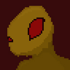
And my avatar, a bit bigger:

p159951-2-aoacjvs.jpg

And I'll add more to this post via Edit as I manage to find them in my stuff/polish them up.

Don' be waitin', as I'm not sure I have any more that are presentable at th' moment.
 
Apr 14, 2014 at 8:35 AM
Been here way too long...
"Big Joe Tire and Battery Restaurant! Opening Soon! Eat at Big Joes!"
Join Date: Oct 7, 2013
Location: India
Posts: 522
Wow, that's very good! But with the Cthulhu especially, maybe you should try using more contrast between the shades. It almost looks like the same color unless you zoom in.
Good luck with future works!
 
Apr 14, 2014 at 1:41 PM
Senior Member
"Master using it, and you can have this!"
Join Date: Apr 7, 2014
Location: tired
Posts: 71
Pronouns: she/her
Oh, thank you much! And I'll take that advice into thought!

And, woah. I just noticed my Cthulhu's nose. Whoops.
 
Apr 14, 2014 at 3:15 PM
Been here way too long...
"Big Joe Tire and Battery Restaurant! Opening Soon! Eat at Big Joes!"
Join Date: Oct 7, 2013
Location: India
Posts: 522
Just curious, what exactly is your avatar supposed to be?
 
Apr 14, 2014 at 9:22 PM
Senior Member
"Master using it, and you can have this!"
Join Date: Apr 7, 2014
Location: tired
Posts: 71
Pronouns: she/her
Well... At first it was going to be a Gaudi, but then I decided that was too fat, so I made it more humanoid. And now.... Well, your guess is as good as mine.
 
Apr 15, 2014 at 12:11 AM
The TideWalker
Modding Community Discord Founder
"That dog!"
Join Date: Apr 5, 2013
Location: In my mind and of my body.
Posts: 1640
Age: 27
Pronouns: he/him
Glag said:
Yep! Here's a Cthulhu I made:

p159951-0-kh8xmkr.jpg

And one I particularly like of MALCO:

p159951-1-ixqafb8.jpg

And my avatar, a bit bigger:

p159951-2-aoacjvs.jpg

And I'll add more to this post via Edit as I manage to find them in my stuff/polish them up.

Don' be waitin', as I'm not sure I have any more that are presentable at th' moment.
the Cthulhu doesn't look horrible, but MALCO has a long way to go to look any good.

I suggest adding more shades of colors to it so it doesn't look like it was made with paint.
 
Apr 15, 2014 at 3:05 AM
Senior Member
"Master using it, and you can have this!"
Join Date: Apr 7, 2014
Location: tired
Posts: 71
Pronouns: she/her
the Cthulhu doesn't look horrible, but MALCO has a long way to go to look any good.

I suggest adding more shades of colors to it so it doesn't look like it was made with paint.
Well... Thanks. But should I be using more shades, or less? Mixed signals, XD
 
Apr 15, 2014 at 3:28 AM
Neophyte Member
"Fresh from the Bakery"
Join Date: Apr 12, 2014
Location:
Posts: 4
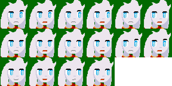
Well, I made this. This is a very heavy edit from Sue's portraits (only borrowed the skin colors, and part of the eyes, though the only familiar thing about it is the iris itself.)

p159958-0-15i68p1.png


p159958-1-2s9ccae.png


Here you go.

Bonus point if you know who the shirt belongs to.
 
Apr 15, 2014 at 4:29 AM
The TideWalker
Modding Community Discord Founder
"That dog!"
Join Date: Apr 5, 2013
Location: In my mind and of my body.
Posts: 1640
Age: 27
Pronouns: he/him
Glag said:
Well... Thanks. But should I be using more shades, or less? Mixed signals, XD

More shading, lots more shading.


FacePalmParadox said:
Well, I made this. This is a very heavy edit from Sue's portraits (only borrowed the skin colors, and part of the eyes, though the only familiar thing about it is the iris itself.)

p159958-0-15i68p1.png


p159958-1-2s9ccae.png


Here you go.

Bonus point if you know who the shirt belongs to.
Wow, that's great looking, his forehead looks a little plain along with his ear, but other then that it looks great. Maybe add some shading to see where the hair parts on top.

I haven't played Vanilla in a while, so I can't pinpoint the shirt. (Kazuma maybe?)
 
Apr 15, 2014 at 5:14 AM
Neophyte Member
"Fresh from the Bakery"
Join Date: Apr 12, 2014
Location:
Posts: 4
Bombchu Link said:
More shading, lots more shading.


Wow, that's great looking, his forehead looks a little plain along with his ear, but other then that it looks great. Maybe add some shading to see where the hair parts on top.

I haven't played Vanilla in a while, so I can't pinpoint the shirt. (Kazuma maybe?)
@Bombchu

His ears seems okay, unless if you want the 3d-ness of it to be apparent. And I've actually tried the hair shading, and it's not exactly not what I like. I'll figure it out later though.


@Dunc2403
Um, he's from an entirely different game, and no it's NOT Arthur, since the guy used to be human (and he's only 15), and no he is not my OC, because he's from a game. It's known for the slogan "Strange, Funny and Heartrending" in a trilogy. He's also found in Brawl. You owe me a quarter.
 
Apr 15, 2014 at 5:17 AM
In my body, in my head
Forum Moderator
"Life begins and ends with Nu."
Join Date: Aug 28, 2009
Location: The Purple Zone
Posts: 5998
Pronouns: he/him
FacePalmParadox said:
@Dunc2403
Um, he's from an entirely different game, and no it's NOT Arthur, since the guy used to be human (and he's only 15), and no he is not my OC, because he's from a game. It's known for the slogan "Strange, Funny and Heartrending" in a trilogy. He's also found in Brawl. You owe me a quarter.
Sonic the hedgehog?
 
Apr 15, 2014 at 5:36 AM
Neophyte Member
"Fresh from the Bakery"
Join Date: Apr 12, 2014
Location:
Posts: 4
Noxid said:
Sonic the hedgehog?
If he was blue,

had different eyes, tinted green,

had no shirt,

and had spikes on the back of his head, rather than the cowlicks in front,

and wasn't human at all before (oh god, mimi-gehog),

then maybe "Yeah........no."


All joking aside, it's Lucas from Mother 3.

If you ask why... I was bored.


EDIT: @Dunc: No hard feelings, I was just ribbing. If I sounded rude, I apologize.
 
Apr 30, 2014 at 3:51 AM
Its dark in here
"Deaths: 4000"
Join Date: Nov 21, 2013
Location: farther
Posts: 922
Age: 27
Pronouns: he/him
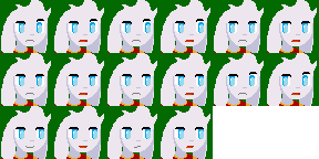
made some face pics of my Quick Man persona

p159965-0-tumblrn4tp6gggnk1rh7vabo1250.png
p159965-1-tumblrn4tp6gggnk1rh7vabo2250.png
p159965-2-tumblrn4tp6gggnk1rh7vabo3250.png
p159965-3-tumblrn4tp6gggnk1rh7vabo4250.png

what do you guys/gals think?
 
May 16, 2014 at 8:46 PM
The TideWalker
Modding Community Discord Founder
"That dog!"
Join Date: Apr 5, 2013
Location: In my mind and of my body.
Posts: 1640
Age: 27
Pronouns: he/him
Goerge Bobicles said:
made some face pics of my Quick Man persona

p159965-0-tumblrn4tp6gggnk1rh7vabo1250.png
p159965-1-tumblrn4tp6gggnk1rh7vabo2250.png
p159965-2-tumblrn4tp6gggnk1rh7vabo3250.png
p159965-3-tumblrn4tp6gggnk1rh7vabo4250.png

what do you guys/gals think?
oof, it's not bad, but please add some anit-aliasing/shading.
Pillar_zps785f8eab.png


Pillar2_zpsfe913c6b.png


Help?
 
May 17, 2014 at 8:51 AM
Veteran Member
"Wacka-Wacka-Wacka-Wacka-Wacka-Wacka-Wacka-Wacka-BLEIUP"
Join Date: Aug 21, 2012
Location: At a computer
Posts: 337
Dunc2403 said:
I repeat, Maybe tell us anything about what it is and what you want so that we're actually capable of helping you.
Its obviously a pillar. a blind man could see its a pillar. :critter:

Anyways, Bombchu Link, i edited it.
p159970-0-foqkubb.png
 
Back
Top