In the Mimiga Village especially, there were a lot of 'disjointed' tiles - ie, the edges of one didn't match the edges of another. This was sorta distracting, and you should fix it, but it is not of the utmost importance at all. Thanks for letting us escape the beatyup twins this time.
The music also seemed a tad fastpaced for that zone, but twas very good musics nonetheless.
And just one carryover complaint from the last demo - I do not understand how he falls down that set of stairs.

Maybe you could have the earthquake hit once he gets to the top and is no the edge? Eh.
Also the dramatic irony/foreshadowing hurt a lot.
The first boss battle, you can stand atop the tile on the bottom left of the stairs, and he kills himself with explosions.
When you reenter your house, the "... but I can avenge them ... " sounds oddly out of place. I think you could probably just remove it, but whatever sinks your anchor.
The dice guys in the crystal cave seemed a tad fast, but i feel like they could grow into just an annoying enemy. Glad you didn't send me through no thin passages. I tried both answers to ctulhu, and they both directed me the same way (also, brotherhood of men in frog uniforms. hmmmm. dragzelire fist!?

)
In doing the doublesave, I got to see your ssaving interface, which is verrrrry pretty. I especially like the zonepic that goes with it.
I also thoroughly enjoyed the cutscene graphics and the 2x rez. both made the hack seem more professional, and the cutscene was reminiscent of iji. I was sorta worried 2x rez would ruin the style, but it looks beau.
Although cutpics take a lot of effort to make (I assume), I think one or two more would be nice, especially when everyone is dead. Maybe make the momtalk happen when you leave the hoose, and have that cutscened.
The robo-critter's xp disapparate while the doors are raised.
Two more vague criticisms, and then a vague comment, and then I think I'm done for now.
Firstly, there are a lot of doors/things you can examine that don't have a corresponding TSC code (or it's just an <END), which is sad. Secondly, there are a lot of awesome tracks, but the transitions btween them seemed a little jumpy.
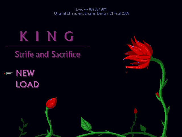
I'm really just amazed by all the hacks, however small, that went into this. Mute system was cool, repositioning the title screen options worked nicely, and for some reason, I was particularly happy with the exclamation point.


 . And the title screen is beautiful.
 Maybe you could have the earthquake hit once he gets to the top and is no the edge? Eh.
 )
)

