
-
Please stop embedding files/images from Discord. Discord has anti-hotlinking logic in place that breaks links to Discord hosted files and images when linked to from anywhere outside of Discord. There are a multitude of file/image hosting sites you can use instead.
(more info here)
You are using an out of date browser. It may not display this or other websites correctly.
You should upgrade or use an alternative browser.
You should upgrade or use an alternative browser.
Cave Story FanArt
- Thread starter jcys810
- Start date

Apr 11, 2010 at 9:26 PM

Join Date: Mar 28, 2010
Location: USA, Washington
Posts: 155
Age: 35
-----cultr1 said:Whoa, excellent job!
About king's eyes: perhaps give them intense color? Just to make them stIck out
Updated, this any better?
http://xxshirushixx.deviantart.com/art/A-Hero-s-Lament-CS-Tribute-160389774
-----Lace said:Wait, you painted this?
How what where...
Still the big head thing, but this is faaaaaaaaabulous.
xD well painted is a figure of speech for doing this all digitally with a tablet as if i were painting it. It's the same general concept, but made much easier.

Apr 11, 2010 at 10:14 PM
Join Date: Mar 28, 2010
Location: USA, Washington
Posts: 155
Age: 35
Okay... so I just went through a lot of thinking.
Truth be told, this whole thing started out at 720 x 450 PX, and i lazily doubled it to 1440 x 900, so it lost a whole lot of quality. So, rather than redraw the whole thing, I'm going to decide against being lazy and i'm going to extend the entire scene, including balrog, and possibly the doctor and misery, maybe even sue, since it looks like there'll be plenty of room 8D
Here's a very rough idea of what sort of scale this is on:
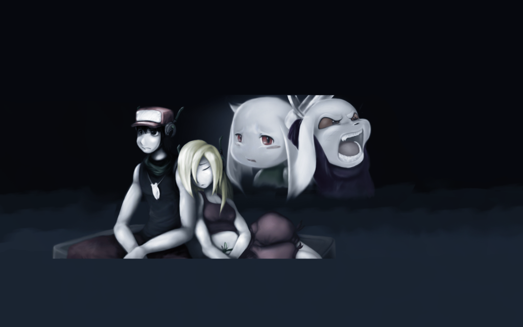
This will make the end image much more clean, and it'll have a lot more content.
Anyone want to throw me some ideas for what I should do with all of this mess of potential?
Truth be told, this whole thing started out at 720 x 450 PX, and i lazily doubled it to 1440 x 900, so it lost a whole lot of quality. So, rather than redraw the whole thing, I'm going to decide against being lazy and i'm going to extend the entire scene, including balrog, and possibly the doctor and misery, maybe even sue, since it looks like there'll be plenty of room 8D
Here's a very rough idea of what sort of scale this is on:
This will make the end image much more clean, and it'll have a lot more content.
Anyone want to throw me some ideas for what I should do with all of this mess of potential?
Apr 11, 2010 at 10:16 PM
Join Date: Apr 19, 2009
Location:
Posts: 3785
Age: 19
Pronouns: he/him
Keep it simple, just focus on how the deaths of Toroko and King weigh on Quote's mind, but drawing Balrog would be fine. With me. Who am not art critic. But I am looking forward to making the completed picture my desktop background.
Apr 11, 2010 at 10:20 PM
Join Date: Mar 28, 2010
Location: USA, Washington
Posts: 155
Age: 35
Captain Fabulous said:Keep it simple, just focus on how the deaths of Toroko and King weigh on Quote's mind, but drawing Balrog would be fine. With me. Who am not art critic. But I am looking forward to making the completed picture my desktop background.
You've got a darn good point there, Probably then, the only additions would be to have a sneering Doctor and Misery, and to add in the rest of Balrog. maybe faint stars or something subtle, but you're right, the main focus of this piece is their deaths
EDIT: I love your signature XD
Apr 11, 2010 at 10:30 PM

Join Date: Feb 13, 2010
Location: undead parish
Posts: 625
Apr 11, 2010 at 10:36 PM
Join Date: Jan 4, 2008
Location: Lingerie, but also, like, fancy curtains
Posts: 3052
@ Volley
Maybe instead of making it balrog have it be just a stone block, ie from the outer wall. Stars might be a bit too cheerful, but having none is sorta weird. You could have two stars only, close to eachother and one brighter than the other. Nice symbolism thar. Kings head is still too big, but I imagine that's hell to fix, so just give him redder eyes for maximum demonosity?
As for the mess of potential, having it relatively empty emphasizes the solitude. Maybe have A moon in the upper right with the doctor and miza silhouetted against it? None too big, but still profound.
Apr 11, 2010 at 10:46 PM
Join Date: Mar 28, 2010
Location: USA, Washington
Posts: 155
Age: 35
IAmSerge said:Freaking. Amazing.
Thanks 8D It's only going to get better!! I hope...
Lace said:@ Volley
Maybe instead of making it balrog have it be just a stone block, ie from the outer wall. Stars might be a bit too cheerful, but having none is sorta weird. You could have two stars only, close to eachother and one brighter than the other. Nice symbolism thar. Kings head is still too big, but I imagine that's hell to fix, so just give him redder eyes for maximum demonosity?
As for the mess of potential, having it relatively empty emphasizes the solitude. Maybe have A moon in the upper right with the doctor and miza silhouetted against it? None too big, but still profound.
Hmmm... well my main reasoning for having it be Balrog is that this is end-game, the good ending after the ballos fight, and even though you went through everything perfectly, turned every stone for every easter egg, Toroko and King still die. Riding off on Balrog, I thought to myself what Quote (mainly) and Curly must have going on in their minds about everything they've both been through.
For curly, her trauma is more for not being able to save the kolons that she was watching over, so you see, there's a lot more emotion to this scene than meets the eye. Having Balrog there finalizes that yes, this is the best ending, and it still didn't go so well.
I'll be reworking proportions as I go along, i'll try to do something about that noggin's size, and as I said, this is a rough look at how it's going to be, who knows, positioning will probably change with the general layout. A lot more can be expressed through positioning that usually goes unnoticed.
I really like the idea for the moon casting silhouettes on the two antagonists, more of a darker eerie feel to them, I really appreciate the idea!
Apr 17, 2010 at 7:04 PM
Join Date: Feb 13, 2010
Location: undead parish
Posts: 625
Choosing an image format
Okay.....
Which image is the best? I will use that format from now on when uploading fanart.
1. Original- (-2.0EC)
2. Enhanced- (-2.0EC + D-Lighting Enhancement)
3. More Exposure- (-1.3EC)
4. Still More Exposure- (-0.7EC)
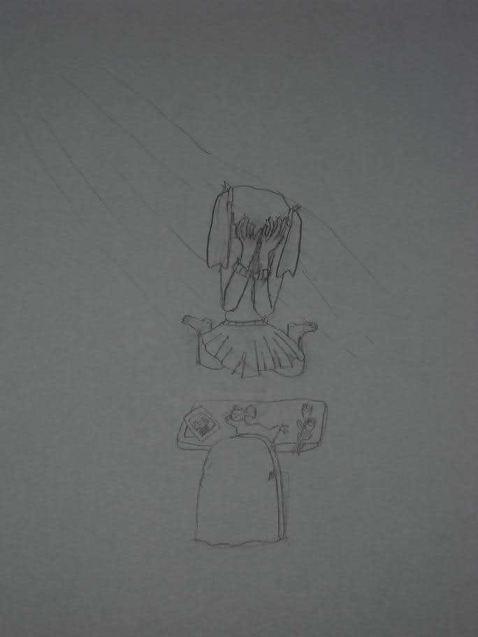
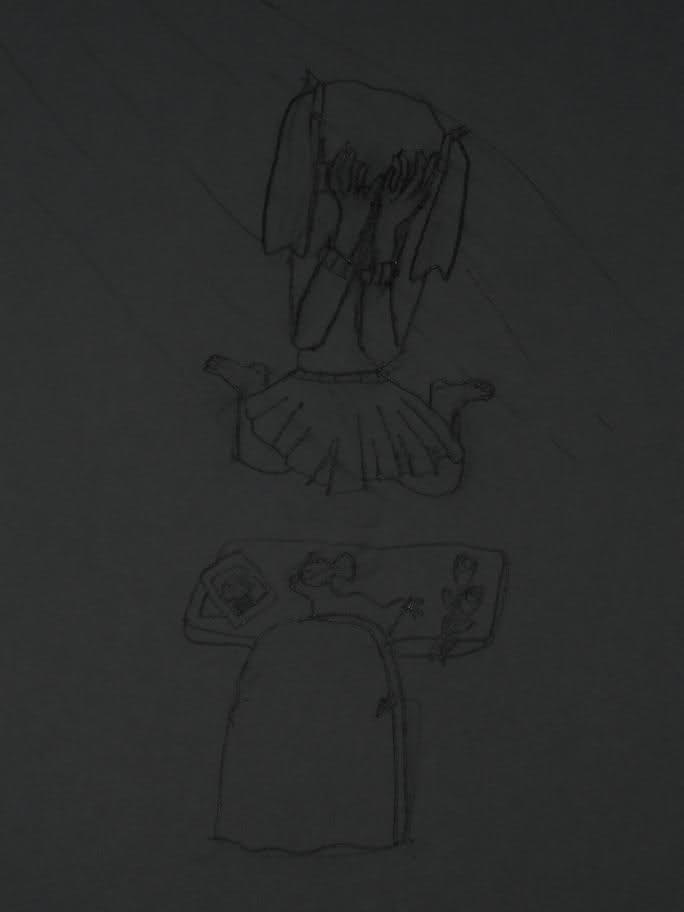
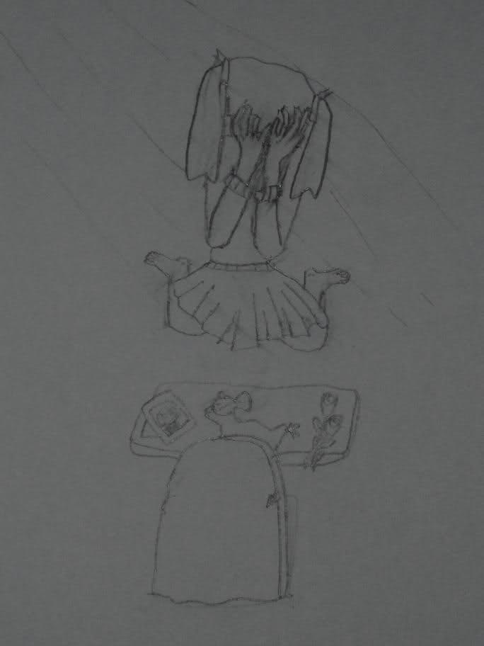
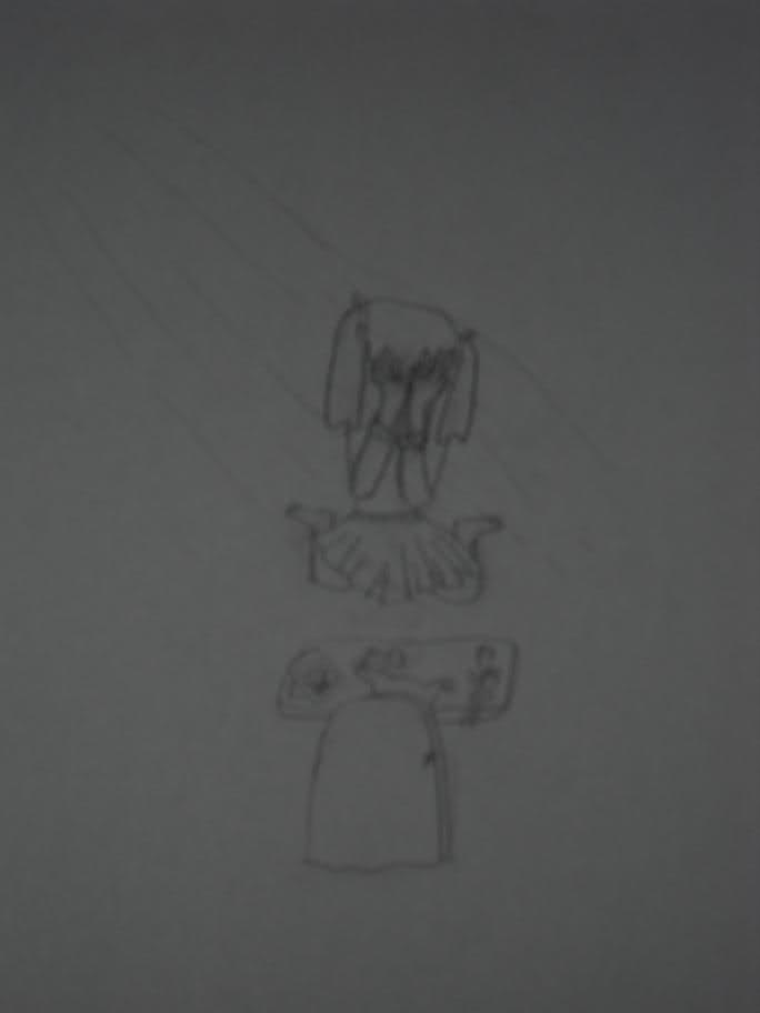
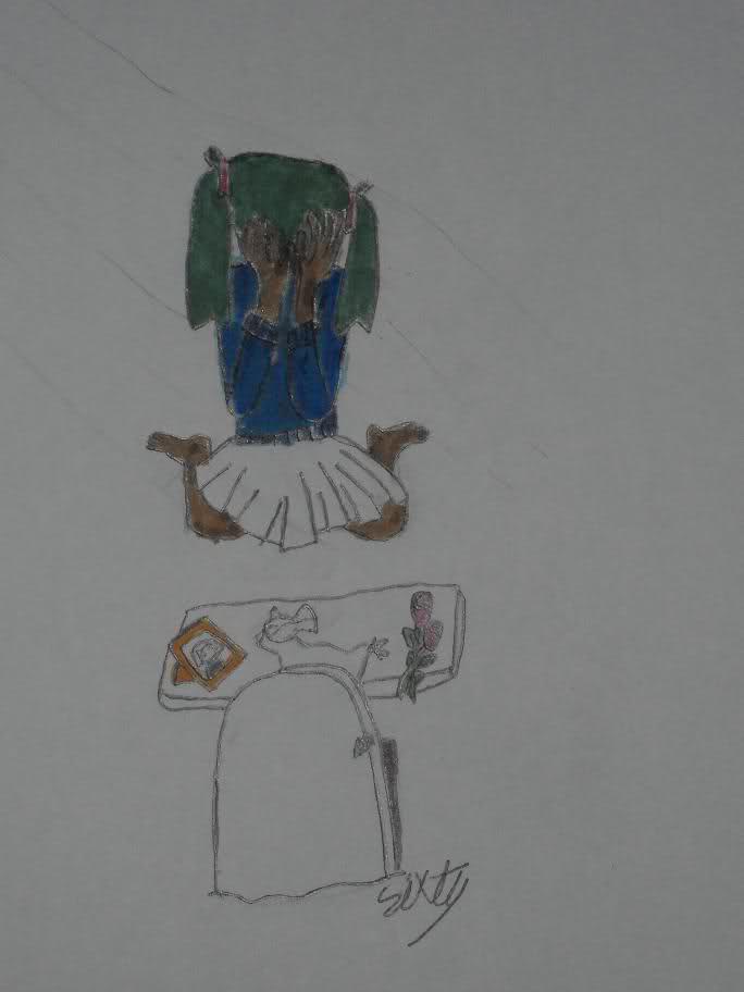
The art itself is a picture I made of Sue (human form) mourning Toroko.
Okay.....
Which image is the best? I will use that format from now on when uploading fanart.
1. Original- (-2.0EC)
2. Enhanced- (-2.0EC + D-Lighting Enhancement)
3. More Exposure- (-1.3EC)
4. Still More Exposure- (-0.7EC)
The art itself is a picture I made of Sue (human form) mourning Toroko.
Apr 17, 2010 at 7:25 PM
Join Date: Mar 28, 2010
Location: USA, Washington
Posts: 155
Age: 35
Re: Choosing an image format
This one, definitely. It has more contrast and you'll be able to work with it easier. Of course, You should run it through Auto-Levels...
Of course, I could just do that for you...
I also did some minor retouching on the parts that showed clipping from too harsh of light
sixtyseconds said:4. Still More Exposure- (-0.7EC)
This one, definitely. It has more contrast and you'll be able to work with it easier. Of course, You should run it through Auto-Levels...
Of course, I could just do that for you...
I also did some minor retouching on the parts that showed clipping from too harsh of light
Apr 18, 2010 at 2:29 AM
Join Date: Jan 7, 2007
Location:
Posts: 2587
Age: 36
Re: Choosing an image format
it would look way better if he relined it on the computer, pencil sketch lines never turn out well in my experience
Volley said:This one, definitely. It has more contrast and you'll be able to work with it easier. Of course, You should run it through Auto-Levels...
Of course, I could just do that for you...
I also did some minor retouching on the parts that showed clipping from too harsh of light
it would look way better if he relined it on the computer, pencil sketch lines never turn out well in my experience
Apr 18, 2010 at 2:52 AM
Join Date: Mar 28, 2010
Location: USA, Washington
Posts: 155
Age: 35
Re: Choosing an image format
I definitely agree, but that's not for me to say xD
I reline everything that I do, even if the lines look alright, I want them perfect
xristosx said:it would look way better if he relined it on the computer, pencil sketch lines never turn out well in my experience
I definitely agree, but that's not for me to say xD
I reline everything that I do, even if the lines look alright, I want them perfect
Apr 18, 2010 at 6:30 PM

Join Date: Mar 1, 2008
Location: Grasstown
Posts: 1435
2 and 4 are better, but if you could get access to a scanner that'd be better still. (I'm guessing you're photographing these; if I'm wrong, let me know.)sixtyseconds said:Okay.....
Which image is the best? I will use that format from now on when uploading fanart.
Apr 18, 2010 at 7:08 PM
Join Date: Feb 13, 2010
Location: undead parish
Posts: 625
@Minstrel
Yes, I am photographing them.... I will scan from now on.
-0.7EC won.
Here's a version of the original fanart with color and -0.7EC.
Yes, I am photographing them.... I will scan from now on.
-0.7EC won.
Here's a version of the original fanart with color and -0.7EC.
Apr 18, 2010 at 7:16 PM
Join Date: Feb 13, 2010
Location: undead parish
Posts: 625
Volley said:And my gesture is completely ignored, thanks.
Sorry, um............ if you'd reline it it would be great

Using pencil then inking over sucks cuz the pen ink shines in the camera flash
and looks weird.I'd do this on the computer, but I'm more suited to detail work, like sprites. Really small sprites...........
Apr 18, 2010 at 7:21 PM
Join Date: Mar 28, 2010
Location: USA, Washington
Posts: 155
Age: 35
sixtyseconds said:Sorry, um............ if you'd reline it it would be great
Using pencil then inking over sucks cuz the pen ink shines in the camera flash
I'd do this on the computer, but I'm more suited to detail work, like sprites. Really small sprites...........
It's alright, I just think that "Nah, that wont work for me" would be nicer to hear XD
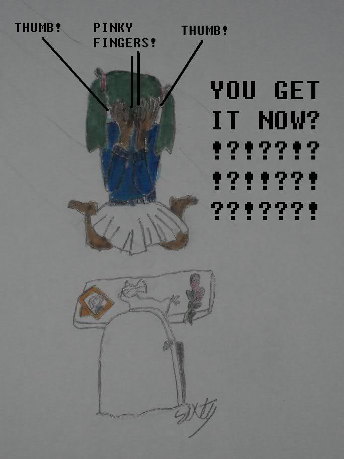
I dont think i'd have a problem with relining it... if her hands weren't backwards D:
Apr 18, 2010 at 7:25 PM
Join Date: Feb 13, 2010
Location: undead parish
Posts: 625
Volley said:I dont think i'd have a problem with relining it... if her hands weren't backwards D:
Epic fail.
And D: is a hard drive. It's