Apr 8, 2010 at 11:15 AM
Join Date: Mar 28, 2010
Location: USA, Washington
Posts: 155
Age: 35
I've been working on this one for about two days or so inbetween college and freight work at Target, Think it's worth finishing?
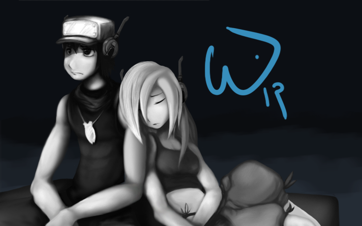


Schokobecher said:Quote looks kinda depressed o.O
One word: Yes.Volley said:Think it's worth finishing?
andwhyisit said:One word: Yes.
carrotlord said:@Volley
It looks really nice, especially the textures.
Volley said:I've been working on this one for about two days or so inbetween college and freight work at Target, Think it's worth finishing?

ragnaroq said:hoooooooly sadlfj
this is really really *really* good, man. I adore your style, I can't even explain how great both Quote and Curly look and how much it just works--from the colors to the poses you chose.
I really love Quote's expression, it reminds me of how I pictured his sprite in the PC version when I first saw it. Curly's drawn in a way that's really beautiful in a way not many artists have ever captured--usually they make her fluffy and cute or try to make her 'sexy' in a way that I can't quite grasp or appreciate, but I *adore* how she looks here.
*edit* Oh, and to respond to your stuff:
I'm kinda on the fence as to whether or not you should show Balrog's face. I think it's fine how it is, maybe make it slightly more apparent that they're riding on him in the first place, like, obvious that they're over an ocean or whatever; but while Balrog's mug would kind of detract from the mood, at the same time, if pulled off right, it could add that touch of blissful neutrality Balrog's so good at conveying that the picture could perhaps use to offset the 'downer' tone.
And I really can't wait for your interpretations of King and Toroko. I love both those characters a lot, and it's always the main thing on my mind that even if you get the best ending they're gone and there's nothing you can do to bring them back.
(Oh, and Quote's necklace is such a cool little touch)
There's your answer.jcys810 said:The purpose of this topic is to post your fanart for Cave Story here. No matter what it is, such as sprites, artwork, etc.
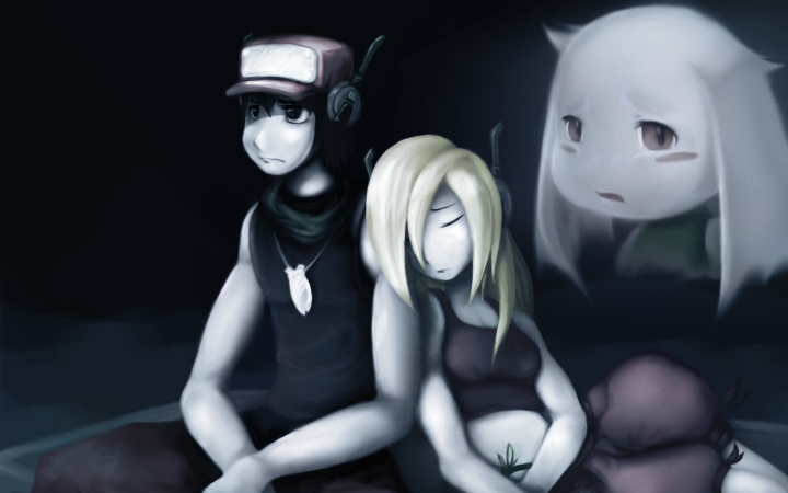

Volley said:Update (Showing Current, then previous)
EDIT Big update, Toroko's done, or so i thought
Another EDIT: Big change in Toroko's shading, much nicer looking, and much more space has been given for King to be opposite her
Fixes:
-proportions (too freakin many to list... arms, namely.)
-Color Scheme
-Shading


Renolds said:Wow... This is... I'm so glad that this thread is a Sticky, I would have totally missed out on this.
What are you using for this, Corel painter?
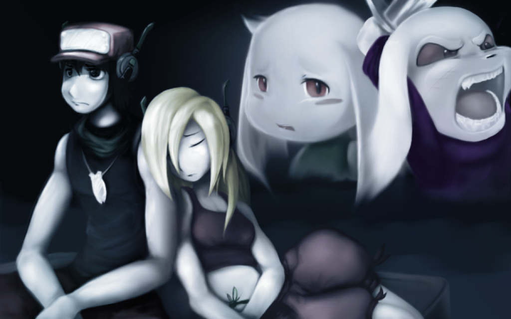
Volley said:No Actually, I've been having a ton of people keep telling me that I need to try out either paint tool SAI or corel Painter, but here I am with my CS 4 Photoshop, being rebellious... like always... Okay, so the potential of CS 4 has kinda worn down on me, but i'm still learning new things that change the way I do my art, so that's a good thing, right?
EDIT: The resolution is a little off on this one because Photobucket only allows 1024 x 640 resolution, but i'll be uploading the full 1440 x 900 widescreen to my dA once it's all finished
Also, just in time for my latest big update. I'd like to know if there's anything that I should add, manipulate, take away from this.
Like I'd said before, i want to do justice to the meaning behind this thought:
https://andwhyisit.bugsiteguardian.com/cstsf/archive1/p22615-0-heroslamentbg.png
-----Schokobecher said:Awesome.
Kings facial expression is just "Brrrr".
Can't wait for the Widescreen Version.
-----DoubleThink said:I love the look on Quote's face :>
-----xristosx said:WOW well done that looks great, i cant wait to see the finished product, could i get your dA link?
-----Schokobecher said:Look at his signature.
-----ragnaroq said:I really REALLY love what you've done with this since you last showed me. I love King's new position as opposed to being way across the screen like last time, and his snout looks so much cooler... the addition of the sword's awesome, too.
Only complains is that his scar looks a bit too faint and not exactly where it was on the face sprite, but that's minor--in some ways he looks better without as apparent a scar.
Keep up the good work, man. I hope you draw more of this stuff, it's only too bad you weren't earlier or you probably could have gotten something on the Nicalis blog.
-----Lace said:Just a minor thingy, but King's eyes look a bit ... plastic. It's sorta a weird complaint, I know, but they don't seem as ragy or as angry shaped as they did in the game. Also, his head seems a bit too big for his body, it looks like he wouldn't be able to bring his sword down on the enemy because his head was in the way.
Sides those two bizarre nitpicks, this is amazing.
