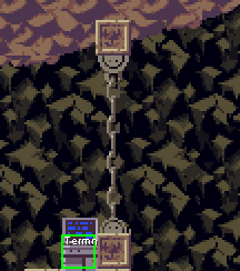
I thought I might as well post this here. An idea for a redesigned HUD I made via CSE2 awhile back. When I made this I was not really sure of weapon icon placement still not particularly sure still.


[ORG][/ORG] (old)
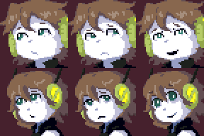
(old) Both look good to me. New ones are closer to anime standard? (Nice!) Also seems to mostly not meet your gaze leading to a different impression vs the old ones. Which have more of a piercing stare.