Sturmfaust II (Need Artists)

May 8, 2010 at 11:15 AM
Hoxtilicious
"Life begins and ends with Nu."
Join Date: Dec 30, 2005
Location: Germany
Posts: 3218
Age: 33
Pronouns: he/him
Thanks Fahrenheight :)
With how many degrees does it start? -65°?
 
May 8, 2010 at 2:11 PM
Senior Member
"Huzzah!"
Join Date: Aug 6, 2009
Location: GMT + 8 ;)
Posts: 202
Age: 36
uh -75 degrees to 0 degrees to 75 degrees? [15 panels][0][15 panels]? /(?.?)\

Wait, did you get the file? :)
 
May 8, 2010 at 2:34 PM
Hoxtilicious
"Life begins and ends with Nu."
Join Date: Dec 30, 2005
Location: Germany
Posts: 3218
Age: 33
Pronouns: he/him
Fahrenheight said:
uh -75 degrees to 0 degrees to 75 degrees? [15 panels][0][15 panels]? /(?.?)\

Wait, did you get the file? :)

Yes, I did, thanks o:
 
May 8, 2010 at 2:45 PM
Senior Member
"Huzzah!"
Join Date: Aug 6, 2009
Location: GMT + 8 ;)
Posts: 202
Age: 36
WooHoo O:


Allright.


  1. I really need the mirrored images of the main character (I need him facing right too ) check
  2. Finishing the missing angles of the main character o: check
  3. Finishing some character pictures uh
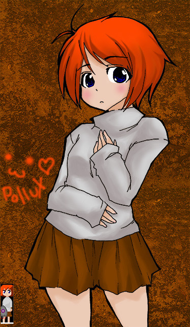
  4. Facepics for Pollux (Normal, sad, curious, happy, anxious, panic, serious) uh
  5. We might need smaller angles, because the current ones seem have big distances o: (Maybe we should go with 5° or 10°? Well whatever suits you, but remember that the smaller the angles are, the better it will look) Check
  6. Are you good at tilesets? o: hmm
  7. I don't know... PROFIT!


tile sets hmm.. how big is a single uh square err tile.

EDIT: and what theme.

 
May 8, 2010 at 4:00 PM
Hoxtilicious
"Life begins and ends with Nu."
Join Date: Dec 30, 2005
Location: Germany
Posts: 3218
Age: 33
Pronouns: he/him
Fahrenheight said:
tile sets hmm.. how big is a single uh square err tile.

EDIT: and what theme.
8x8

diph.php


You saw how the tileset is used, right? o:
It's some kind of Industrial, Tech and a little bit of Cave Theme.
 
May 10, 2010 at 3:57 PM
Senior Member
"Huzzah!"
Join Date: Aug 6, 2009
Location: GMT + 8 ;)
Posts: 202
Age: 36
Spoiler!
p92761-0-jy5ut.png

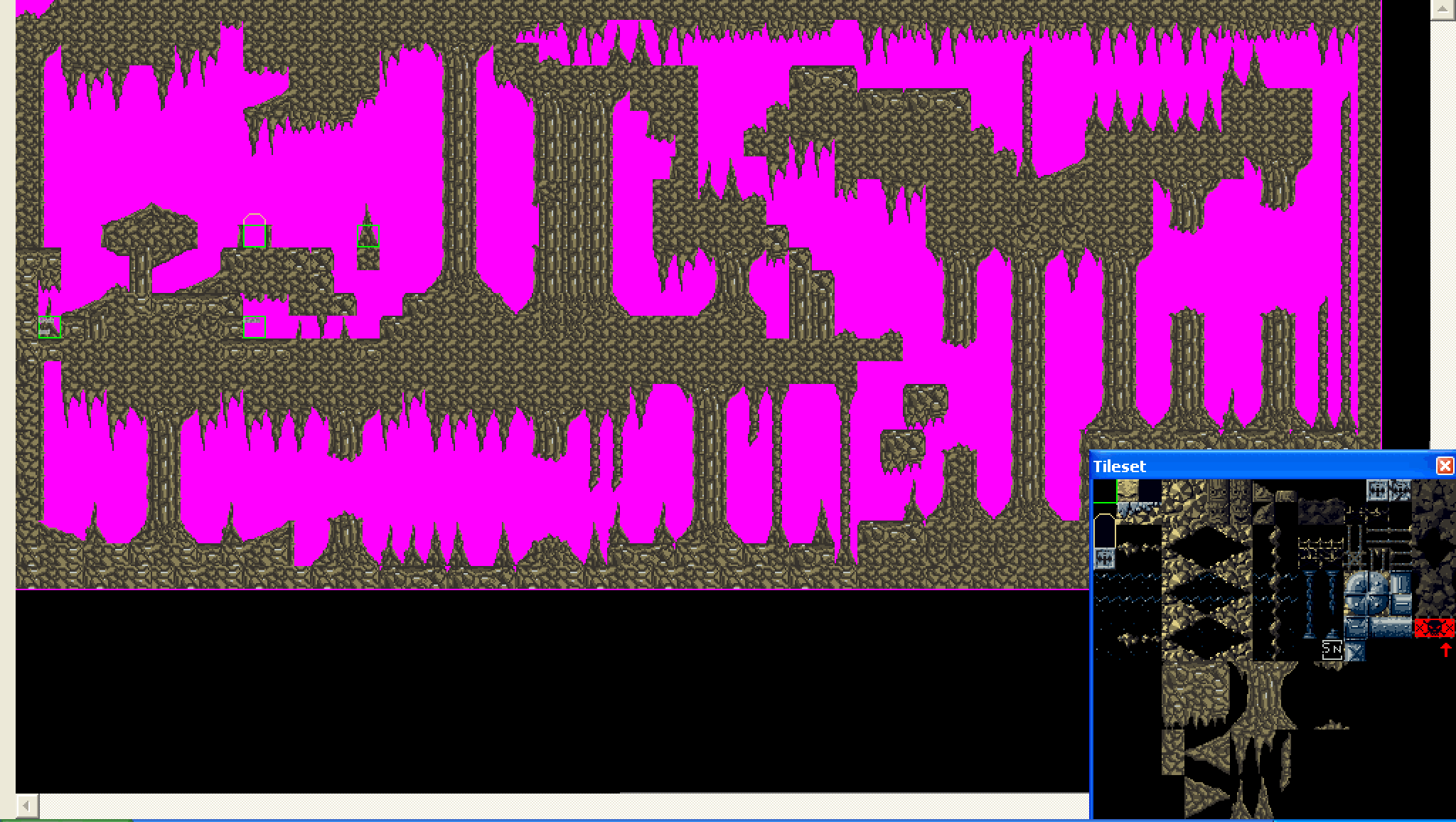
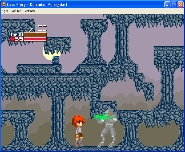
I've used a Cave Story Map editor to see what it look like in game and added two of our sprite.. well the tile is kinda small.. oh yeah, its a cave theme.

uh what do you think boss? I'm still going to add more soon.
 
May 10, 2010 at 8:03 PM
Hoxtilicious
"Life begins and ends with Nu."
Join Date: Dec 30, 2005
Location: Germany
Posts: 3218
Age: 33
Pronouns: he/him
Awesome! I would like to have the same old brown/white color sheme though :confused:
But it really looks pretty much fine, it's a bit unicoloured I think.
 
May 13, 2010 at 3:45 PM
Senior Member
"Huzzah!"
Join Date: Aug 6, 2009
Location: GMT + 8 ;)
Posts: 202
Age: 36
A Preview Boss S.P.G.

I use the color that you said.. still need some work.

p92763-0-mxgw9.png
 
May 16, 2010 at 3:11 PM
Hoxtilicious
"Life begins and ends with Nu."
Join Date: Dec 30, 2005
Location: Germany
Posts: 3218
Age: 33
Pronouns: he/him
Sorry for the late response.
Goob job.
I like it but something feels wrong, can't tell what it is though o:
 
May 16, 2010 at 7:40 PM
Hoxtilicious
"Life begins and ends with Nu."
Join Date: Dec 30, 2005
Location: Germany
Posts: 3218
Age: 33
Pronouns: he/him
Schokobecher said:
Too much cave maybe?

No. It's more about how it's drawn, not the fact that it is a cave o:
 
May 17, 2010 at 8:36 AM
Senior Member
"Huzzah!"
Join Date: Aug 6, 2009
Location: GMT + 8 ;)
Posts: 202
Age: 36
How its drawn? uhh I draw it.. wierdly? or not suitable for repeatability?
 
May 17, 2010 at 8:45 AM
Lvl 1
Forum Moderator
"Life begins and ends with Nu."
Join Date: May 28, 2008
Location: PMMM MMO
Posts: 3713
Age: 32
Fahrenheight said:
How its drawn? uhh I draw it.. wierdly? or not suitable for repeatability?

It looks good, it just all looks very much the same.

Add some variety to the tileset, both with colors and different cave parts and such. At least that what I think it needs.

It's good, but you need more variety.
 
May 20, 2010 at 3:40 PM
Senior Member
"Huzzah!"
Join Date: Aug 6, 2009
Location: GMT + 8 ;)
Posts: 202
Age: 36
GIRakaCHEEZER said:
It looks good, it just all looks very much the same.

Add some variety to the tileset, both with colors and different cave parts and such. At least that what I think it needs.

It's good, but you need more variety.

hmm.. I'm working on it, I just need variety right? as for the colors, it was SP who said to use those colors, so blame him :)[joking] but unless SP said so, I'll add more Colors..
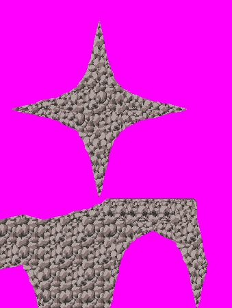
While thinking for how I'm gonna do it, I made a new tile set, so do you think this is better?

p92769-0-50er3.png


[yes, for the past 3 days(?) This is just what I did :(]

sorry for the late reply, as soon as I read that, I began practicing and working, but because of school... yeah.
 
May 20, 2010 at 4:28 PM
Hoxtilicious
"Life begins and ends with Nu."
Join Date: Dec 30, 2005
Location: Germany
Posts: 3218
Age: 33
Pronouns: he/him
Wow, this looks nicely Caveish o: I wonder if it fits into the game though, because it looks somewhat realistic imo o:

Fahrenheight said:
hmm.. I'm working on it, I just need variety right? as for the colors, it was SP who said to use those colors, so blame him :)[joking] but unless SP said so, I'll add more Colors..

If you need other colors you can use them.
Actually I originially planned to have the same tileset in brown and white. (Different colors but one original tileset)
It's allright though o:

If you want, you could make a tileset in plain white/black/grey too. Because the editor will be able to "color" blocks or make them darker (not lighter though, but I probably will add support for that). But it is only able to "color" a whole block or to color it's corners, keep that in mind when you making a tileset. One tile with two different colors, probably can't be colored by the editor.

Fahrenheight said:
While thinking for how I'm gonna do it, I made a new tile set, so do you think this is better?

It looks very nice, but I'm not sure if it is able to fit into the game.
I like the texture, but I like the shape of the other tileset a bit better. (This one seems to be more complicated, especially for collision.)
 
May 21, 2010 at 4:51 PM
Senior Member
"Huzzah!"
Join Date: Aug 6, 2009
Location: GMT + 8 ;)
Posts: 202
Age: 36
S. P. Gardebiter said:
Wow, this looks nicely Caveish o: I wonder if it fits into the game though, because it looks somewhat realistic imo o:

what? REALISTIC!? wha?

S. P. Gardebiter said:
If you need other colors you can use them.
Actually I originially planned to have the same tileset in brown and white. (Different colors but one original tileset)
It's allright though o:

oh okay, but using yours is better..


S. P. Gardebiter said:
If you want, you could make a tileset in plain white/black/grey too. Because the editor will be able to "color" blocks or make them darker (not lighter though, but I probably will add support for that). But it is only able to "color" a whole block or to color it's corners, keep that in mind when you making a tileset. One tile with two different colors, probably can't be colored by the editor.

... so you mean if: 32 x 32 block has 2 colors or more, you can't make them darker or recolor them?


S. P. Gardebiter said:
It looks very nice, but I'm not sure if it is able to fit into the game.
I like the texture, but I like the shape of the other tileset a bit better. (This one seems to be more complicated, especially for collision.)

... complicated degrees perhaps? originally those pointy things in the new tile set I made is for stalagmite things or doodad or decorations or whatever you call it, but I kinda added more so its become 4 pointy rocks..

so, what do you mean by you can't add them? How Complicated it is? Collision? you mean bumping into them right? (COLLISION DAMAGE HAHA!)
 
May 27, 2010 at 1:10 AM
http://imgur.com/EuvCtsQ
"In Soviet Russia, graves keep YOU!"
Join Date: May 2, 2010
Location: beverly hills is where i WANT to be
Posts: 743
Age: 30
Pronouns: he/him
GalkdsfjahkjsdhaConcept art

p92772-0-2cmp3l2.png


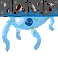
So, this thing as it is right now sticks to the ceiling, and tries to grab you. In it's core is a black thing with red eyes, which generates electricity. Depending on what game your playing, the thing inside it may be more or less prominant in the creature (causeing it to conduct more or less electricity, or behaving differently)

I might be able to sprite it (perhaps)
 
May 27, 2010 at 4:41 PM
Senior Member
"Huzzah!"
Join Date: Aug 6, 2009
Location: GMT + 8 ;)
Posts: 202
Age: 36
S.P.G. Must be really busy..

just passing by, checking something and doing tile sets...

My Question is still my previous question(how compicated the 32 x 32 tile sets collision)

and sharing this:
p92773-0-pun2w.jpg


@explosive
btw nice concept art, and have you finished spriting it yet? :(
 
May 27, 2010 at 5:17 PM
http://imgur.com/EuvCtsQ
"In Soviet Russia, graves keep YOU!"
Join Date: May 2, 2010
Location: beverly hills is where i WANT to be
Posts: 743
Age: 30
Pronouns: he/him
Alright, you caught me on my lunch break.
p92774-0-fz6xy9.png

I think it's 32x32, but I might have made it 30x30 by accident...
I still need to make a few more frames for animation, though.

Oh, and it uses 8 colors... maybe nine (I'll need to check -.-)

Oh, and I've gone through the thread and checked out your art. You're really talented!
 
May 27, 2010 at 7:21 PM
Hoxtilicious
"Life begins and ends with Nu."
Join Date: Dec 30, 2005
Location: Germany
Posts: 3218
Age: 33
Pronouns: he/him
Fahrenheight said:
what? REALISTIC!? wha?

I was talking about the texture. It doesn't look much retro like. But maybe it's only me.

Fahrenheight said:
oh okay, but using yours is better..

Huh? o:


Fahrenheight said:
... so you mean if: 32 x 32 block has 2 colors or more, you can't make them darker or recolor them?


I use 8x8 blocks, not 32x32!

However, I think you might got something wrong.

The editor will be able to do something like this:

diph.php


The editor will be able to do that with every 8x8 block placed in the map, so you could mix colors. However, you will not be able to do everything with that! It only will be able to start a color at the cornor of a 8x8 block, so you can't do anything complex "with simple colors", like this:

diph.php


I could also make "animated coloring", like making it change from blue to red. But I have no idea where this could come in handy, except for lights.

Fahrenheight said:
... complicated degrees perhaps? originally those pointy things in the new tile set I made is for stalagmite things or doodad or decorations or whatever you call it, but I kinda added more so its become 4 pointy rocks..

It's like this:

diph.php


Those slopes are okay. (As 8x8 tiles) But anything round might be bad for colision detection, aslong as it's not in the background or foreground layer. (Because these aren't used for collision)

Fahrenheight said:
you mean bumping into them right? (COLLISION DAMAGE HAHA!)

Well, walking on them is already a collision.

explosive said:
GalkdsfjahkjsdhaConcept art

p92772-0-2cmp3l2.png


So, this thing as it is right now sticks to the ceiling, and tries to grab you. In it's core is a black thing with red eyes, which generates electricity. Depending on what game your playing, the thing inside it may be more or less prominant in the creature (causeing it to conduct more or less electricity, or behaving differently)

I might be able to sprite it (perhaps)

Wow, this looks great. I like it :)

Fahrenheight said:


Awesome! Only thing is that the upper half of her legs and maybe her face is a bit big o: Looks really good.

explosive said:
Alright, you caught me on my lunch break.
p92774-0-fz6xy9.png

Looks allright. It could be 64x64 though. But if you like, we can have small and big ones o:
I don't care for the number of colors btw., as there is no limitation here ;) Use as many colors as you need.
 
Back
Top