Mod Art Help

Nov 28, 2012 at 9:37 AM
Not anymore
"Run, rabbit run. Dig that hole, forget the sun."
Join Date: Jan 28, 2010
Location: Internet
Posts: 1369
Age: 34
Pronouns: he/him
I dunno. It looks like a gaudi wearing a wedding dress...

But you got the dress right! :orangebell:
 
Nov 29, 2012 at 11:23 PM
Melon Lord
"Wacka-Wacka-Wacka-Wacka-Wacka-Wacka-Wacka-Wacka-BLEIUP"
Join Date: Sep 20, 2011
Location: Rialto
Posts: 337
Age: 27
Pronouns: he/him
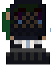
Alright, made slight changes to the widow from Matt's comment.
p159691-0-34phzx1.png


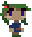
Also made one of the main characters here.
p159691-1-cqh4x.png
She's got semi-long hair and the splotch on her shirt is supposed to be dirt or mud. Though, I could always take that off it it looks weird.
 
Nov 30, 2012 at 12:49 AM
I don't anymore.
"I'm sorry Mario, but your princess is in another castle."
Join Date: Aug 9, 2010
Location: Greener Pastures
Posts: 1188
Age: 30
She is much better. I think the thing about the character that looks odd now is that all charactrs in cave story have eyes that are 2 pixels long exceptfor a few enemies. Also the eyes should probably just be plain white. Anything else looks like it would blend with the viel too much. It is a good character though.

The girl looks nice, but her right hand is massive.
 
Nov 30, 2012 at 1:00 AM
Melon Lord
"Wacka-Wacka-Wacka-Wacka-Wacka-Wacka-Wacka-Wacka-BLEIUP"
Join Date: Sep 20, 2011
Location: Rialto
Posts: 337
Age: 27
Pronouns: he/him
She is much better. I think the thing about the character that looks odd now is that all charactrs in cave story have eyes that are 2 pixels long exceptfor a few enemies. Also the eyes should probably just be plain white. Anything else looks like it would blend with the viel too much. It is a good character though.

The girl looks nice, but her right hand is massive.

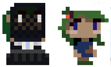
For the first part, thank you. Though, the thing is her eyes actually are 2 pixels long. The thing under them is glowing blue-white tears. Mainly to stand out from the whole veil and emphasize her anguish, sadness, etc.

For the girl, I was actually following the Human Sue's sprite. Eh, maybe I'll just put it as a mini "L" shape.

Edit: Alright, more edits to see if they look any better. Thoughts?
p159693-0-1rs13l.png
 
Nov 30, 2012 at 1:47 AM
I don't anymore.
"I'm sorry Mario, but your princess is in another castle."
Join Date: Aug 9, 2010
Location: Greener Pastures
Posts: 1188
Age: 30
Mucho better.
 
Dec 12, 2012 at 4:19 AM
Melon Lord
"Wacka-Wacka-Wacka-Wacka-Wacka-Wacka-Wacka-Wacka-BLEIUP"
Join Date: Sep 20, 2011
Location: Rialto
Posts: 337
Age: 27
Pronouns: he/him
Alright, made some more stuff, including a title screen and a rough version of the 1st boss.
p159695-0-v4qq7d.png


The boss is actually supposed to be a spirit of the bushlands that you, Jenn, has defiled by trespassing and potentially killing the innocent creatures. She's holding a mix of a Barbed "Fork Spear" and a bludgeon/mallet hybrid. Maybe I'll just position the thing to be behind her since the thing kinda blends in with her eye.
Thoughts on both?
 
Dec 12, 2012 at 4:31 AM
I don't anymore.
"I'm sorry Mario, but your princess is in another castle."
Join Date: Aug 9, 2010
Location: Greener Pastures
Posts: 1188
Age: 30
It all looks fine. But the J is weird The horizantal lines are supposed to be thinner. I mean, that's how Times New Roman works and that's what Cave Story's font was. Yah, I would try throwing that weapon behind the persons head. The legs as well seem more like a mass than something recognizable. I'd polish that up a bit. It looks like you're doing some good with this though, can't wait to see more of it.
 
Dec 14, 2012 at 11:28 PM
Melon Lord
"Wacka-Wacka-Wacka-Wacka-Wacka-Wacka-Wacka-Wacka-BLEIUP"
Join Date: Sep 20, 2011
Location: Rialto
Posts: 337
Age: 27
Pronouns: he/him
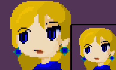
Been making a lot more progress in terms of stages, NPC's, and bosses. Guess I'll be thanking Finals for that. Anyway now that I'm done with school until the 7th of next year, I have way too much free time to work on my game. I've made my first shot at facepics, whatcha think?

p159697-0-33wbamo.png

If you couldn't tell already, it's Jenn. Anyway I used Misery's base since she had what I wanted in mind. I'll probably use the human Sue facepic for that little girl I made earlier. Still trying to figure out how to make good mouths ;-;
 
Dec 14, 2012 at 11:40 PM
I don't anymore.
"I'm sorry Mario, but your princess is in another castle."
Join Date: Aug 9, 2010
Location: Greener Pastures
Posts: 1188
Age: 30
Holy shit that's competant.

Lets see. The only things I don't care for are the blue of the eyes and the ear rings. They just aren't shaded like round objects. Also there's this one bright spot at the top by the hair. It looks like a mistake accidentally left there. That and a pixel missing from the eyebrow.
 
Dec 14, 2012 at 11:50 PM
Melon Lord
"Wacka-Wacka-Wacka-Wacka-Wacka-Wacka-Wacka-Wacka-BLEIUP"
Join Date: Sep 20, 2011
Location: Rialto
Posts: 337
Age: 27
Pronouns: he/him
HyMyNameIsMatt said:
Holy shit that's competant.

Lets see. The only things I don't care for are the blue of the eyes and the ear rings. They just aren't shaded like round objects. Also there's this one bright spot at the top by the hair. It looks like a mistake accidentally left there. That and a pixel missing from the eyebrow.
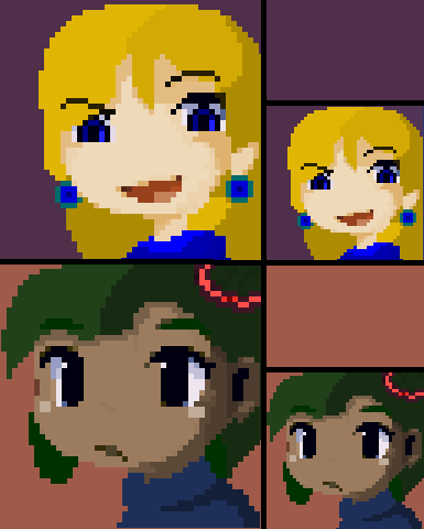
My, my, didn't expect to hear this from ya. I just dislike pastel-colored/simply colored stuff, so I just make sure to put some shading, just like I usually do when doodling. Seriously though, thanks. I'll just fix the missing pixel and the bright spot, I'm keeping the eye and ear ring shading though.

Edit: Fixed version
p159699-0-2lvn3op.png
 
Dec 15, 2012 at 1:22 AM
Not anymore
"Run, rabbit run. Dig that hole, forget the sun."
Join Date: Jan 28, 2010
Location: Internet
Posts: 1369
Age: 34
Pronouns: he/him
It's not bad at all. Fairly decent.
 
Dec 16, 2012 at 1:48 AM
I don't anymore.
"I'm sorry Mario, but your princess is in another castle."
Join Date: Aug 9, 2010
Location: Greener Pastures
Posts: 1188
Age: 30
Lookin alot better now. Would still like to see the earrings be more round.
 
Dec 16, 2012 at 4:17 PM
Melon Lord
"Wacka-Wacka-Wacka-Wacka-Wacka-Wacka-Wacka-Wacka-BLEIUP"
Join Date: Sep 20, 2011
Location: Rialto
Posts: 337
Age: 27
Pronouns: he/him
Good to see you all approve of the first one. Made another one for Jenn, did slightly more than just editing colors and shifting some pixels. Also made a facepic for the little girl.
p159702-0-1orddl.png

First time making mouths, also hairbands for the girl. Just used ordinary household elastic hairbands for reference.
 
Dec 16, 2012 at 5:14 PM
I don't anymore.
"I'm sorry Mario, but your princess is in another castle."
Join Date: Aug 9, 2010
Location: Greener Pastures
Posts: 1188
Age: 30
Her expression looks uncomfortable. If that's the goal then good job, otherwise...

The girl below, the head band is on the dark side of her head and is too bright. Also, just as a personal note, you may wanna screw around with her colors a bit so is less obvious that she's a resprite.
 
Dec 16, 2012 at 5:38 PM
Melon Lord
"Wacka-Wacka-Wacka-Wacka-Wacka-Wacka-Wacka-Wacka-BLEIUP"
Join Date: Sep 20, 2011
Location: Rialto
Posts: 337
Age: 27
Pronouns: he/him
HyMyNameIsMatt said:
Her expression looks uncomfortable. If that's the goal then good job, otherwise...

The girl below, the head band is on the dark side of her head and is too bright. Also, just as a personal note, you may wanna screw around with her colors a bit so is less obvious that she's a resprite.
Considering the situation(s) she'll get into, yeah she will be uncomfortable. Violation of personal space, confusion, and not being able to formally and nonchalantly answer questions up ahead.

To the second, there's a reason why she resembles a resprite, but I'm becoming afraid people will think it's an asspull only fanfic writers would put in. Oh, and I'll darken it. I think I forgot to do that when getting the colors.
 
Dec 16, 2012 at 5:58 PM
I don't anymore.
"I'm sorry Mario, but your princess is in another castle."
Join Date: Aug 9, 2010
Location: Greener Pastures
Posts: 1188
Age: 30
Those are hard grounds to tread, best of luck to you.
 
Dec 28, 2012 at 9:28 PM
Melon Lord
"Wacka-Wacka-Wacka-Wacka-Wacka-Wacka-Wacka-Wacka-BLEIUP"
Join Date: Sep 20, 2011
Location: Rialto
Posts: 337
Age: 27
Pronouns: he/him
So, now I'm going to (attempt) some tileset editting. Have a look at the results after gratutious amounts of editting (2-5 minutes) with the best software I could use: Microsoft Paint.
p159706-0-35ji2ac.png

Just so you can know, this is going to take place in a flooded village/town. Thoughts? Maybe I'll have the lower section even darker, then again it looks metallic so maybe not. Maybe a bit of rust, maybe.
 
Dec 28, 2012 at 10:08 PM
I don't anymore.
"I'm sorry Mario, but your princess is in another castle."
Join Date: Aug 9, 2010
Location: Greener Pastures
Posts: 1188
Age: 30
Meh. You should just turn the buildings a shade of purple or blue.
 
Jan 5, 2013 at 2:56 PM
Junior Member
"It's dangerous to go alone!"
Join Date: Dec 6, 2012
Location: Edolas
Posts: 40
Pronouns: he/him
Hey, I was editing sprites for my mod, but whenever I add the color Black on Quote it shows up blank? Why is that?
 
Jan 5, 2013 at 3:06 PM
Professional Whatever
"Life begins and ends with Nu."
Join Date: Jan 13, 2011
Location: Lasagna
Posts: 4481
Pronouns: she/her
Perfect black is the default transparency for Cave Story. There are two ways to overcome this:

1. Use a shade of black that is almost perfect black (use R:1 G:1 B:1 or something) so that it is not treated as transparent

2. Hack the executable to change the default background colour (but that'll screw shit up so don't do it)

Failing that, you could just use green (like the Sakamotos' hair) or a dark blue.
 
Back
Top