Mod Art Help

Jan 20, 2014 at 7:13 PM
Melon Lord
"Wacka-Wacka-Wacka-Wacka-Wacka-Wacka-Wacka-Wacka-BLEIUP"
Join Date: Sep 20, 2011
Location: Rialto
Posts: 337
Age: 27
Pronouns: he/him
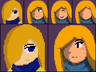
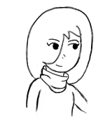
Slightly Dusty thread, but considering the new year, it's time we do some more critique on 2014 art. Since I got that Wacom Bamboo Tablet for Christmas and such, I've been doodling and pretty much now have a finalized design for Jenn's portrait for the most part. I suppose all I need now are you guys' thoughts, suggestions, etc.
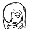
p159891-0-jennhead.jpg
p159891-1-sketch.png
- The doodle(s) it's based on

p159891-2-compare.png
- Every (Neutral) portrait change made to Jenn since 2012. The third one was just a rough thing, the last one on the right is what I think is good for the moment and need suggestions/critique on.
 
Feb 1, 2014 at 8:05 PM
Been here way too long...
"Big Joe Tire and Battery Restaurant! Opening Soon! Eat at Big Joes!"
Join Date: Oct 7, 2013
Location: India
Posts: 522
JonSpider said:
Slightly Dusty thread, but considering the new year, it's time we do some more critique on 2014 art. Since I got that Wacom Bamboo Tablet for Christmas and such, I've been doodling and pretty much now have a finalized design for Jenn's portrait for the most part. I suppose all I need now are you guys' thoughts, suggestions, etc.

p159891-0-jennhead.jpg
p159891-1-sketch.png
- The doodle(s) it's based on

p159891-2-compare.png
- Every (Neutral) portrait change made to Jenn since 2012. The third one was just a rough thing, the last one on the right is what I think is good for the moment and need suggestions/critique on.
The leftmost is the best. In the others the face gets too wide, and the hair doesn't seem right somehow.

And, I wanted to remake all the credit art with color added to a few highlighted objects. You can find it here. What do you all think?
 
Feb 3, 2014 at 3:21 AM
Senior Member
"This is the greatest handgun ever made! You have to ask yourself, do I feel lucky?"
Join Date: Dec 10, 2011
Location: South Florida
Posts: 91
Age: 24
Pronouns: he/him
JonSpider said:
Slightly Dusty thread, but considering the new year, it's time we do some more critique on 2014 art. Since I got that Wacom Bamboo Tablet for Christmas and such, I've been doodling and pretty much now have a finalized design for Jenn's portrait for the most part. I suppose all I need now are you guys' thoughts, suggestions, etc.

p159891-0-jennhead.jpg
p159891-1-sketch.png
- The doodle(s) it's based on

p159891-2-compare.png
- Every (Neutral) portrait change made to Jenn since 2012. The third one was just a rough thing, the last one on the right is what I think is good for the moment and need suggestions/critique on.
hello friend!

i decided to just revamp your sprite and make a blank face just to save you the troubles!

p159893-3-lhnbfap.png


im not sure if it was supposed to be in cave story style, but i made it in that style anyways

some points you should take:

-take some colors from the cave story pallete so yours wont be as dull
-use the original face sprites as reference for face shapes and stuff
-dont be afraid to add more shading! it adds a difference between things, such as the hair.

i guess thats all i have to say. if anyone else has sprite troubles, be sure to reply so i can help you out!
 
Feb 3, 2014 at 9:19 PM
Been here way too long...
"Big Joe Tire and Battery Restaurant! Opening Soon! Eat at Big Joes!"
Join Date: Oct 7, 2013
Location: India
Posts: 522
How exactly should I improve on this?
p159894-0-g1cxv5j.png
Thank you in advance!
 
Feb 3, 2014 at 10:11 PM
Senior Member
"This is the greatest handgun ever made! You have to ask yourself, do I feel lucky?"
Join Date: Dec 10, 2011
Location: South Florida
Posts: 91
Age: 24
Pronouns: he/him
IdioticBaka1824 said:
How exactly should I improve on this?
p159894-0-g1cxv5j.png
Thank you in advance!
a major thing you can do is to drop the animu eyes. its not good to confine such details to a small sprite.

i made an edit to show you what i mean.

p159895-1-xcmicv3.png


i grabbed some colors from the cave story pallete incase you see some unfamiliar colors. when you take away some major details, its easier to look at.

another thing you should do is add more contrast for different shades. i didnt even know there was shading on "the guy on the left"'s hair! make it more noticeable. the same problem was also on his sword, with the random pixels of pink. the other dude didnt have much problems, so i pretty much tinkled with him.

shading is also heavily encouraged. i really didnt see much of it here!
 
Feb 4, 2014 at 2:10 PM
Been here way too long...
"Big Joe Tire and Battery Restaurant! Opening Soon! Eat at Big Joes!"
Join Date: Oct 7, 2013
Location: India
Posts: 522
Wow, you're talented at this! The shading is really good. But... don't you think the colors are a bit dullish?
The anime-style eyes were actually made after a long-thought decision. I actually got the okay from my big sister on it! And while I myself was a bit sceptical at first, I think it turned out pretty good for such a small sprite. But I understand your logic.
Also, these are characters from an anime called 'Bleach'. It's a girl on the left, so it was kind of funny to read your post.
 
Feb 4, 2014 at 2:17 PM
Been here way too long...
Discord Group Admin
Org Discord Moderator
"Life begins and ends with Nu."
Join Date: Oct 18, 2011
Location:
Posts: 2337
Two things:
Using colours that are not neon does not make a sprite look dull. It makes it look proffesional.
The anime eyes were awful. That's simply the way it is, since you'll never fit a good one into a 16x16 sprite.
 
Feb 4, 2014 at 2:38 PM
Professional Whatever
"Life begins and ends with Nu."
Join Date: Jan 13, 2011
Location: Lasagna
Posts: 4481
Pronouns: she/her
It's not that the eyes looked terrible, but they weren't fit for such a small sprite, as others said. I personally like making large eyes but yeah it's hard when you have such tiny constraints.
 
Feb 4, 2014 at 2:54 PM
Been here way too long...
"Big Joe Tire and Battery Restaurant! Opening Soon! Eat at Big Joes!"
Join Date: Oct 7, 2013
Location: India
Posts: 522
Dunc2403 said:
Two things:
Using colours that are not neon does not make a sprite look dull. It makes it look proffesional.
The anime eyes were awful. That's simply the way it is, since you'll never fit a good one into a 16x16 sprite.
1. The new colors looked like they were in the shade. It's not like anyone will be sitting under a tree for the whole course of a mod. And professional isn't necesarily better.
2. Alright. I'm making a mod for you people, anyways, so I have to suit to your interests.
 
Feb 4, 2014 at 4:20 PM
Professional Whatever
"Life begins and ends with Nu."
Join Date: Jan 13, 2011
Location: Lasagna
Posts: 4481
Pronouns: she/her
-Your sprites' colours were a bit bright
-Recolor's had shading, but the contrast wasn't top-quality
- Dull is bad, neon is bad
- Make a good sprite using shading that looks nice and has enough saturation to look not grey and also not hurt your eyes

IdioticBaka1824 said:
And professional isn't necesarily better.
No that's kind of the point of it being professional
"2. (of a person) engaged in a specified activity as one's main paid occupation rather than as a pastime."
As in they have to be actually GOOD at it or they lose their job
IdioticBaka1824 said:
2. Alright. I'm making a mod for you people, anyways, so I have to suit to your interests.
No
No no no no no no nO NO NO NON O NO NO NO
Don't make a mod for other people or you will hate your life
The only good reason to make a mod is for personal development or entertainment
 
Feb 4, 2014 at 4:28 PM
In my body, in my head
Forum Moderator
"Life begins and ends with Nu."
Join Date: Aug 28, 2009
Location: The Purple Zone
Posts: 5998
Pronouns: he/him
Feb 4, 2014 at 4:29 PM
Professional Whatever
"Life begins and ends with Nu."
Join Date: Jan 13, 2011
Location: Lasagna
Posts: 4481
Pronouns: she/her
Sparkledogs are exempt from all rules of any kind
 
Feb 4, 2014 at 10:34 PM
Senior Member
"This is the greatest handgun ever made! You have to ask yourself, do I feel lucky?"
Join Date: Dec 10, 2011
Location: South Florida
Posts: 91
Age: 24
Pronouns: he/him
im actually not a professional! i have been spriting for 4 years now, but there is still lots of room for improvement!

well i do agree that the colors are dull, it doesnt mean you have to make it over the top saturated. i actually took the oranges from the gravekeeper since i really didnt see much oranges to pick.
 
Feb 4, 2014 at 11:23 PM
Professional Whatever
"Life begins and ends with Nu."
Join Date: Jan 13, 2011
Location: Lasagna
Posts: 4481
Pronouns: she/her
Increasing the saturation and decreasing the luminescence is a semi-stable way of finding a darker shade. Of course, the best scenario is using colours of a different hue as well as a darker shade to create a more vibrant colour scheme, but the saturation/luminescence tip is a good start.
 
Feb 5, 2014 at 1:25 AM
Senior Member
"This is the greatest handgun ever made! You have to ask yourself, do I feel lucky?"
Join Date: Dec 10, 2011
Location: South Florida
Posts: 91
Age: 24
Pronouns: he/him
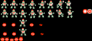
ive been making some sprites for my own mod and need some c+c on this.

p159905-0-u9ofogx.png
 
Feb 5, 2014 at 3:37 AM
Its dark in here
"Deaths: 4000"
Join Date: Nov 21, 2013
Location: farther
Posts: 922
Age: 27
Pronouns: he/him
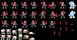
so I've been making new sprites and I would like some feedback on them before I put them in a mod


@$$#013 knight

p159906-0-tumblrn0i77swpmd1rh7vabo1400.png

ignore the ravils

and fire knight

p159906-1-tumblrn0i77swpmd1rh7vabo2400.png
 
Feb 6, 2014 at 1:33 PM
Been here way too long...
"Big Joe Tire and Battery Restaurant! Opening Soon! Eat at Big Joes!"
Join Date: Oct 7, 2013
Location: India
Posts: 522
That's very nice! The effect of metal was achieved neatly. Although you might want to add a bit more detail in the fire

And, um, how should I improve on this?
p159907-0-vthwizr.png
 
Feb 6, 2014 at 11:31 PM
Senior Member
"This is the greatest handgun ever made! You have to ask yourself, do I feel lucky?"
Join Date: Dec 10, 2011
Location: South Florida
Posts: 91
Age: 24
Pronouns: he/him
Goerge Bobicles said:
so I've been making new sprites and I would like some feedback on them before I put them in a mod


@$$#013 knight

p159906-0-tumblrn0i77swpmd1rh7vabo1400.png

ignore the ravils

and fire knight

p159906-1-tumblrn0i77swpmd1rh7vabo2400.png
ill be honest. those do not look like knights at all. they look more like robots

im not sure if this is your design. but if it is, then you should search more images of knights. at least thats what i did. i made a really sloppy edit of the sprite.

p159908-2-sadgwle.png


some points should be taken:

-the pose wasnt really that interesting, so i tried spicing it up a bit.

-most knights arent fat, so making it skinny was my option.

-its not a good idea to outline the sword

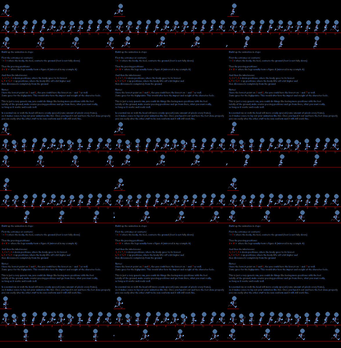
also, if youre going to make a walking animation, take a look at this (i didnt make this):
p159908-3-gmkkxxa.gif


i guess thats it.


@IdioticBaka its not all that bad since its pretty much just an edit of bkmoon, but maybe the moon should be a bit thicker. maybe by 1 pixel. the anti-aliasing isnt all that good, so i recommend looking for some tutorials
 
Feb 7, 2014 at 2:13 AM
Serri Online
Moo~
"Life begins and ends with Nu."
Join Date: Jun 27, 2013
Location:
Posts: 2838
Age: 29
Pronouns: She/Her
Maybe the @$$#013 Knight was intended to be animated like that? And not all knights looked like those from King Arthur and Dark Souls.
 
Feb 7, 2014 at 2:19 AM
I don't anymore.
"I'm sorry Mario, but your princess is in another castle."
Join Date: Aug 9, 2010
Location: Greener Pastures
Posts: 1188
Age: 30
TLincoln said:
Maybe the @$$#013 Knight was intended to be animated like that? And not all knights looked like those from King Arthur and Dark Souls.
But those are all good knight designs. : (

As much as I appreciate dark souls I get the argument. Though bad is still bad.
 
Back
Top