Gun

Mar 14, 2020 at 10:37 AM
Senior Member
"This is the greatest handgun ever made! You have to ask yourself, do I feel lucky?"
Join Date: Sep 23, 2019
Location:
Posts: 97
Pronouns: he/him
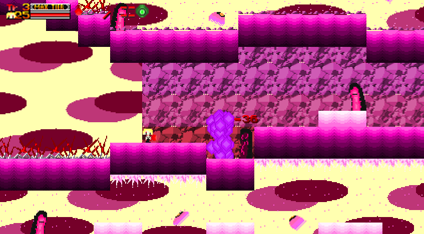
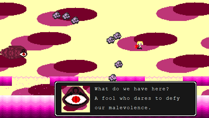
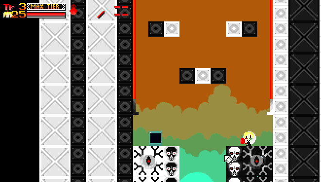
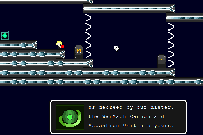
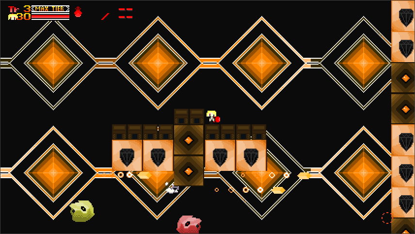
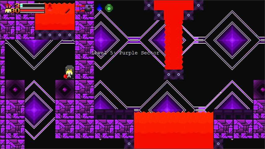
Ladies and Gentlemen, this is Mambo no.5 Gun. My first mod which I've been working hard on. The basic premise is that you play as Gunnoid-0 and you venture into Mechanto Isle's Colour Sectors to train yourself up to fight the War Machine. But will your training prove meaningful or meaningless? Find out as you experience this new mod for yourself.
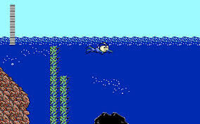
Now as the for mod itself, it does take it's inspiration from MegaMan (getting weapons after defeating a boss, jumping higher in water) and Lunar Shadow (so yes, getting HP upgrades will heal you and alternate costumes exist). In addition, the graphics are mostly custom though some graphics from Cave Story exist albeit in a modified state. In addition, this mod also makes use of the MIM (Infinite Mimga Mask) and the Swimming Hack (hence why you float in water).
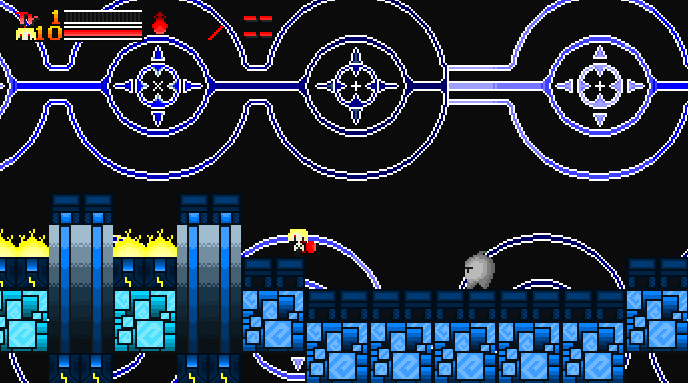
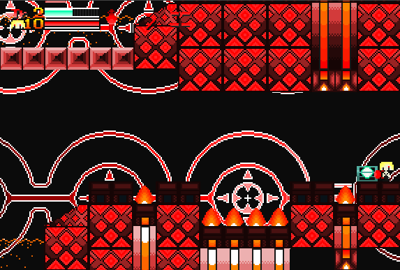
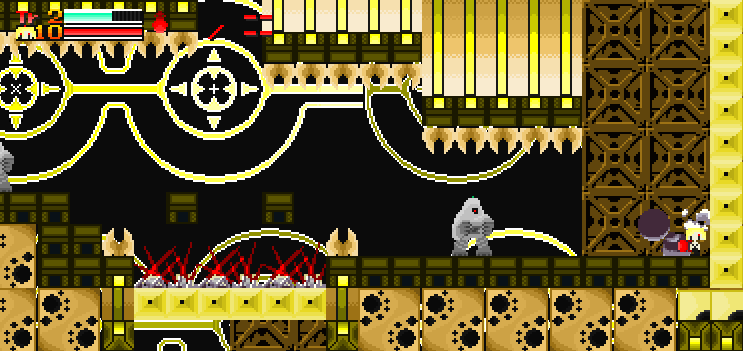
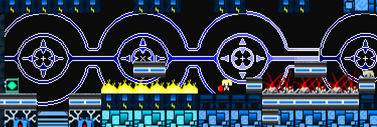
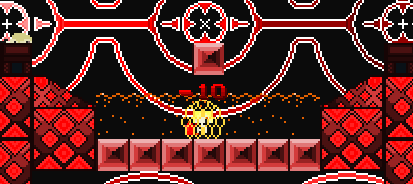
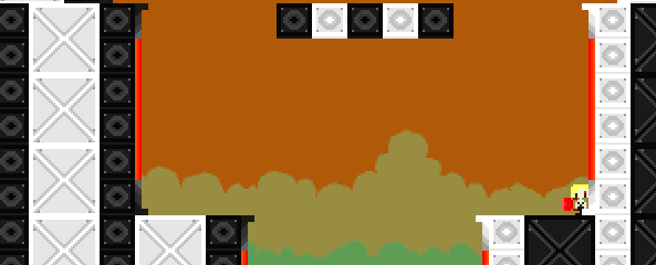
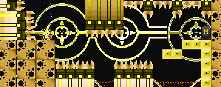
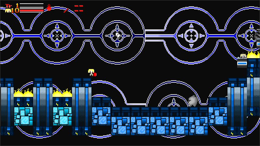
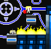
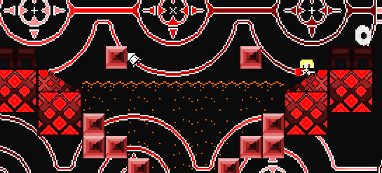
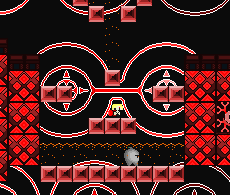
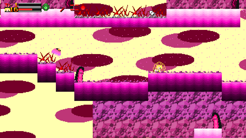
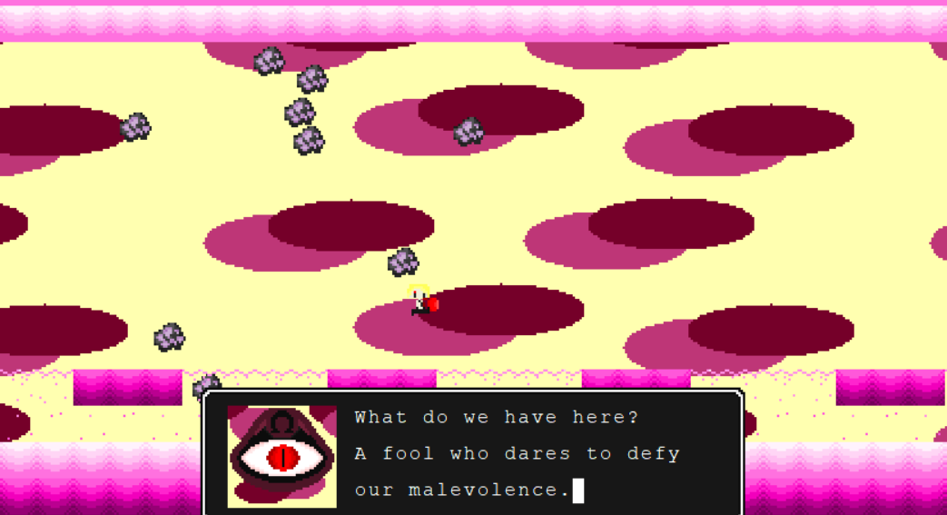
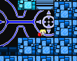
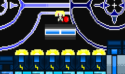
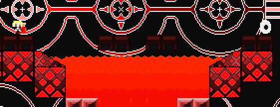
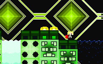
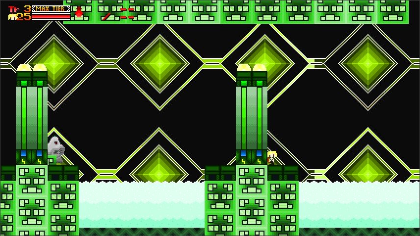
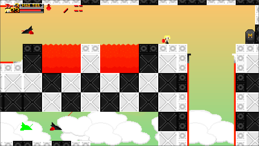
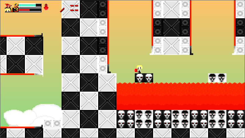
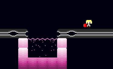
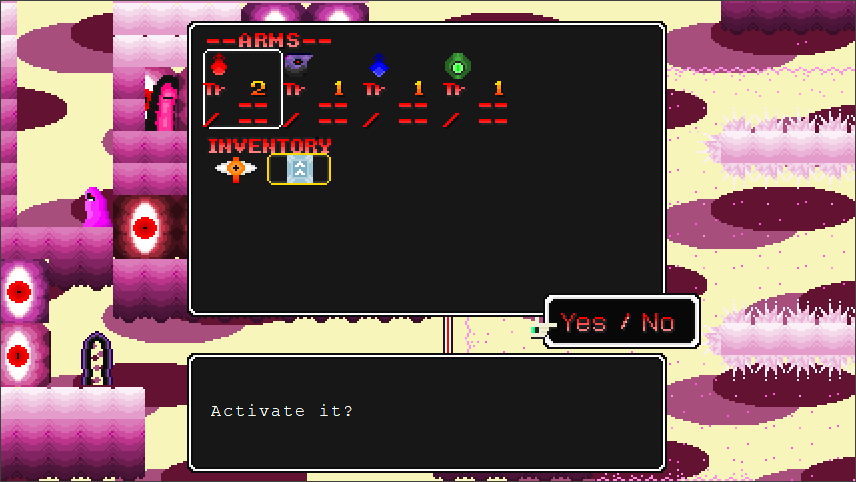
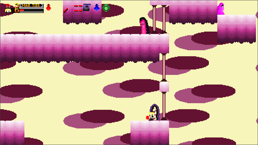
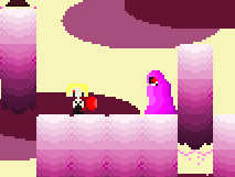
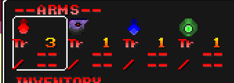
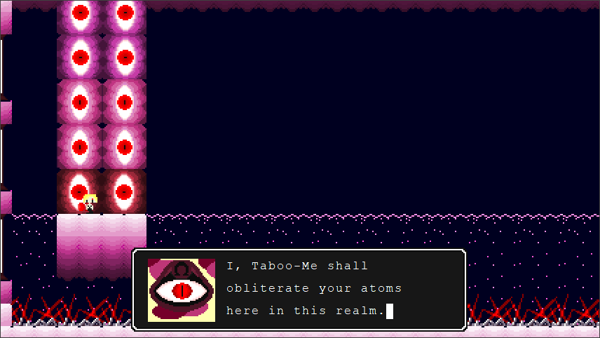
But I think I've said enough, so I'll let the screenshots do the talking, shall I?

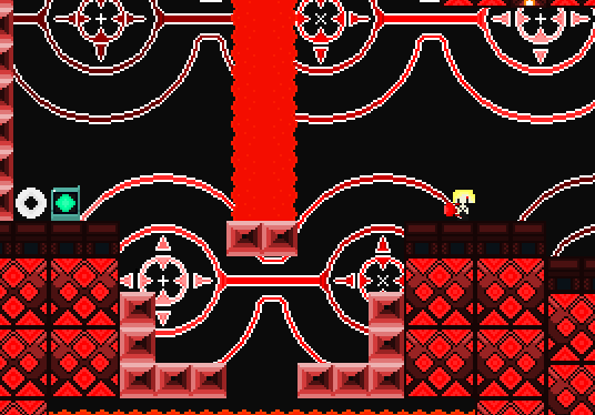
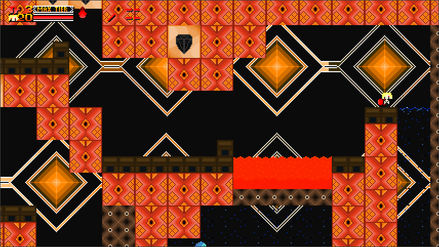
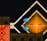
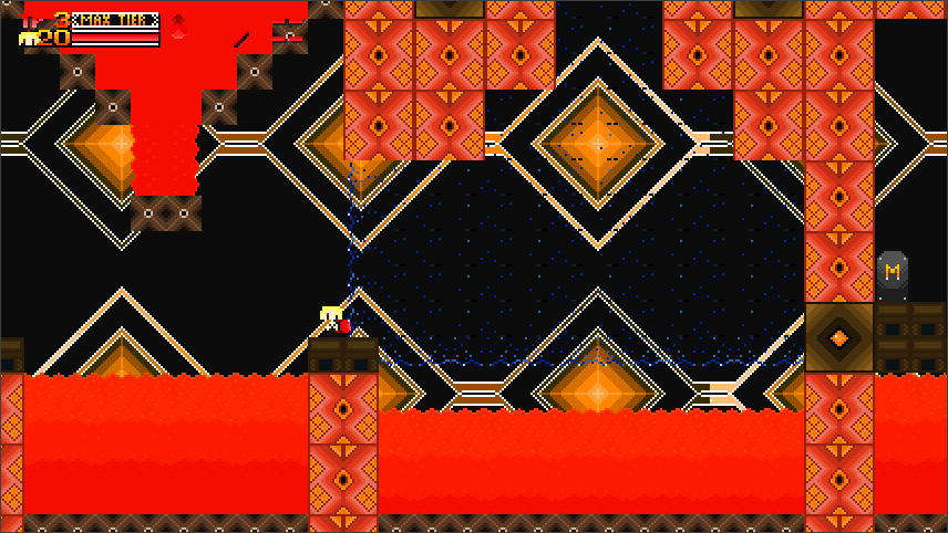
Screenshots
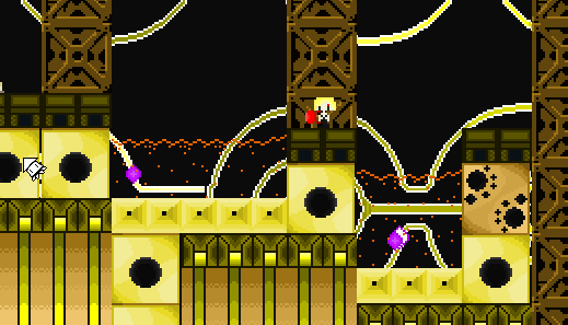
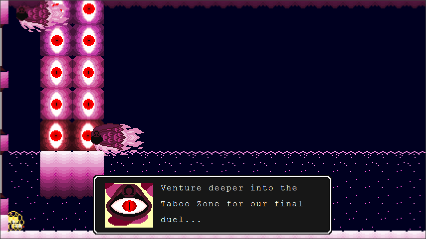
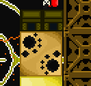
p372788-0-0yiklov.png
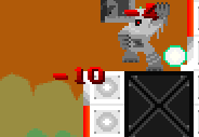
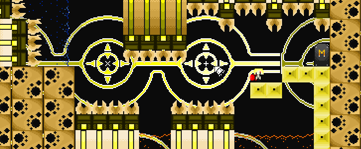
p372788-1-edpmlfi.png

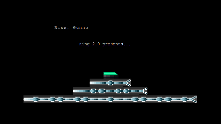
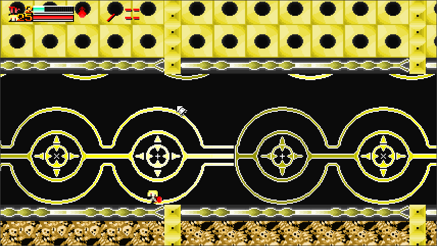
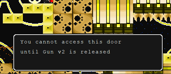
p372788-2-pwib7kp.png
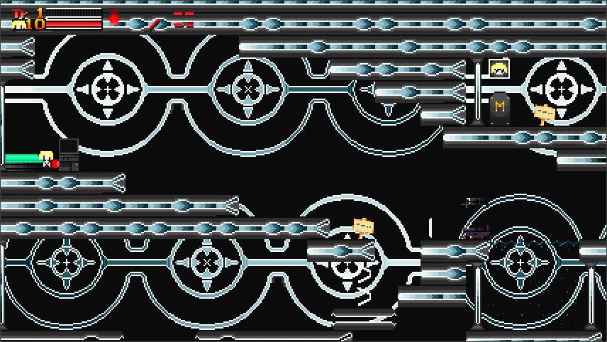
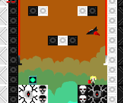
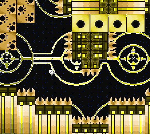
p372788-3-jikejai.png

Changes List
(for v2)
General
  • All HP Upgrades now have <PRI instead of <KEY, preventing any accidental ambushes by enemies.
  • Now that EnlightenedOne has allowed me to use his Unique Teleporter hack, my mod will have enough teleporter slots to last me the entire mod.
  • The laser tiles in Level 4 and Level 8 have been replaced with Entity #211: Spikes, so yes lasers can now go in all 4 directions.
Training Hub Changes
  • The Taboo Jellies and Taboo Shooters have had their HP reduced from 100 and 300 to 25 and 40. Their XP has been dropped from 1000 to 50.
  • Manual/window.rect have been placed in the Manual file (not sure if that's a good idea or not)
  • The Hub background has been changed to black, making it more consistent with the Boss Sever (it also frees up a space for another background).
  • The terminal (changed it in tribute to Shin Megami Tensei III: Lucifer's Call, which had these terminals which took you to previous locations/allowed you to save your game) and computers have had their colours changed from black to white. I like this change because it reminds me of the 90s Apple Computer).
  • Added EQ+0002 to the Training Hub's intro event (i.e #0090). Level 0 has also been renamed to the Training Hub. In addition, the forcefields now deal 0 damage. I might consider changing the forcefield colour but we'll see.
Sector Blue
  • The extra door in Sector Blue will lead to an alternate path in Sector Purple.
  • The electric spikes will be replaced by Entity #102 and will also deal 2 damage and also replace the fatal spikes at the end of Sector Blue.
Sector Red
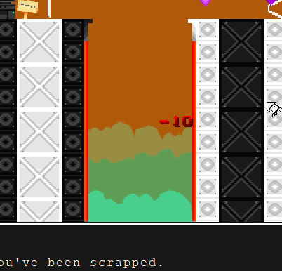
  • Changed the orange water to actual lava. It's just a matter of getting the tiles to align correctly. (I may reference this colour discrepancy in a future mod).
  • EDIT: The tiles work correctly and we even have side lava tiles now.
  • The fire spikes have been replaced by Entity #38, which deals 2 damage on contact. Lava will still deal 10 damage though.
  • The extra door in Sector Red will lead to an alternate path in Sector Orange.
Sector Yellow
  • The extra door in Sector Red will lead to an alternate path in Sector Green.
  • The water area with the blades has been altered slightly to give the player more movement room
VS War Machine
  • The leftmost sides of the area have now been sealed off. Instead of deleting them, I might consider reusing them for a level in a future update.
  • War Machine's Hover Body now uses the same zero gravity mechanic as the Ironhead fight. With that in mind, it changes the fight considerably.
Taboo Zone 1
  • The entire area has now been revamped so that it has multiple routes that can be taken. There are also two doors that can take you to different parts of Taboo Zone 2.
Development Trivia
  • Originally the mod was going to be far shorter, with v1 being the entire game and no Taboo Zone. As such, War Machine would have been the final boss with 覚悟 (Final Boss) [Kokuga] being it's battle theme. This was of course before I released that Clownacy's MOD Loader was a thing of course.
  • Custom graphics weren't planned from the start; I started out editing one thing and then changed them once I was no longer satisfied with the recoloured graphics I was using previously. After the graphical change, it was deliberately kept secret so I could make a better impression on the modding community.
  • Taboo-Oh was originally going to be an extra boss that was the Core/Undead Core using Ironhead's A.I. It was later changed to a Mini-Core reskin before that was changed into the fish-like appearance seen in the final game (so the graphics wouldn't be too weird).
  • Several enemy designs and Taboo-Oh had to be changed because I learnt from Brayconn that enemies positions in spritesheets are hard-coded. With that in mind, I had to get creative hence the why the Taboo Zone enemies and the Drone/Roblob enemies are in the same spritesheet.
  • Originally the second phase of Diamond Dogs was going be another round using the Sister's A.I. There was even consideration on using the lifts as platforms (with <MOV so the player would be warped to the top pf the arena if they fell into a pit). It got canned because while the boss acted differently, it was also quite buggy. As in, bosses shuffle in, are absent for a few seconds before rushing at you at blinding speeds kinda buggy. The second phase was now changed so all 3 phases are now different unlike War Machine.

Updates List
Gun v2 will add several new things to the mod:
  • 4 new levels, three of which are themed after secondary colours and will make use of the previous level gimmicks while adding new twists of their own.
  • These new levels will require the Ascension Unit (or Tier 3 Gunnoid-Cannon for the brave) to navigate the levels. They also have routes that can be accessed through the extra doors that you need a Tier 3 Gunnoid Cannon or Ascension Unit to reach.
  • A new boss. The only thing I can reveal about this boss is that it's name is a David Bowie reference.
  • The Taboo Zone will be getting an expansion and a new boss. It's also connected to the new hub area that will be accessible in Gun v2.
Download Link :
Gun v1
Gun v2
Gun v2.0
(Fixes the War Machine script error, makes the Sector Purple keycard obtainable and slows down the Taboo scrolling)
Gun v2.1 (Fixes (Fixes the War Machine script error, makes the Sector Purple keycard obtainable but reverts the scrolling speed of Taboo Zone due to Follow Slowly breaking the level background) <- Current Version
 
Last edited:
Mar 14, 2020 at 11:59 AM
Moo~
"Life begins and ends with Nu."
Join Date: Jun 27, 2013
Location:
Posts: 2836
Age: 29
Pronouns: She/Her
I already have a lot to say about the graphics from the screenshots alone, but I'm gonna have to wait until I play the mod later tonight.
 
Mar 14, 2020 at 1:08 PM
Senior Member
"Huzzah!"
Join Date: Jul 6, 2019
Location: United States
Posts: 214
I have played the entirety of Gun v1 in 15 minutes and my thoughts are this:
1. the background is pretty nice, however I don't like how the tiles look just hanging around, they don't look good
2. the rocks underwater texture in Taboo are floating and that's weird
3. the weapons are a good choice, actually. Yeah I think using it for some parkour in the Taboo is cool
4. each and everyone of the enemies have a new texture, and they are amazing, but the Golem things that throw rock float too, and the space ship is the worst of all it shoots up and is facing me AHHHHH-
5. The story is simple, you = robot, kill = join group and kill a Taboo-Oh creature that is supposed to be very powerful and can teleport (this isn't a bad thing)
6. The three phase boss is cool, Kill monsterX, kill monsterX but walls of 10 damage, monsterX, but under water, speaking of water...
7. The water shield and water mechanics are great, I like it a lot, but why do you jump higher underground than on the surface
8. the amount of textures is incredible if you couldn't tell, and most of them look really cool!
9. the music is cool, did you make it yourself?
overall I give this mod in its current state, a 6.5/10 take it or leave it also the weird single frame fire is weird
 
Last edited:
Mar 14, 2020 at 1:56 PM
Senior Member
"Huzzah!"
Join Date: Mar 25, 2019
Location:
Posts: 206
Well, the screenshots definitely look distinctive. The predominance of a single color in the maps may get a little tedious, but I digress. I'll just play the mod.
 
Last edited:
Mar 14, 2020 at 7:03 PM
Junior Member
"Wahoo! Upgrade!"
Join Date: Jun 9, 2018
Location: Momorin's Hideout
Posts: 46
Age: 21
Hey, this mod's out! I'd been watching the updates for a while now, and the hype is real.
BTW, this post'll be long, since I wanna say everything I can here. This means a lot of nitpicking. Most of it isn't really criticism, since it's so minor. It doesn't make the mod bad by any means, just tiny stuff to fix in the next version.
Okay so right off the bat, there's a couple technical things.

GUN 1.PNG


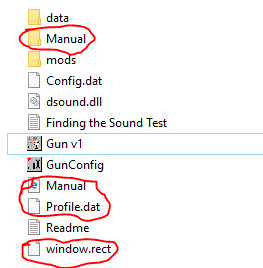
The files circled in red are unnecessary. It's not a huge deal, but still awkward. Keep Config.dat, since that's what makes it windowed. Profile.dat acts as a save file that works in pretty much every copy and mod; useful if you wanna immediately start at the new content for updates, really unprofessional otherwise.
The actual mod's intro is way too fast, mostly because the text disappears as soon as it's fully on the screen. Use some more <WAI commands. That title screen music is jammin', sounds like Doom 1993.

HUB

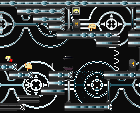
So... the hub's graphics. It's almost like TRON, except TRON had a lot more color variety. Here, it's kinda cluttered. In this room, it's mostly because of those wheels in the background. They're cool, but here they're pretty distracting, especially if they're where the player walks around. I think this room would be a lot better without them, and that having a full background thats a different color than the tiles would mostly fix the "only one main color" thing.
Wow, the map is an eye. That's cool. You can have it open just by pressing W if you want, just by equipping it. You did it with the airtank, so I know you know how. IIRC the Map System's EQ+ Number is 0002, though that might be a tiny bit off. Also, isn't that a teleporter, not a terminal? It kinda blends into the background too, since it's so dark. And force fields hurt you. This doesn't really matter, but it can be a little annoying to take damage from them. Honestly, I dunno why Pixel made them damaging in the first place. Booster's Lab can edit NPC.tbl to change a lot of things about entities, including whether they damage you and how much. And finally, the teleporter just has you disappear. Look to Arthur's House in vanilla (or any other teleporter) for how to have an animation for it. I know, REALLY minor stuff, but it's worth mentioning.

SECTOR BLUE

Terminal is kinda Captain Obvious, but the tileset here is nice. Background wheels are still a little annoying, but there's more variety and detail compared to the hub. More colors, electric-looking blocks, and those eye blocks all make this a much better-looking level. The dead robots are a nice touch, apparently training is way more deadly than I thought.

GUN 2.PNG


This yellow stuff is electricity or fire, right? It should move. Assuming you aren't using it for another puropse, maybe put a reskinned Fire entity (#38) there and have it do damage with NPC.tbl. And since it's an entity, you can have place tiles there too, or have events remove or add it in. Maybe have a section about turning off the damaging electricity to progress?
Either way, these enemies look cool, and the level design is fun. Enemies and jumps are simple, though there are a lot of instakill spikes that also make it hard to collect falling XP.

SECTOR RED

Oh, we're here already? This mod's goin' kinda quickly. Terminal is Captain Obvious again.
The slopes and water don't match up, since the water is completely square. PrtCave and PrtMimi have watery slopes, so look to them for how to do it. Also...

GUN 3.PNG


excuse me uh
that's water
Make it a full solid red if you want it to be lava; red water doesn't look like lava, and fire nearby doesn't make it. That's why the water is all blocks, I assume? The gravity defying red water is at its worst both the times you descend. It's good gameplay-wise, but it looks pretty bad. It'll probably take changes in level layout to fix this.
Use <PRI for anything that makes text, unless there's no way an enemy can realistically get to you. With <KEY, an enemy can theoretically hit you while you're picking up a health item. Not a huge issue here, but could be later on.
Aww, I can't get the secret doors 'til v2! Are they like WTF Story with the bonus levels or something? It's cool either way, and the Tier 3 Gunnoid Cannon is a good way to get there.

SECTOR YELLOW

New enemies and tileset, and they look great! It's like a metal beehive with robo-giants, added to with the great-as-always music. But what are the green reskinned spikes supposed to be? The sideways blue water looks great, I'm always a sucker for good-looking surreal stuff like that!

GUN 4.PNG


Not much new to say here. Looks good, sounds good, plays good.
The teleporter to Rebellion has a really glitchy animation, and an enemy is right next to you if you restart.

REBELLION

The terminal's less Captain Obvious here, though it's missing a period like a lot of the others.
But this is a good-looking level too! It's simple, but the symmetry has not gone unnoticed. The Doom music is back, and maybe a little unfitting for an epic final test.

GUN 5.PNG


Cool that the wall lasers only hurt you with the red parts. Lots of mods/games would have made a harmless-looking corner hurt you. That said, the lasers themselves kinda blend in with the orange sky.

WAR MACHINE

This forboding atmosphere is great. Long hallway, weird ambient "music," skulls in the ground, what more could you want?
Well, you can use the Tier 3 Cannon to propel yourself up the shaft you came from and walk on the ceiling, Mario 1-2 style. That's clearly breaking the game here, and I could easily walk off the map. And you should probably have a cutscene trigger to the left, so the player doesn't go all the way to the left and find a dead end like I did. Like have the character stop and focus the camera on the War Machine.
War Machine itself is just Monster X, and that's a little boring. The water makes the third phase better in that regard (nice that the phases are the levels' colors in reverse), but the first two aren't that interesting. A more varied arena would help, and consider that Monster X goes through literally every tile.
Uh... I'm helping War Machine now? And I have the Spur and Booster 2.0? Okay...
You can equip the Booster without the player having to activate it in the menu. I forget what <EQ+ number the Booster 2.0 has, but it should be easy. It'd probably help to take the item out of the inventory system though, since equipping it in the inventory is a bit more complicated than just <EQ+ and <EQ-.
Kinda confusing progression, but only because some stuff is locked until v2.

TABOO ZONE

uh wow this is crazy looking
Is that Zero's music and background for Kirby's Dreamland 3?
Tiles are weird and blocky and cut-off and glitchy-looking (the stone has a few see-through pixels), the music and background are trippy and really weird compared to everything beforehand, the level design is boring and too spike-filled, and why are these incredibly easy enemies taking hundreds of damage?

GUN 6.PNG


wha
what
i dont need a thousand XP for every kill
these are jellyfish
why are they taking over 100 damage
oh hey more blocked-off stuff
and the sign's text cuts off "area"

GUN 7.PNG


WHO ARE YOU
WHY AM I FIGHTING YOU

The message box is too long. The text blocks itself out with new lines, so you can't see the first line when all the text is loaded.
And Taboo-Oh is just Ironhead in a bigger arena and no water. The "bigger arena" part isn't a good thing: Ironhead wasn't made for this arena, so when the boss goes far left or right it teleports to somewhere close to it, freezes for a second, and then teleports back to where it should be. This doesn't seem intentional at all.

Is that it?
I don't have anywhere to go, so...

CONCLUSION

This isn't bad for a first mod. It's clear you're just starting out, but that's okay. It looks okay, sounds good, has good gameplay, and is overall pretty fun.
...
Until Taboo.
This final area is clearly very rushed. The tiles look terrible and strangely amateurish, considering how much better the previous levels looked. The level design is just walking or jumping or swimming left and right, sometimes using the Booster. The only two enemy types are some of the most harmless in the entirety of Cave Story, but now with ridiculous amounts of health and XP drops. The boss comes out of nowhere, glitches out, and is really anticlimactic. And then the mod seems to end with no explicit indication that it's the end of v1. Even for the parts that may be intentional (tiles and enemies), there are way better methods to do trippy levels.
Honestly, I'd very much prefer if the mod ended with War Machine. Taboo drops the mod from a 6/10 to a 4/10. But discounting the final level, this is fun, if unpolished.
I haven't said everything I want to, but I need to be done now. It's been over two hours of playing and writing about a 20 minute mod. This mod's interesting and has lots of potential, so I'll continue posting in this thread.
EDIT: Sorry about the thumbnails, I'm too lazy to upload this stuff to imgur or the like.
 

Attachments

  • GUN 1.PNG
    GUN 1.PNG
    9.1 KB · Views: 3
  • GUN 2.PNG
    GUN 2.PNG
    24.8 KB · Views: 3
  • GUN 3.PNG
    GUN 3.PNG
    11.2 KB · Views: 2
  • GUN 4.PNG
    GUN 4.PNG
    29.1 KB · Views: 2
  • GUN 5.PNG
    GUN 5.PNG
    13.5 KB · Views: 2
  • GUN 6.PNG
    GUN 6.PNG
    45.2 KB · Views: 4
  • GUN 7.PNG
    GUN 7.PNG
    18.5 KB · Views: 4
Last edited:
Mar 15, 2020 at 4:33 AM
Moo~
"Life begins and ends with Nu."
Join Date: Jun 27, 2013
Location:
Posts: 2836
Age: 29
Pronouns: She/Her
It is time to play the mod. And off the bat, when I saw my name in the credits for the mod, I was genuinely confused at first, like maybe I showed you a hack and you didn't ask who made it. But then I saw this in the Readme.
Readme.txt said:
Serri (General modding advice and for pointing out that I could use Audicity to convert MP3 files to OGG.)
I didn't know we can be credited for just about anything now. I may go and make a mod and thank everyone for acknowledging my existence and whatnot! /s

But I digress and it is now time to play.
- I appreciate this part being fast and all, but damn, scrolling text makes me wanna press Z to read it faster, only to skip the cutscene entirely.
ane6zm.png


- The music sounds ambient though, what games are they from?

zgp369.png

hllhai.png

- It's an interesting take on making an environment, it's just so flashy, and it's hard to really see where I'm supposed to go because the background is as bright as the foreground. Maybe it'd be better if the background used a different color palette or if its brightness is lowered by quite a bit. Maybe White isn't exactly the best song to play for this area.

- Sector Blue is looking better with the contrast between the tiles and background, so at least that's been issued, it seems.
lwur4w.png


- Oh how nice it would've been to interact with this corpse of myself here. I mean, unless you're going with how there are many versions of you that have died prior to you right now like in the game Haydee (kids, don't look that game up!), then I guess I can see that happening.
jcynmw.png


- Excuse me?
n1o8oa.png

- That is such horrible level design. With the red palette in the stage, I was really expecting that to be water, because of the theming around the stage. I didn't think that would turn out to be lava. That really needs to be resprited so it won't look like water but under a red light.

- Case in point, it looks too inviting just so I can kill that frog.
ahixrx.png


- At least over here, this looks a lot more like lava, but I do think a redesign could still help by a longshot.
p372795-7-4etms4.png

- Actually come to think of it, the Intro place has a pool of water, why haven't I seen any of that yet?

- These blocks, I feel obliged to try breaking these since they look like the sponges from Ikachan, but the good Lord knows they're actually solid tiles.
p372795-8-n28h6m.png


- ...What sane person would try going through here even with a Level 3 Machine Gun? This is just begging for a Booster to be used.
p372795-9-h5h4hr.png


- Oh, okay. I see how it is... *cries into the corner*
p372795-10-ajk86z.png


- This whole spike section, I feel could be nerfed, like have more elbow room for me to maneuver through with the new water physics, or have the spike damage nerfed down (can be done through the Hackinator).
p372795-11-mu52p8.png


p372795-12-patmb0.png

>Doesn't touch wall lasers
>Dies anyway

- I died from the non-laser part. At least make a new entity with a smaller hitbox if you wanna go with the idea, jesus.
p372795-13-ur9yel.png


- Huh, why is this room so massiv- wait a minute... Is Monster X gonna be here?
p372795-14-obn9e0.png


- 3 Monster X battles in a row... Man does that sound boring, tbh...

- At least I can grind for EXP right before facing him, though I wish Butes gave more EXP...
p372795-15-40pwg3.png


- Awesome.
p372795-16-mjcvam.png


- Oh yeah, btw. Use <MM0<WAS for stopping at H/V triggers like this, so you don't accidentally hurt yourself like I was about to over here.
p372795-17-fgfuv4.png


- ...Is this supposed to be a troll stage? I thought I was done until I accidentally jumped in some Magicant water, and now I'm sent here. And there's no exit for some reason???
p372795-18-9hllfv.png

Overall, it's not a bad start for your first mod, but man, does there need to be a lot of improvements. Looking at StudioDixel's review, I am glad we both share similar thoughts on the same stuff. Hope to see what comes next!
 
Mar 15, 2020 at 12:05 PM
Senior Member
"Huzzah!"
Join Date: Mar 25, 2019
Location:
Posts: 206
Huh? I didn't know I was credited until I read this:
It is time to play the mod. And off the bat, when I saw my name in the credits for the mod, I was genuinely confused at first, like maybe I showed you a hack and you didn't ask who made it. But then I saw this in the Readme.
There was no need to but I surely appreciate it.
OK, so at this point I've already played the mod until the "part after the boss" and I already have a couple of thoughts that I need to put together.
Now, I don't wanna say the exact same things as the others, so I'm going to do my own thing, I hope.
Whatever, I'll finish what I started.
1.No new .EXE image? Why not?
2.PNG
2.Mega Man inspiration for the water mechanics, I see. Neat.
animation.PNG
3.You could have given those tiles a little animation, don't you think?

4.About the red section, I thought that lava or whatever was just dyed water...it wasn't.

5.Some enemies are just too tanky...It doesn't even make it harder, just tedious.

5.You cannot access the M doors yet? Then why are they even there? I died just to get to one. It would have been more effective in my opinion if you added them in a future update.

6.The fight with Monster X gets repetitive and the underwater part seems to be just stupid since you can stay at the bottom of the screen and win by just shooting up.
2.PNG
7.I suggest you put more <TRA commands here, because otherwise I can do this.
3.PNG
8.Um, what?
4.PNG
9.OK, this just looks wrong.

10.I'm no expert, but I'm pretty sure you can activate the Booster without having the player check the inventory. It's also not very good design.
5.PNG
11.Oh, god. This area is a mess right now.
6.PNG
12.Ok, that door brought me here and uh?
Spoiler alert, I hadn't saved and I died.
Again, this is NOT a review, otherwise I would've finished this.
Well, that's it for me. Your mod is not bad at being a Cave Story mod, but I wouldn't call it great either...yet.
 
Mar 15, 2020 at 3:01 PM
Moo~
"Life begins and ends with Nu."
Join Date: Jun 27, 2013
Location:
Posts: 2836
Age: 29
Pronouns: She/Her
2.Mega Man inspiration for the water mechanics, I see. Neat.
Nah, you can swim in this one, while Mega Man can't. Besides, you can just change the water physics to land physics and increase the jump height through the physics hacks to really make it more like Mega Man.
 
Mar 15, 2020 at 3:35 PM
Senior Member
"Huzzah!"
Join Date: Mar 25, 2019
Location:
Posts: 206
Nah, you can swim in this one, while Mega Man can't. Besides, you can just change the water physics to land physics and increase the jump height through the physics hacks to really make it more like Mega Man.
ARE YOU SURE ABOUT THAT?
download.jpg
But to be serious for a second, you're right, I honestly don't know why I said it was inspired by Mega Man, oops.
 
Mar 16, 2020 at 2:46 AM
Moo~
"Life begins and ends with Nu."
Join Date: Jun 27, 2013
Location:
Posts: 2836
Age: 29
Pronouns: She/Her
Checking to see if anything has been edited besides the status post that was made, and I just wanna mention this:
(it also frees up a space for another background)
You can have unlimited backgrounds for your mod, actually. :p

I am also confused though on why you're planning on keeping the Manual folder, Manual HTML, and Window.rect, as they're all unnecessary and you can just delete them out of your mod directory. Just the two cents that I thought was self-explanatory through StudioDixel's review, if you haven't realized that.
 
Mar 16, 2020 at 12:42 PM
Senior Member
"This is the greatest handgun ever made! You have to ask yourself, do I feel lucky?"
Join Date: Sep 23, 2019
Location:
Posts: 97
Pronouns: he/him
Checking to see if anything has been edited besides the status post that was made, and I just wanna mention this:

You can have unlimited backgrounds for your mod, actually. :p

I am also confused though on why you're planning on keeping the Manual folder, Manual HTML, and Window.rect, as they're all unnecessary and you can just delete them out of your mod directory. Just the two cents that I thought was self-explanatory through StudioDixel's review, if you haven't realized that.
I can? I assumed that Booster Lab only allowed you to have a few actually. I also need to know, where file is Entity #34 (Fire) located? (If I can find it, I can edit it accordingly.) And it is possible to have multiple StageImages for each Hub Terminal? Oh right, and as for the Manual/Manual HTML/Window.rect, I'll get rid of those for the Gun v2 release (though I'll be keeping them in my own copy of the mod).

Also thank you for giving me pointers on how to prove this mod: as such, I can confirm the following:
  • Taboo Zone's level design will be getting a major revamp, considering how reviled it was. Unlike the main stages, Taboo Zone will have multiple routes across it's three sections (and some routes require you to go through doors). There will also be additional dialogue to better flesh out this bonus dungeon.
  • The Deep Sector levels will require use of the Ascension Unit (it's actually useful now), though a brave player can use the Tier 3 Gunnoid Cannon. Aside from the Boss Weapon, I might consider adding a new weapon.
  • I might change Sector Yellow's lava to ice (to complement the water) and the blades to ice spikes.
  • I will be implementing custom entities once I've learnt how to actually implement them.
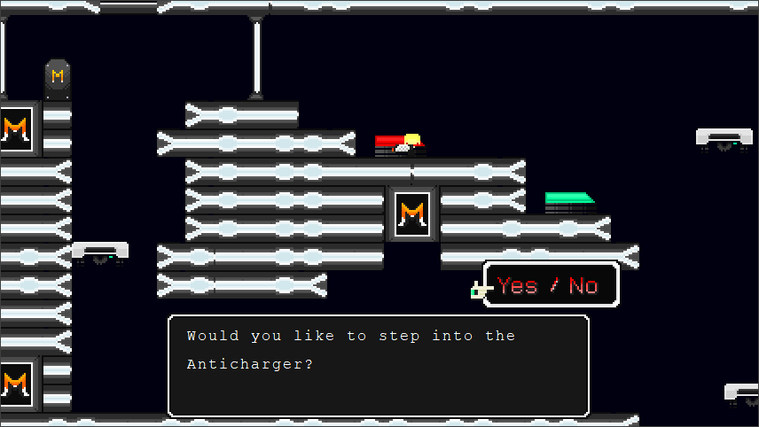
  • The Deep Sector Hub will have an Anti-Charger capsule (i.e red instead of green) that kills the player. One of the endings can be obtained by choosing to go into the capsule.
That will be all for now.
 
Last edited:
Mar 16, 2020 at 2:58 PM
Senior Member
"Huzzah!"
Join Date: Mar 25, 2019
Location:
Posts: 206
  • Taboo Zone's level design will be getting a major revamp
  • , considering how reviled it was. Unlike the main stages, Taboo Zone will have multiple routes across it's three sections (and some routes require you to go through doors). There will also be additional dialogue to better flesh out this bonus dungeon.
  • The Deep Sector levels will require use of the Ascension Unit (it's actually useful now), though a brave player can use the Tier 3 Gunnoid Cannon. Aside from the Boss Weapon, I might consider adding a new weapon.
  • I might change Sector Yellow's lava to ice (to complement the water) and the blades to ice spikes.
  • The Deep Sector Hub will have an Anti-Charger capsule (i.e red instead of green) that kills the player. One of the endings can be obtained by choosing to go into the capsule.
  • I will be implementing custom entities once I've learnt how to actually implement them.
It's nice to know that clearly you still don't lack ideas. If you keep updating and improving it, I might do a full review of it at some point.
The Deep Sector Hub will have an Anti-Charger capsule (i.e red instead of green) that kills the player. One of the endings can be obtained by choosing to go into the capsule.
I suggest you put this information under "spoilers" because some people don't like to know certain things before they've played the game themselves.
Then again, these people probably shouldn't scroll the page if they haven't played the game and really don't want any spoilers.
 
Mar 16, 2020 at 3:37 PM
Senior Member
"This is the greatest handgun ever made! You have to ask yourself, do I feel lucky?"
Join Date: Sep 23, 2019
Location:
Posts: 97
Pronouns: he/him
You can find the sprites on the NpcSym bitmap
Thank you for your help. I'll now be replacing the fire "spikes" with actual fire.

It's nice to know that clearly you still don't lack ideas. If you keep updating and improving it, I might do a full review of it at some point.

I suggest you put this information under "spoilers" because some people don't like to know certain things before they've played the game themselves.
Then again, these people probably shouldn't scroll the page if they haven't played the game and really don't want any spoilers.
Thanks for the heads up, I've now put the last bit in a spoiler tag.
 
Sep 4, 2020 at 2:07 AM
Junior Member
"Wahoo! Upgrade!"
Join Date: Jun 9, 2018
Location: Momorin's Hideout
Posts: 46
Age: 21
#0090
<MNA<FAI0004<WAI0010<MSG<FAC0001Oh hey, V2 is out!<NOD<CLRMight as well do that thing.<CLO<CMU0002<END

Great to see this updated!
Second verse, same as the first. Last time I made a lot of direct suggestions of what I would do to improve things, even though it's your mod. I'll try not to do that unless it's a purely technical thing.
Also, no pictures this time. There's not much need for them here, and I still dunno how to insert images without something annoying happening.
Okay, there's widescreen and 60fps now. And damn, the title music is even rockin!

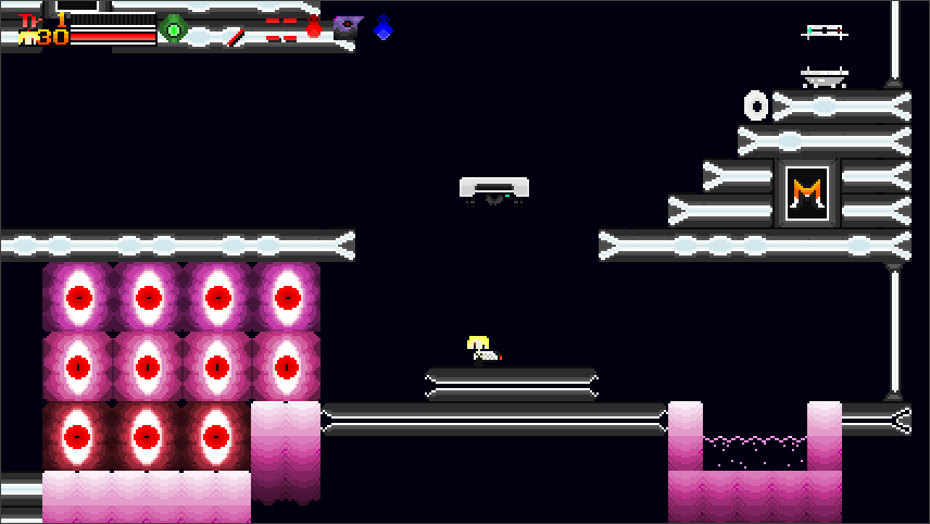
This hub area is an big graphical improvement. The wheels are gone, and the tiles seem cleaned up (speaking of, you should really update the thread screenshots). That said, the pillars in the bottom right are solid blocks, but they don't really look like it? It kinda cuts the water off and looks weird.
Wait, you can do the Sectors in any order you want? That's pretty cool, but my one worry is that it'll screw up the difficulty curve, since the levels were designed to be played in V1's order. I'll try them in reverse order, just to see.

If you cancel out of the teleporter's "Go to Sector" YES/NO prompt, the light of the teleporter stays on even when you haven't teleported, and you just disappear when teleporting. Yes, this is super minor.

V1 SECTORS

It looks mostly the same, so I'll just mention things that are different.

The white stuff looks more like sand than something that damages you. Actually, I still have no idea what element Sector Yellow is supposed to be about. Sure enough, the beginning terminal and final teleporter assume you've done Sector Blue and Red already. It's nothing major, just a couple phrasings.

Yes, yes, YES!
Sector Red has actual lava!
This is such a huge improvement from V1. That said... it may just be my monitor, but the actual platforms look way too dark. The dark red blends in with the black background. V1's platforms were fine, so why make them hard to see?
I might as well use the Gunnoid Cannon to get to that secret door.

ORANGE SECTOR

Hey, this is new! I heard about these Deep Sector levels, and this doesn't disappoint. The tileset changed for the better and the music is rockin!

That part with the floating water over lava is really cool. It takes advantage of the swimming and physics-defying liquids to make a cool platforming challenge. That said, I still think the lava looks weird, like it's an unmoving pile of goo.

Wait, another key card? And I can't pick it up because I already got it in Sector Red... kinda weird. The swimming mechanic is cool and all, but it screws you over if you fall in lava. You can't use the Booster because you're swimming, and you can't jump back out either. The LV3 Gunnoid Cannon is a bit OP with its unlimited ammo; it kills enemies super fast and the flying makes platforming challenges a non-issue.

GREEN SECTOR

o dam
THIS MUSIC
THESE GRAPHICS
It just gets better and better.

Wow, Sector Chartreuse? There's a lot to this mod, isn't there?

DEEP SECTOR?!

Well okay, this mod is way bigger than I thought. Seeing the updates, I thought Orange, Green, and Purple were just optional challenge levels. This was a nice surprise.

I like changing into alternate costumes. Still, it's not as cool as it could be. You can't play as another character or wear silly clothes, it's all just different colors for the Gunnoid. And the YES/NO menus are really awkward.
That "Suicide" ending was kinda weird. Why was it there in the first place?

And uh...
I can't go back to the normal training hub from Deep Sector, the forcefield is blocking the way and I gotta go through Purple Sector to get back. Am I supposed to be here right now? Or was I supposed to fight the War Machine thing, get the Booster, then come back and go through the Deep Sector? If that's the case, maybe don't give the player what is essentially an unlimited Booster v0.8 right at the start. It's so easy to sequence break that I thought this was the intended route. Now I gotta take steps to get back on track. Choices are cool and all, but the more paths the player can take, the harder it is to make sure all those paths work.

REBELLION

What an atmospheric intro to the song. Kind of a far cry from V1. The song goes back to groovy MIDI, but the dramatic buildup is nice.

ok this is weird
When I enter War Machine's room, there's this constant <FAI that keeps happening over and over. It kinda hurts to look at. I checked with BL, and yeah, it's a big ol' TSC error. Event #0090 ends with <EVE0090, which makes that event loop endlessly. That's kind of a huge game-breaker, since it makes events (like the trigger for the boss) never happen because event 90 is already in place. This is REALLY bad, since there's no way out of it, and no way to avoid it. I had to manually change the <EVE0090 to <END to progress.

Okay, this isn't good. It looks like you're supposed to only stay in the area to the right, but all you did to block the area off is place a bunch of blocks. That makes most players think they're supposed to go past those blocks, and the only way to do that is to use the LV3 Gunnoid Cannon and fly over them. And the hole you come from is still not blocked off in any way, so it's easy to fly over them, walk on the roof of the map, and fall into the abyss. This was a problem back in V1, but with these blocks, many players (including me) will think they're supposed to do something that ends up breaking the game.

Anyways.

The atmosphere is good as always; I love how those skulls in the ground are Gunnoid heads now.
Huh, this boss music is really out of place here; almost everything else is much more advanced and atmospheric. It's kinda weird to switch from droning ambiance to a peppy NES bossfight tune. Same deal with the Game Over theme.

War Machine is a huge improvement from before, but I have a few nitpicks:
The Hover Body is pretty cool gameplay-wise, but War Machine itself is still on treads in the same corridor. It doesn't look like a new hovering transformation, everything just turned red.
The corridor in the Diver Body map is bigger than normal, so now you can stand under the Monster X treads without getting hurt by them. The fight is VERY easy and mindless because of this, especially with 45 health like I have; you can just stand still and shoot up to win.
The main thing here is the arena.

Also, the boss music fades out before looping. It seems to happen for some other songs too. I know it's probably hard to make a looping song sound natural, but an NES-style theme like this should be simple with any basic audio editor.

You have to go to the menu to equip the Ascension Unit. I don't get why it's still like this. It's actually more convenient, both for the player and for you, to just use <EQ+0032. The Booster doesn't even need to be an item in your inventory to work.

DETERMINATION

To get through Determination, I gotta go back to the Deep Sector and get more keycards. Again, the LV3 Machine Gun thoroughly breaks this mod.
In Purple Sector, the keycard sparkle is floating in the air, and you can't get it. I had to use BL put it on the ground to make it collectible.

I praised these wall-lasers back in V1, but their big flaw is a lot more obvious when you have to platform around. The wall-lasers look thin, but their hitbox is way bigger than that. You get hit without visibly touching them.

And I don't think that extra room to the right needs to be there. It's just a boss-refight door, you might as well put it in the main room like Rebellion did.

Oh crap, I have the Spur! I had no idea until halfway through Determination. But jeez, these weapons are pretty powerful considering the enemies here. You can usually just stand out of reach and oneshot them with the Spur.

All these platforming challenges that were designed for the Booster are rendered moot by the LV3 Machine Gun's flying ability. It's basically a more-controllable version of the Booster 2.0 with unlimited fuel. There's definitely a hack somewhere that gets rid of the Machine Gun's recoil, so check that out.

Okay, I dig these "Diamond Dog" characters. The Balfrog phase in particular reminds me of the Super FX Chip's 3D graphics. Nice job with the spritework! The fight itself is very easy with the Spur. Especially the 2nd phase, you can just stay up near the platform you start on and shoot them from above; they never reach you. I forgot to say it with War Machine, but it's pretty cool that you can fight the bosses again. But probably skip the dialogue on the re-fights.

TABOO ZONE

This is way better than before.. The enemies' health and XP drops make sense, the tileset looks coherent and deliberately-designed. The level design itself works much better than before, with hazards and pathways that require a bit more than jumping left and right. This area is alluded to by War Machine and the Diamond Dogs, so it doesn't come right out of left field.
Sure, it's got some improvements to make: The wide-open map makes it pretty easy to avoid every hazard, the Blade and Bubbler do absurd amounts of damage, and the bright moving background actually hurts my eyes a bit. But overall, good job on improving this!

Taboo-Oh still does that weird teleport-y thing. I think it's because you made the room a screen wide. The original Ironhead fight took place in the middle of a wider map with a fixed camera. Maybe just recreate that map. It seems like a genuinely fun fight if it works properly.
This Undead Core fight's alright. Nice spritework, and the fight itself is a simple, yet fun concept.

And I think that's it. I'd like a more obvious ending to the demo, but it's pretty clear there's nothing left to do until V3.
tl;dr

In comparison to V1, this mod is a clear improvement. Taboo Zone got way better, the new graphics do a good job, and the Deep Sector continues the fun platforming pretty well.
That said, I don't think it fixes enough of the major issues from V1. There is now an unavoidable softlock at War Machine, along with a critical item that's impossible to collect. The sequence-breaking recoil for the Machine Gun is worse than ever; even without it, the mod is a bit too easy for my taste. Defeating enemies is a cakewalk, and you have a lot of health. I still have no idea what's going on with the story. And it just sorta ends after Taboo Zone's boss, just like last time.

I'm not using a numerical score like last time, since they're too vague and pseudo-objective to judge an entire work. Heck, I mainly did it last time to emphasize how bad Taboo Zone was back in V1.
But I'll certainly be back for V3! This mod has lots of potential, and it is somewhat improving. It still needs a lot of polish to reach that potential.

I'm gonna break my promise from the start and give some advice. With the next update, it'd be a good idea to hold off on the new areas. Spend the energy improving what's already here. This mod has many big problems, and fixing them should always come before adding new areas. Maybe call V2.5.
 
Sep 9, 2020 at 9:03 AM
Moo~
"Life begins and ends with Nu."
Join Date: Jun 27, 2013
Location:
Posts: 2836
Age: 29
Pronouns: She/Her
Word of advice: It's better to post in the thread that there's an update to the mod than as a Status Update. But I digress, I wonder what's changed than last time.

Lol, I'm still being credited way too generously for the Audacity one.

Maybe this can be contrasted a bit more, the colors blend in way too well...
p374192-0-t9eqx6.png


So far, there's a much better atmosphere being played around with in the starting area.

Sector Blue's still a bit noisy. And I suggest starting the Keycard event over here with a <PRI over a <KEY, especially with the Frog hopping at me while I'm reading the text.
p374192-1-10r6r2.png


The darker areas for this platform blend in too well with the background, ironically.
p374192-2-73iq5s.png


Sector Red's still very red. At least there's lava now.

Massive gap? Or two subtly noticeable platforms that are very dark in appearance? I really feel that color theory should be better applied to these stages...
p374192-3-qdqzu0.png


Oof... I know it's cut off to make way for platforming, but it just doesn't feel right without it looking it like it's going in a tube underneath the platform, or flowing off the platform naturally.
p374192-4-zy0a7f.png


Now here's a place I've never been to. The Orange Sector. I hear the Anamanaguchi music playing.
p374192-5-p4fe50.png


Hmm, this kinda resembles sperm cells.
p374192-6-x8fcs5.png


This mod needs more of these.
p374192-7-8cxduf.png


Sector Green time.

These electrical things can blend in a bit too well with the background.
p374192-8-8125fz.png


Something tells me the semen here will hurt me...
p374192-9-j8ttn8.png


Oh no, it's this place again...
p374192-10-ms7d95.png


Oops, I softlocked myself... If only I had a Booster...
p374192-11-ddbdrs.png


No Monster X??? Oh, thank god!
p374192-12-m6py11.png


No screenshot, but holy shit, the third phase. That's extremely unfair if you have a Level 2 Machine Gun. It really would've helped if I had a Booster, or if there were those fans from the original Balfrog battle, or even the water tiles to help me climb up.

Okay, I actually wanted to try going in the Purple sector, since I barely had enough EXP to get me back to Level 3 in Sector Blue, so let's see how Sector Purple is like.
p374192-13-xbtixw.png

(oops I couldn't think of what's new there. The challenges throughout the training sectors are all the same.)

Okay. Time to go to Magicant. How better is it this time? Will it not be a troll level?
p374192-14-6w2z2m.png


HHHHHHHH
p374192-15-ru87ci.png

Mayhaps a statement staying you've unlocked the Booster would've sufficed. And then have it auto-equipped with <EQ+0032.

God, this stage could really trigger someone's epilepsy, tbh. The background scrolls way too fast.
p374192-16-w8en5d.png


Wait, this is supposed to be an npc? Why does it look as useless as the entities in Yume Nikki when it has dialogue like this?
p374192-17-w1p6nw.png

p374192-18-s8yiop.png


I didn't know I had weapons, either...
p374192-19-mzfrxn.png


Oh!
p374192-20-7y0f7y.png


More instances of <PRI being necessary instead of <KEY.
p374192-21-pubs1b.png


N-Nani???
p374192-22-yhe6xg.png


I'm curious now. Why are there three entrances to Magicant/Taboo Zone? What's the point of having three?
p374192-23-vahwf4.png

Hmmm, wow. Where to begin my ending thoughts... (Time to read Dixel's review...)
War Machine... What? ...Uh oh. OH NO.
Oh wait, Flags didn't get unset in Training area. I can't fight him without hard resetting my save even if I tried.

This is definitely a step up from Gun v1, but there are some basic issues that were overlooked, whether there was a lack of a testing team that works with you, or whether you've tested it all by yourself. I do agree with Dixel on making the next version just cleaning up everything, all regarding TSC. Maybe for some platforming and enemy placements as well. Every note made during testing counts!
Also, no pictures this time. There's not much need for them here, and I still dunno how to insert images without something annoying happening.
1. Install ShareX.
2 (optional). Use this code for having ShareX upload screenshots to Catbox.
3. Use this BBCode:
Code:
[img]Image Link[/img]

I have NO idea why people use photo attachments now. Especially when many forum threads show image links from various image hosting sites.
 
Last edited:
Back
Top