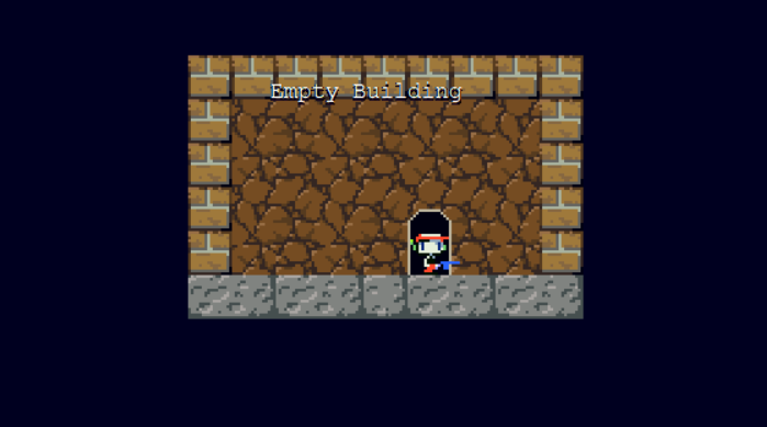
Grotto Myth (Short Demo/Proof of Concept)

Jul 7, 2020 at 9:15 PM
Senior Member
"Fly, Fly, Fly!"
Join Date: Feb 4, 2015
Location: Nibel
Posts: 138
Age: 19
Pronouns: he/him
"Sometimes, two worlds, regardless of their traits, will develop many parallels to each other. Equivalent people, equivalent locations... However, when something from one world enters the other... Both worlds are at risk of completely falling apart."

After a couple months of work, I've created a short, approximately 10 minute demo of this idea for a mod I've had for about a year now.

Description(?)
After the First Cave crumbles and caves in, Quote mysteriously awakens in a familiar yet very different world.

A short, roughly 10 minute demo of an experimental mod concept. I'm not sure how far I'm going to get with this beyond the demo, but I hope to fledge this out into a full mod eventually.
Some more information is on the Doukutsu Club page (tags, credits, etc). The aesthetic of the mod is somewhat inspired by the beta (primarily I used tiles from the beta), but aside from that, almost everything is original.
My plans are for the final result to be about an hour in length. I'm not good at describing things but I suggest you take a look at the screenshots to see if you would be interested in trying this out.
If you ever find any bugs, please let me know ASAP and I'll try to patch them.
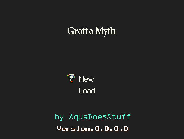
full

full

full

full

Download
Doukutsu Club

0.0.1.1
-fixed many errors
-changed the palette of Kagigi City slightly to be more pleasant to look at
-added a custom game over theme
-updated to a more recent version of Clownacy's Mod Loader
-there's something in the empty building now

0.0.1.0
Initial release (demo/proof of concept)

I'm unsure about how this is going to be recieved, but I hope you all enjoy this short 10 minutes of a demo I put together.
As I develop this mod, I won't release more demos but rather privately release builds, so if you think you'd be interested in beta testing as I work on this, send a message on my profile wall or message me on Discord.

That's all.
 
Last edited:
Jul 7, 2020 at 9:53 PM
Senior Member
"Huzzah!"
Join Date: Mar 25, 2019
Location:
Posts: 206
OK, I tried it out and I have noted some things as I was playing it:
-I think the title screen music is pretty nice. I actually found the whole soundtrack to be really enjoyable.
-The fanfares, too, sound more advanced than the original and overall pretty good.
-Using the star blocks to simulate the whole cave crumbling is kinda lazy, however.
-The level design in general is a little uninteresting. The caves look bland and the enemy placement and design gets old immediately, but that's nothing a little bit of practice can't solve.
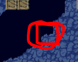
-When you walk too close to this "half slope", you get "teleported" above it because Cave Story does that, unfortunately.
.halfslope.PNG
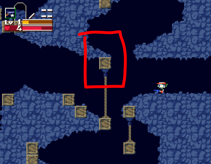
Same thing happens here.
.beneath.PNG
There's a bunch of others, but you get the idea.
-I suggest you get rid of all those paths that lead nowhere. They're a bit of a waste of time.
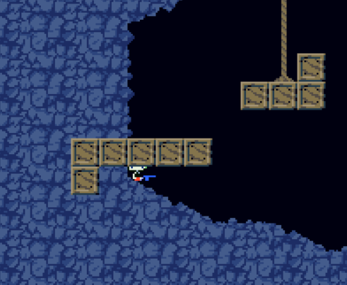
Yeah, I suggest you do something about this, too. You could just remove this one block.
.unfortunately.PNG
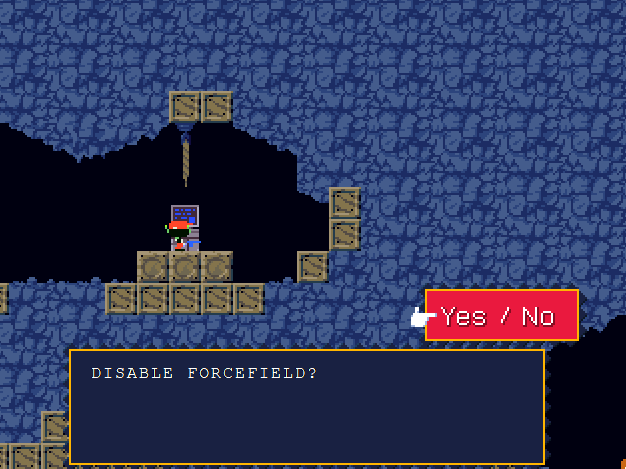
-Why does this exist here, though? You could've just said that Quote cannot enter any of these kinds of buildings.
.why.PNG
-I also suggest you make it more obvious that the shop is...well, a shop.
-I really like the idea of a town with a tower. Hmm...
Overall, this is a solid attempt and I think it has tons of potential, especially regarding the music. Still, I would like to listen to something completely original since this stuff is already really nice.
 
Jul 7, 2020 at 10:35 PM
Senior Member
"Fly, Fly, Fly!"
Join Date: Feb 4, 2015
Location: Nibel
Posts: 138
Age: 19
Pronouns: he/him
OK, I tried it out and I have noted some things as I was playing it:
-I think the title screen music is pretty nice. I actually found the whole soundtrack to be really enjoyable.
thanks!
-The fanfares, too, sound more advanced than the original and overall pretty good.
-Using the star blocks to simulate the whole cave crumbling is kinda lazy, however.
yeah, I kinda agree, but I couldn't really think of anything better. I might redo the collapse sequence at some point, but for now I'll leave it as is.
-The level design in general is a little uninteresting. The caves look bland and the enemy placement and design gets old immediately, but that's nothing a little bit of practice can't solve.
i was never good at level design and I figured somebody would comment about it. I'll revamp the levels once I get better (might also just try to find somebody else willing to do levels lol)
-When you walk too close to this "half slope", you get "teleported" above it because Cave Story does that, unfortunately.
Same thing happens here.
There's a bunch of others, but you get the idea.
Yup, I noticed that after playtesting the areas. I tried to fix a few but I couldn't catch them all... I'll make sure to patch it in 0.0.1.1
-I suggest you get rid of all those paths that lead nowhere. They're a bit of a waste of time.
i was thinking of having them lead to a door or a chest later in development, but I probably would have been better off just adding them later. Oh well
Yeah, I suggest you do something about this, too. You could just remove this one block.
ack, I forgot about that! I was gonna fix it and never did, will fix in the next patch as well
-Why does this exist here, though? You could've just said that Quote cannot enter any of these kinds of buildings.
same reasoning as the paths that lead no where, except I actually have no idea what to use it for. Might repurpose it later.
-I also suggest you make it more obvious that the shop is...well, a shop.
Alright, I'll add a shop sign, perhaps. Actually, I should probably add signs to all the buildings.
-I really like the idea of a town with a tower. Hmm...
thanks!
Overall, this is a solid attempt and I think it has tons of potential, especially regarding the music. Still, I would like to listen to something completely original since this stuff is already really nice.
i left some songs for later locations in the game files (mods folder), most of which are original, feel free to listen if you want to hear more

 
Jul 8, 2020 at 3:30 AM
Senior Member
"Ha! Ha! Ha! Mega Man is no match for my Mimiga Man!"
Join Date: Apr 27, 2018
Location: The Deck
Posts: 229
Age: 18
Pronouns: he/him
I haven't played the entire thing yet, unless it's as short as I think it is, in which case yes I have. Anyways, I just got to Kaigigi town, and I do think this has some good potential to be its own thing, and I definitely like the concept

In my opinion, though, Kaigigi town does look like it could be improved upon. The buildings don't contrast against themselves very well, and from what I've seen, the colour scheme doesn't do it much of a favor. It feels like it's there but also just barely isn't, if you know what I mean. My best input for that is to improve how the buildings look so they don't feel, bland. You should maybe change the colour of the "crust", too, that yellow stuff on the border of the town? I feel like it could look better than it is. I also really like the whole Kaigigi thing in general, and I hope you expand upon that.

I pretty much agree with everything else the other guy has said already, but this definitely has the potential to become a good mod in my opinion. Good work!
 
Last edited:
Jul 8, 2020 at 3:57 PM
Junior Member
"Fresh from the Bakery"
Join Date: May 29, 2020
Location: 18th century Vienna
Posts: 17
Pronouns: she/her
Hi, I've played your mod. It's really enjoyable so far!
I would suggest making the first few caves a bit more interesting, like putting a life capsule or more coins in those dead ends or something.
When you get the coin, after the fanfare, use <RMU instead of <CMU, that way On To Grasstown will pick back up where it stopped instead of starting over.
I am in love with Kaigigi Town. I don't know why I just am. It's really good. Except a bunch of bookshelves in the library say the same thing as one another.
I love this demo so far! I really hope you expand on it.
 
Jul 8, 2020 at 7:22 PM
Senior Member
"Fly, Fly, Fly!"
Join Date: Feb 4, 2015
Location: Nibel
Posts: 138
Age: 19
Pronouns: he/him
Hi, I've played your mod. It's really enjoyable so far!
I would suggest making the first few caves a bit more interesting, like putting a life capsule or more coins in those dead ends or something.
When you get the coin, after the fanfare, use <RMU instead of <CMU, that way On To Grasstown will pick back up where it stopped instead of starting over.
I am in love with Kaigigi Town. I don't know why I just am. It's really good. Except a bunch of bookshelves in the library say the same thing as one another.
I love this demo so far! I really hope you expand on it.
Yup, I was planning on adding more to the first 2 caves too.
I will change the cmu to rmu as well (i probably forgot rmu existed for a second or something lol)
for the bookshelves in the library, I was planning on adding more but I ran out of ideas pretty quickly, but I will make sure all of them say unique stuff eventually

I haven't played the entire thing yet, unless it's as short as I think it is, in which case yes I have. Anyways, I just got to Kaigigi town, and I do think this has some good potential to be its own thing, and I definitely like the concept
The demo isn't much longer after Kagigi Town (I basically spent the last few weeks of working on this on mapping all the buildings and stuff).
In my opinion, though, Kaigigi town does look like it could be improved upon. The buildings don't contrast against themselves very well, and from what I've seen, the colour scheme doesn't do it much of a favor. It feels like it's there but also just barely isn't, if you know what I mean.
I don't know exactly what you mean, but I think I understand. And yeah, the color scheme isn't the best... it is a bit too monotone so I should probably change it.
My best input for that is to improve how the buildings look so they don't feel, bland. You should maybe change the colour of the "crust", too, that yellow stuff on the border of the town? I feel like it could look better than it is. I also really like the whole Kaigigi thing in general, and I hope you expand upon that.
Yeah, the buildings look really similar. I could add more detail to the yellow ground there (rn its just recolored rocks from the previous section), so the looks of the mod will definitely be improved at some point.

I pretty much agree with everything else the other guy has said already, but this definitely has the potential to become a good mod in my opinion. Good work!

So seeing this criticism is making me realize I kind of rushed this mod, I really wanted to release it early this week and I made sure I added everything that I NEEDED to add, but there was still some things I could have added/changed to make the experience more fun
I will be working on the next build today, and I'll try to fix most of these issues. Once again, if you'd be interested in playtesting beyond the limits of the demo or making some contributions, let me know! Thank you for your feedback.
 
Jul 8, 2020 at 7:46 PM
Senior Member
"Huzzah!"
Join Date: Mar 25, 2019
Location:
Posts: 206
So seeing this criticism is making me realize I kind of rushed this mod, I really wanted to release it early this week and I made sure I added everything that I NEEDED to add, but there was still some things I could have added/changed to make the experience more fun
Look, if anything this build set the mood of the mod. I think it's more of a proof of concept than a demo, but there are many things to like about this build and I certainly wouldn't consider it a mistake if I were you, so good luck and be sure I will play the full version when it comes out because of this.

Maybe you could release a trailer for it when it's in a more polished state to make other people know about it.
 
Jul 11, 2020 at 7:59 PM
Senior Member
"Fly, Fly, Fly!"
Join Date: Feb 4, 2015
Location: Nibel
Posts: 138
Age: 19
Pronouns: he/him
Updated to 0.0.1.1! Added a few tweaks to make the demo a little better using the criticism.

0.0.1.1
-fixed many errors
-changed the palette of Kagigi City slightly to be more pleasant to look at
-added a custom game over theme
-updated to a more recent version of Clownacy's Mod Loader
-there's something in the empty building now

You can download it here
 
Back
Top