-
Please stop embedding files/images from Discord. Discord has anti-hotlinking logic in place that breaks links to Discord hosted files and images when linked to from anywhere outside of Discord. There are a multitude of file/image hosting sites you can use instead.
(more info here)
You are using an out of date browser. It may not display this or other websites correctly.
You should upgrade or use an alternative browser.
You should upgrade or use an alternative browser.
Grand Gallery of Modding Tutorials (LOOK HERE BEFORE ASKING)
- Thread starter dooey100
- Start date
Mar 24, 2015 at 3:04 AM
Join Date: Apr 5, 2013
Location: In my mind and of my body.
Posts: 1643
Age: 28
As long as you don't use the shift map feature more then once before each save it's entirely as stable as CE if not more so. I think this might be related to the .pxa file deletion mystery
CE should only exist for those who are stranded with a PC that doesn't have java on it and no internet connection.
I don't get it, I used CE back when I was a n00b, but had no issues moving over to BL (aside not having the faces and sound effects shown when you type the TSC command).
CE should only exist for those who are stranded with a PC that doesn't have java on it and no internet connection.
I don't get it, I used CE back when I was a n00b, but had no issues moving over to BL (aside not having the faces and sound effects shown when you type the TSC command).
Mar 24, 2015 at 2:45 PM
Join Date: Nov 21, 2013
Location: farther
Posts: 922
Age: 29
Pronouns: he/him
It took me less than a week to get used to CE, I'm still trying to get used to BL. the main reason why I started with CE over BL is because there was a video tutorial on CE but at the time there wasn't enough of a tutorial on BL at the time
Mar 24, 2015 at 10:41 PM
Join Date: Aug 16, 2014
Location: no
Posts: 848
Age: 25
Pronouns: He/Him
Why not add a CE skin like thing that allows BL to look and feel like CE, but with the features of BL.
Mar 24, 2015 at 11:02 PM
Join Date: May 28, 2008
Location: PMMM MMO
Posts: 3713
Age: 33
Noxid, you of all people should know how finicky people are towards any UI changes in the slightest. You've really got no choice but to remake your tutorial video with BL if you want it to catch on, or else you're done in by your own hand.Noxid said:BL is just CE with tabs
they are practically the same editor
Mar 24, 2015 at 11:13 PM
Join Date: Feb 13, 2015
Location: Canada
Posts: 218
Age: 27
Pronouns: he/him
Hey, two seperate editors are better than one!
I like the interface and feel of CE, but BL has a few more features that CE doesn't. Since the two don't conflict with each other, I can use CE and BL to my heart's desire, switching between them for whatever the occasion may be.
I like the interface and feel of CE, but BL has a few more features that CE doesn't. Since the two don't conflict with each other, I can use CE and BL to my heart's desire, switching between them for whatever the occasion may be.
Mar 24, 2015 at 11:36 PM
Sincerity will always triumph over irony.
Modding Community Discord Admin

"What're YOU lookin' at?"
Join Date: Apr 23, 2013
Location: In a cave above the surface.
Posts: 1099
Age: 27
Pronouns: He/They
Gender Notes: More info at a later date.
CE isn't bad, and I won't condemn its use because really it's stupid to bring down any of the two because they both work fine. Use what you want…
…but…
- BL's UI design is so much more fun than boring CE.
- You can get some basic visualizer of the NPC's, so you don't have to decrypt names.
- There are so many BL features that I can't do in CE.
- There are practically no CE features (anymore) that BL can't do.
- It takes five seconds to open a text document and scroll to the value you need for a command, and compare this to typing in every number until the picture you are looking for pops up. Plus you can memorize parts of it (maybe it is just me, but I've got the <AM+ values down completely).
- Cats.
- I don't have to emulate a .exe file on my Macintosh.
- Is semi-actively updated.
Mar 24, 2015 at 11:46 PM
Join Date: Aug 16, 2014
Location: no
Posts: 848
Age: 25
Pronouns: He/Him
Well, I find all the fun a bit distracting. If there could be a CE mode, I would most certainly use BL. I'm comfortable with the plain design, and it was easy to grip on to and there weren't to many choices in the beginning.
Mar 25, 2015 at 4:55 AM
Been here way too long...
Discord Group Admin
Org Discord Moderator

"Life begins and ends with Nu."
Join Date: Oct 18, 2011
Location:
Posts: 2337
see it's this attitude of active self-limitation that I'd like to be rid of by deprecating CE
I was asked for a reason to get rid of CE; the self-limiting attitudes indicated by some of the replies are my reasons
I was asked for a reason to get rid of CE; the self-limiting attitudes indicated by some of the replies are my reasons
Mar 25, 2015 at 2:10 PM
Join Date: Aug 16, 2014
Location: no
Posts: 848
Age: 25
Pronouns: He/Him
No, what I'm asking for is an option to make the editor simpler in apperence. Also, what I meant was a way for people who have been using CE to be introduced to the new features a bit at a time.
Mar 25, 2015 at 3:12 PM
Join Date: Nov 21, 2013
Location: farther
Posts: 922
Age: 29
Pronouns: he/him
I really hate it when I have to switch between 2 windows, its bad enough that I go through all that shit with org maker and synthesia. I know many things from memory, but the many more obscure commands I constantly forget.CE isn't bad, and I won't condemn its use because really it's stupid to bring down any of the two because they both work fine. Use what you want…
…but…
- It takes five seconds to open a text document and scroll to the value you need for a command, and compare this to typing in every number until the picture you are looking for pops up. Plus you can memorize parts of it (maybe it is just me, but I've got the <AM+ values down completely.)
the interface is actually better in my opinion, and the additional features that BL has is definitely worth the effort of using(with the exception of when I use the physics hack, for some reason I can only make playable physics with carrotlord's program) the main reason why I use ce is because its practicle for small stuff.Well, I find all the fun a bit distracting. If there could be a CE mode, I would most certainly use BL. I'm comfortable with the plain design, and it was easy to grip on to and there weren't to many choices in the beginning.
Mar 25, 2015 at 3:44 PM
Join Date: Aug 28, 2009
Location: The Purple Zone
Posts: 5998
Pronouns: he/him
how exactly do you propose to make it simpler
because really, I tried to make it as intuitive and easy to migrate as possible
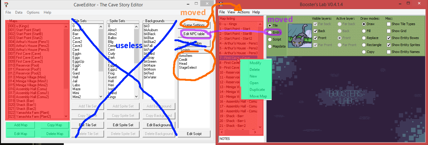
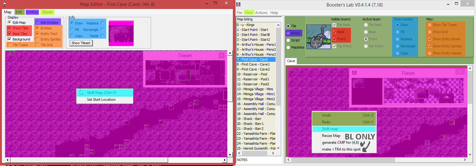
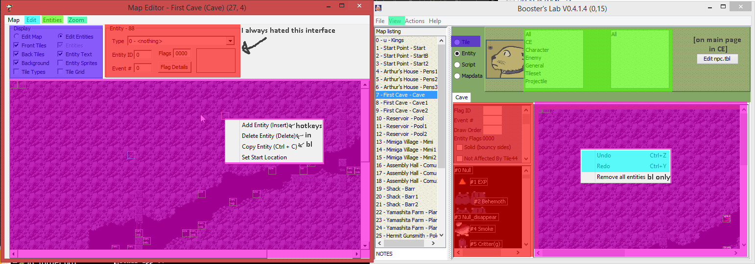
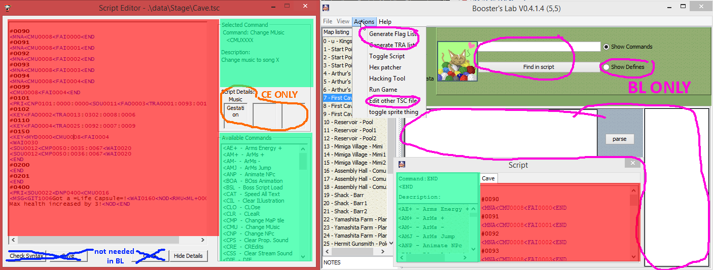
In fact, I'll do a side-by-side comparison
main page
 Tileset editor
 NPC Editor
 TSC Editor
 Mapdata editor
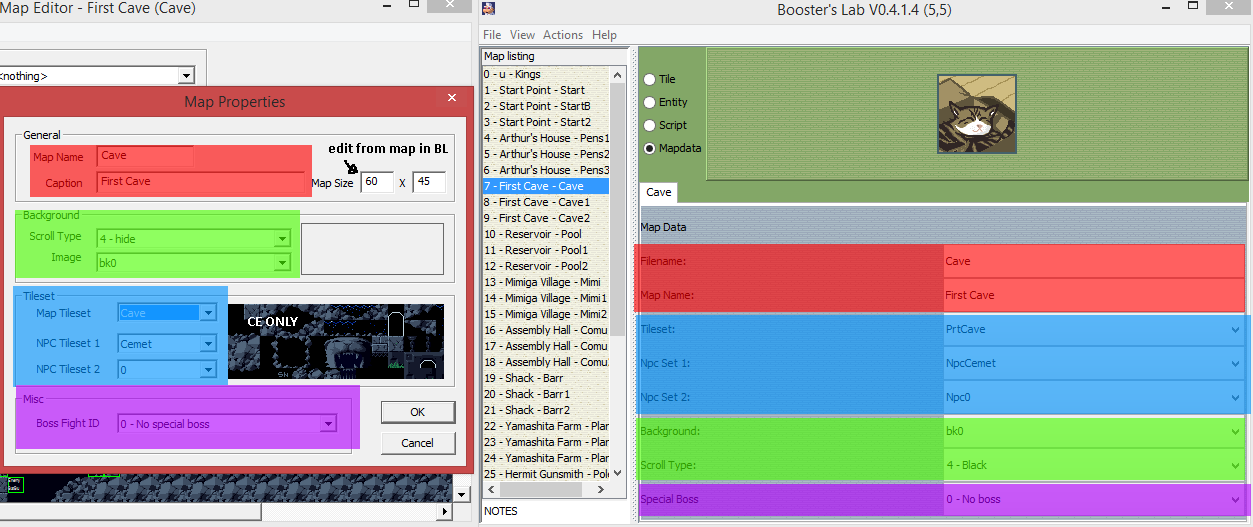 Hacking tools
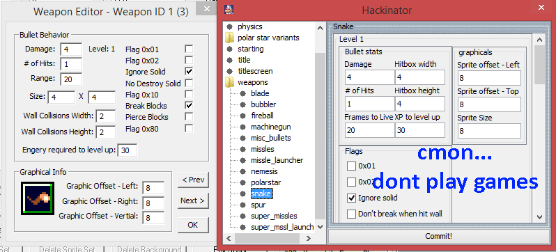
If u cant figure it out then maybe this interface would be more suited to you
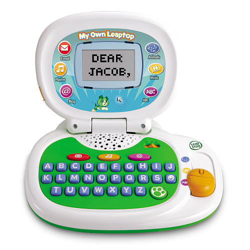 If you want less features, use BL V0.1
because really, I tried to make it as intuitive and easy to migrate as possible
In fact, I'll do a side-by-side comparison
main page


If u cant figure it out then maybe this interface would be more suited to you

Mar 25, 2015 at 4:10 PM
Thinking over it a little more, my only argument for CE was that people still use it (unlike SW when it was made defunct) and used myself as an example, but honestly the only reason I don't use BL is because I don't really think about using BL. CE is there on my taskbar and it's easy to open so I just use that most of the time. I am starting to feel that the only reason that CE is being used is because people are stubborn, and I think I will move on to BL permanently. So while I still don't think this is the same situation as comparing CE and SW, I think it would be better to start navigating modders towards the more powerful and not dead editor.
Mar 25, 2015 at 5:35 PM
Join Date: May 28, 2008
Location: PMMM MMO
Posts: 3713
Age: 33
The main page is still a little overwhelming when you first open it up. All the panels for doing any map editing at all should be hidden until you have at least one map open, otherwise all these panels could be confusing to someone who sees them without even having a Cave Story exe/mod opened yet. And it's really important that this main page is the most intuitive/least intimidating, since this is where people are most likely to be scared off/jump ship.Noxid said:how exactly do you propose to make it simpler
because really, I tried to make it as intuitive and easy to migrate as possible
Mar 25, 2015 at 6:17 PM
Join Date: Nov 21, 2013
Location: farther
Posts: 922
Age: 29
Pronouns: he/him
hehe, I remember when I first opened cave editor, I was horribly bombarded with information until I accidentally openned up a mapGIRakaCHEEZER said:The main page is still a little overwhelming when you first open it up. All the panels for doing any map editing at all should be hidden until you have at least one map open, otherwise all these panels could be confusing to someone who sees them without even having a Cave Story exe/mod opened yet. And it's really important that this main page is the most intuitive/least intimidating, since this is where people are most likely to be scared off/jump ship.
Mar 26, 2015 at 4:29 PM
Senior Member

"This is the greatest handgun ever made! You have to ask yourself, do I feel lucky?"
Join Date: Oct 22, 2014
Location: Xyrinfe multiverse
Posts: 100
Age: 30
Pronouns: she/her
Could someone add the BOA command's thread to the first post's list, please?
Jun 3, 2015 at 8:25 PM
Join Date: Apr 28, 2015
Location: Home
Posts: 68
Age: 22
Pronouns: he/him
So, I am currently trying to make my first mod. I decided to put a Kazuma NPC that would appear a short time after the game starts. I have the entity flag 0x0800 on the entity and the EntityID is 5000. The problem is that, whenever I start a game and the script below runs, he wont appear. I have constantly read and reread guides but I am still confused. Can somebody tell me whats wrong?
The script:
#0200
<FLJ5000:0000<KEY<CMU0000<MSGYou awake in an unfamiliar room.<WAI0120<NOD<CLO
<FAC0001<MSGWhere...<NOD
where the hell am I?<NOD<CLO<FAI0004<MNA<WAI0060<FL+5000<END
Jun 3, 2015 at 10:19 PM
Join Date: Aug 16, 2014
Location: no
Posts: 848
Age: 25
Pronouns: He/Him
Did you check the wrong flag?


