Okay, played it for about 15 minutes until I jumped into a spike pit, and here are my criticisms.
Preface: Sine you're pretty good at this, I'm going to critique you like I would an actual game designer :3 Also, I am good at playing Cave Story, and I have a lot of experience with TSC coding, so if I seem naïve it's for the sake of common players.
First, a little about designing mods: the player of your mod is like a customer in many respects. There are numerous products just like yours within grasp; if they don't like yours, they can go grab another for literally ten seconds of effort. Yours may even be better, but if you get off on the wrong foot, you can lose your "customer" for good. Your job as a modder is to hook them to your mod, and so they'll keep playing it and look forward to updates, which I assume is your purpose for making this mod.
This makes beginnings key. If there is even a small amount of confusion, or an unclear or potentially frustrating part at the very start, people will just give up on your mod and go try a different one. That is another reason my critique will seem so harsh.
First impressions are the most important part of game design in many senses.
~~~
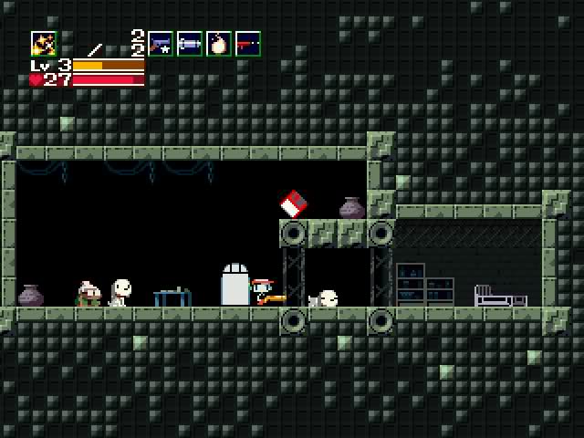
First thing I notice in-game: the beginning isn't linear. This is not a good way
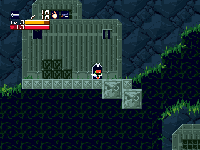
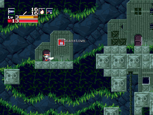
to begin a game, especially if there is an item the player needs to get at the beginning to progress, and only a few ways lead to it. It makes new players apprehensive, and worry about their choices, which is not what you want the player to do at the very start of the game. A good and easy way to fix a bit of this would be the hermit's house, for example. Simply putting that door in the player's view as soon as they enter the room removes any apprehension that they would get from having another possible branch to explore. I liked the locked door handle jiggle <SOU arrangement, by the way, it was a nice touch.
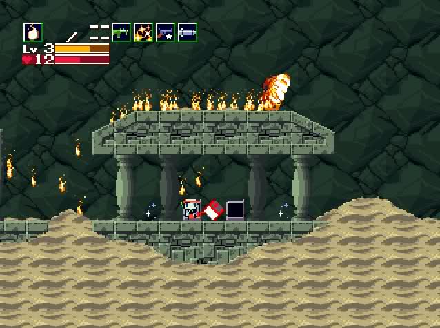
Next, the stairway with the shootable blocks: it is easy to get yourself stuck at the bottom, because at the bottom there is no way to make the step-on blocks regenerate, and the secret way out is semi-difficult to find, because a player won't naturally look at what is effectively the middle of a hill (assuming you haven't destroyed the very bottom shootable blocks). This will frustrate players, and cause someone to get frustrated, possibly give up on the mod as a whole.
The next thing I notice is this:
There's a little hill with an enemy behind it. The player's first instinct is to shoot the enemy (since the gun has decent range now), but it hits the hill and stops. This is irritating, because it shrinks the already close-quarters battlefield for the player, and wastes their time. If your intent was to show the player that the hill blocks bullets, I would recommend switching the positions of the enemy and the hill, so the players inevitable extra shots will hit the hill and dissipate, having the same end result.
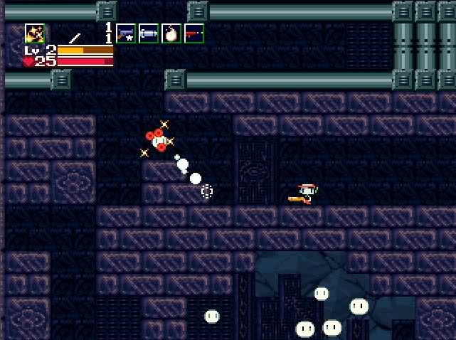
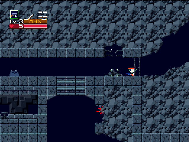
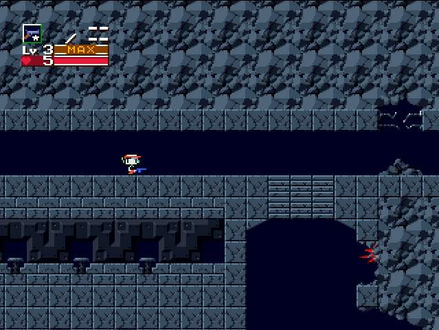
The next thing that catches my eye is this patch of different tiles here:
I can see it's for the style of the map, like the ceiling, or to connect the two rooms in a sense (maybe even literally later), but it causes players to stop unnecessarily and waste their time trying to figure out if that area has meaning. They think "Is it a secret door? Does it disappear like those blocks before? Do I just ignore it?" and gives the player a sense they're not figuring out a puzzle, or doing something wrong. It also appears here, and has a similar effect:
In both cases, just replace it with the cracked square tile you're using everywhere else, it will make things a lot better for the player.
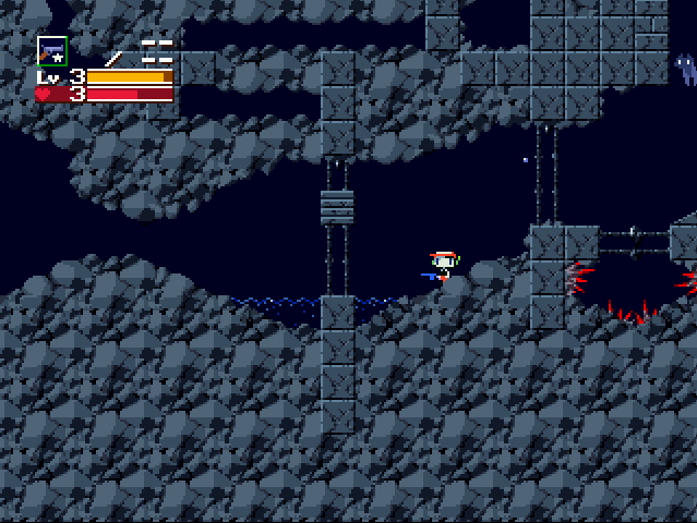
In that same picture above, you can see a spike pit to the right. My only gripe with this is the Quote-sized holes on the left and right. Players are experimental, and rewarding exploration with instant death followed by respawning a solid 4 minutes back is not a good idea in the beginning of a game.
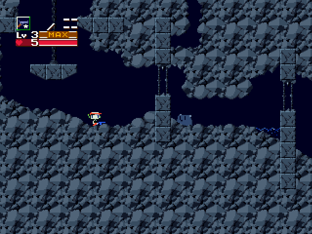
Then there was this spot of enemies:
There were two enemies in there, but I took a screenshot after I killed one.
It's just not a good setup for enemies, and sadly, a lot of modders fall into this trap, thinking it presents a challenge. The reality is that it doesn't at all. Players sit there for a second, think "how do I do this?" and then just jump in spamming X, take one or two hits, and move on. It's practically forcing the player to take a bit of damage.
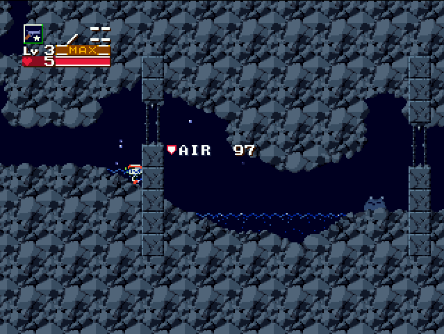
On to something more positive, this puddle:
Players are prone to walking right up to the edge of walls and then jumping when they are unfamiliar with a map, and so I actually like this placement, for two reasons:
First, it teaches the player they have an air meter. It is almost forcing the player to go underwater, but at the same time flowing with the level design.
Second, it teaches the player their jumping height in water. By not letting them over the wall when they're in water, it teaches them quite nicely that their underwater jump height only clears one block.
Though it may not seem like it, overall I like this mod a lot. Just be mindful of your map design and I'm sure you'll have an awesome mod









 I'll likely be moving to Dallas in the next few months to room with a close friend who works for a developer there. Hopefully I can get a job with them.
 Dude, you see that?
 oh, yeah I see it...
 ]
]