suggestions/constructive criticism

Jul 16, 2007 at 1:28 AM
Lurking in the Shadows
"No! Don't OPEN that DOOR!"
Join Date: Jul 16, 2007
Location:
Posts: 0
hi. i thought this topic might be a good place for gamemakr to get suggestions and inspiration so he can improve the game even more and make it even more groundbreaking than ever!:D id like to see a LOT of posts here, so anyone reading this who has taken a look at gm's site, feel free to share your thoughts:)

gm - feel free to disregard anything you want in this thread. these are only suggestions, and its your game after all.;)

gm i think you should improve the monsters like you did the castle. ;)
 
Jul 16, 2007 at 1:39 AM
Lurking in the Shadows
"No! Don't OPEN that DOOR!"
Join Date: Jul 1, 2007
Location: colby KS
Posts: 0
Age: 31
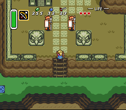
i agree with lavos spawn. some of the enemy graphics do need to be improved. especially the armos design. they look a little too NESy. this is a SNES game, and having NES looking graphics will only take away from the playing experience.

also, the mushrooms in town look a little flat
 
Jul 16, 2007 at 7:11 AM
Lurking in the Shadows
"No! Don't OPEN that DOOR!"
Join Date: Nov 16, 2006
Location: Kentucky
Posts: 0
Thirded. Enemy graphics and environment graphics alike should all be at the SNES level. Anything that's not will stick out like a sore thumb, and totally distract from the experience. I'm all for some NES Zelda nostalgia, but not if it's in the form of NES style graphics.
 
Jul 17, 2007 at 3:06 AM
Lurking in the Shadows
"No! Don't OPEN that DOOR!"
Join Date: Jul 8, 2007
Location:
Posts: 0
Hi all,

I'm very interested in the discussion (and pros and cons) of using a similar Armos Knight from the original Legend of Zelda.

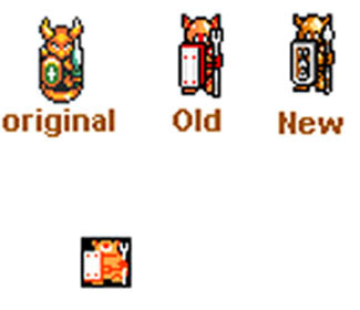
First, here's the current versions of the Armos Knight (the current Zelda 3C version and the original NES version, side-by-side):

p257902-0-83246926996873b5bff.jpg


Now, the colors won't/don't necessarily have to look like this. What I was trying to go for, obviously, was to recreate the original NES Armos using more SNES-like graphics. So, it pretty much copies it, but has the semi-bird's eye view of A Link to the Past and has a more 3D look with the shading.

Personally, I thought it looked different enough and SNES-like enough but yet would be easily recognizable as the Armos from The Legend of Zelda.

However, I'm interested in everyone's thoughts on this. How many people like it, how many people hate it. If you hate it, some constructive criticism would be much-appreciated. What do you think should be changed? Anything minor, or would you prefer to see the Armos scraped and just recreated from scratch?

Thanks all.
 
Jul 17, 2007 at 4:04 AM
Lurking in the Shadows
"No! Don't OPEN that DOOR!"
Join Date: Jul 1, 2007
Location: colby KS
Posts: 0
Age: 31
i like the overall design, but it looks too simple colorwise, especially compared to some of the other monsters(its a little bright), and structurewise (the trident and the legs.) the trident looks too thin, like itd break too easy. the legs make it look like itd tip over if it hops like the lttp armos. why would the ancients create something to protect their palace which would tip over? sorry if this sounds like a rant. i just want to help on this game, even though i cant edit graphics yet(my stupid pc)
 
Jul 17, 2007 at 4:20 AM
Lurking in the Shadows
"No! Don't OPEN that DOOR!"
Join Date: Jul 8, 2007
Location:
Posts: 0
No need to apologize, at all. I asked 'cause I want the criticism. I'd rather have things looking good before the game is released, 'cause people saying, "Man, this sucks bad" afterwards isn't the desired response that Gamemakr's going for. LOL

There's a limited number of colors that can be used for each enemy, and the max is used on the Armos. However, maybe it can be messed with a bit to try to get some more detail, somehow. My very first version had a cracked-looking shield, but Gamemakr wasn't too thrilled with it. I do agree about the trident, though. I'll see if I can't whip something better up and get your feedback.
 
Jul 17, 2007 at 4:26 AM
Lurking in the Shadows
"No! Don't OPEN that DOOR!"
Join Date: Nov 16, 2006
Location: Kentucky
Posts: 0
Here's an in game pic to reference against other GFX.

edit: this is an older version of the Armos Knight, btw

p257911-0-9300620armos.gif


I would agree with most of what darkprince said, and add that I think what really bugs me about the graphics, i.e. what makes them look "NESish" to me, is the shield. It makes the Armos Knight easily recognizable (rectangular, white, four dots) but it's the first thing that jumps out at me as "out of place" when i look at the picture. Also, I'd consider using a darker palette with them. I think the bright orange is making the black outline very noticable.
 
Jul 17, 2007 at 11:44 AM
Lurking in the Shadows
"No! Don't OPEN that DOOR!"
Join Date: Jul 8, 2007
Location:
Posts: 0
Ahhhh!!!!!! Don't use that screenshot. The Armos in that one looked awful. He was too tall. That's an old old version. :)

I made some changes to the Armos, based on your suggestions. So... feedback time. Here it is:

p257925-0-835804913f0ec95632a.jpg
 
Jul 17, 2007 at 3:11 PM
Lurking in the Shadows
"No! Don't OPEN that DOOR!"
Join Date: Jul 1, 2007
Location: colby KS
Posts: 0
Age: 31
i like this one. but im still concerned that if this hops like the lttp armos, it would look too prone to tip over. but i might change my mind once i see it in action. but would there be a way to change the legs so it looks like it was designed to hop, but still be recognized as the LoZ armos, and still being different enough from the lttp version? maybe this could be a hybrid of the two. i dont know. but this new version is a LOT better than the first one.:)
 
Jul 17, 2007 at 5:13 PM
Lurking in the Shadows
"No! Don't OPEN that DOOR!"
Join Date: Nov 16, 2006
Location: Kentucky
Posts: 0
Ah, I didn't realize that they were different in that old screenshot...

The new Armos looks better to me at first glance - is there any way you could post the graphics in a format that doesn't distort them? Meaning that it leaves all the pixels intact without any blurring so I can insert them into the game myself and see how they look?

At this point I'm thinking it's going to look better in game, but I'd like to see it in action. :)
 
Jul 17, 2007 at 7:08 PM
Lurking in the Shadows
"No! Don't OPEN that DOOR!"
Join Date: Jul 8, 2007
Location:
Posts: 0
Sure, I can repost with the original size. I just uploaded this as a larger-sized picture as a jpeg so it'd be easier to see. But, I'll have to wait 'til this evening, after work, to do it.

On a side note, Reshaper, I have that email from you, and I'll be responding if I can get a long enough break from work. :)

I'm wondering how it'd look hopping too. I see what you're saying, darkprince, about the legs maybe looking strange while the creature hops. The problem is, I was limited to the size of the original graphic and there's only so much space to draw in. And, my very first version (years ago, that was never shown) had a base, like the original. But, Gamemakr didn't want to keep the base and wanted the legs.

I'm glad you guys like this one better. I very much appreciate the constructive criticism. Very much. In fact, feel free to rip it apart more, if need be. I think we all want to get the very best possible end result.
 
Jul 17, 2007 at 7:25 PM
Lurking in the Shadows
"No! Don't OPEN that DOOR!"
Join Date: Jul 2, 2006
Location: Atlanta, GA
Posts: 0
This is the first time I've seen Zelda3C monster graphics without finding them in my Inbox. :)

The new Armos graphics do look much better, but I can't help thinking that it's going to be a "dumb" version of the vicious sentry that chased me *without* hopping. I know it was my idea to model this after Zelda 1 graphics, but now I feel like we're not doing the Zelda 1 monster justice here.

I have a replacement idea... This monster could be something that doesn't look like it would come to life. For example, it could be a statue among lots of "real" statues that are actually part of the overworld graphics. If it also has the same palette as the overworld counterpart, you'll never know which ones will come to life as you get close.

The only remaining question: What kind of statue should it be..? A statue of a soldier or Iron Knuckle would be too normal and suspicious. It could be a horse head, dragon head, or even an abstract design. Any ideas? Remember that it has to face south -- it can't turn left or right.
 
Jul 17, 2007 at 8:38 PM
Lurking in the Shadows
"No! Don't OPEN that DOOR!"
Join Date: Jul 8, 2007
Location:
Posts: 0
And, I won't make a habit out of it, sir. *salutes* :) We were just having some discussion and feedback, so it seemed like the thing to do.

I'm wondering if this could cross over into the ASM thread and we could alter the original somehow to... well... I'll just email Reshaper about it and see what he thinks.

Or, we could go with your idea and make it a completely new monster. How 'bout this for an idea? We could change the palette of the "sleeping" Armos to completely clear, so it would be invisible. Then, when Link gets close, the palette could change so that the monster would be visible. And, we could use a Poe/Ghini graphic and stick them in the graveyard. Maybe even put the sleeping, unseen version right next to tombstones so that they "come to life" when Link gets near the graves, sort of like they did when you touched the tombstones in the orginal Zelda.
 
Jul 17, 2007 at 11:23 PM
Lurking in the Shadows
"No! Don't OPEN that DOOR!"
Join Date: Jul 1, 2007
Location: colby KS
Posts: 0
Age: 31
how about, if this goes in a graveyard, a zombie or skeleton. or the monster could have 4 faces(one on each side). that wouldnt look too odd because it wouldnt need to turn turn to face link. that would fit in with your statue idea. or maybe a walking(hopping) tree, like a spirit of the forest.:) or a "hand from hell" going with josh's "first invisible, then not" idea, when they come to life, its like they're coming from the underworld.

or maybe a demon rabbit! :)
 
Jul 18, 2007 at 2:44 AM
Lurking in the Shadows
"No! Don't OPEN that DOOR!"
Join Date: Nov 16, 2006
Location: Kentucky
Posts: 0
The only remaining problem I have with the new Armos Knight graphics is that the single big eye doesn't stand out as a single big eye until you initially realize that's what it's supposed to be. I looked at it for a long time thinking the dark part of his eye was part of his helmet, and then it finally hit me that it was part of one huge eye. I think this may be remedied by more clearly separating the dark part of his eye and the helmet with some black pixels. Perhaps even turning the dark part of his eye completely black would help.
 
Jul 22, 2007 at 8:44 PM
Lurking in the Shadows
"No! Don't OPEN that DOOR!"
Join Date: Jul 2, 2006
Location: Atlanta, GA
Posts: 0
Josh - I like the invisible ghost idea, but it would require more than a palette swap to make the ghost start out invisible. Only one of the colors in a palette can be transparent; we would either have to swap out actual tiles or set all the colors to "green" so that he could rest on the grass unseen.

dp909 - (Ah, so here's where you posted about the Armos -- of course!) A zombie would need to bust out of the ground... in my experience with zombies, they tend to keep moving at all times. The skeleton idea would be better, except that they would compete with the Stalfos patroling certain dungeons. The multi-faced statue is a good idea, and so is the hopping tree, which reminds me of Actraiser, level 1. The Hand from Hell is hilarious; maybe I'll use that with a different monster.

I just saw "Monty Python and the Holy Grail" for the first time ever, last month. (Yes, you may throw things.) That bunny was vicious!! The raging rabbit was also great in "Maximo vs. the Army of Zin." Therefore the demon rabbit is the best possible idea; no further debate, please. (lol, kidding)

Reshaper256 (who hasn't lost the original focus) - Yeah, I can see how the eye currently blends in with the other graphics. Like all facial features, it should be immediately obvious or redrawn until it is.

The hopping tree could be used in more areas of the game than a four-faced statue; I think it may be the current winner.
 
Jul 23, 2007 at 3:07 AM
Lurking in the Shadows
"No! Don't OPEN that DOOR!"
Join Date: Jul 1, 2007
Location: colby KS
Posts: 0
Age: 31
and maybe, in the areas that it appears, there could be normal trees that look like the monster scattered around, like your statue idea. and maybe through some hacking, there could be some sort of secret in some of the normal trees(i'll email you with some ideas.);)
 
Jul 24, 2007 at 12:07 AM
Lurking in the Shadows
"No! Don't OPEN that DOOR!"
Join Date: Nov 16, 2006
Location: Kentucky
Posts: 0
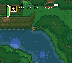
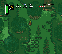
First of all I'd like to congratulate GameMakr24 on completing the construction of the forest. He's been working on it for a LONG time, and the end result is astounding to say the least. I'd like to say that the layout of the forest, from the few screenshots I've seen, is expertly handled. I can't wait to run around in that forest myself. As much as I like them, however, I do have some criticism.

So thought I'd give some feedback on the forest graphics:

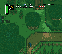
Harmony_1.gif


In this image, as in the rest that contain them, the bushes seem to stick out strangely against the trees. I think it's their darker outlines. Perhaps the bushes could be outlined with a lighter green shade as the trees are?

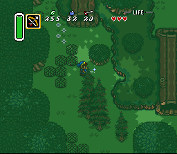
Harmony_2.gif


Here, the pine trees look flat to me. The only feeling I get of them being *up* in the air is when Link walks behind them. This isn't the case with the larger trees, they look 3D to me at first glance. It may have something to do with there being no outlining on the trees to distinctly separate them from the ground. Also, I feel like the trunk looks a bit underdeveloped.

Harmony_3.gif


I really like this shot. The only clear problem I have is the tile where the river suddenly meets the mountain to the left of Link. There needs to be some sort of transition there. I like the horizontal log, although the perspective bugs me just a bit.

Harmony_4.gif


Besides my previous mentions, I do think the forest is very well designed, and all in all, beautifully drawn. I know it'd be tempting to just call it "done" after working on it for so long, but I'd like to encourage you to revisit it for some more graphical improvement.

I have similar feelings about the castle graphics, although the original graphics pale in comparison to the new ones, I do feel like they could still be improved. Sorry for being so critical today, but both you (GM) and you (Josh) have told me to do no less. :p
 
Jul 24, 2007 at 3:41 AM
Lurking in the Shadows
"No! Don't OPEN that DOOR!"
Join Date: Jul 8, 2007
Location:
Posts: 0
First, I would like to echo some of the things Reshaper said. GM, I've been meaning to email you about the bushes. I was also thinking that they should, perhaps, be outlined in the dark green that the trees are outlined in. Also, these still seem to be the "square-shaped" bushes. I sent you a rounder looking bush that I think will look better.

As far as the pine trees, I always thought they were great. However, I kind of see the point he's making. Darn him for being overly-critical. LOL. You should've seen him pick apart some of my monster graphics via email. :)

I think the short pine trees look perfect. But, the tall pine trees do look a little flat. I'm not sure what can be done about this without redrawing the trees, and I know that won't be fun. I'm trying to think how you can alter these and make them look a little more 3/4 overhead view.

I think the horizontal logs work fine as they are. If they are a completely separate graphic, they may be able to be worked on a bit to give them a more 3/4 overhead view. Are they a mirrored graphic?

All-in-all, though, the forest looks great. It really comes together well. These are only some minor nit picky things, and for the most part are easy quick graphical fixes. Great job, man!
 
Jul 24, 2007 at 5:28 PM
Lurking in the Shadows
"No! Don't OPEN that DOOR!"
Join Date: Jul 2, 2006
Location: Atlanta, GA
Posts: 0
Thanks for the congratulations! Finishing an area of this size is always a landmark. All of the criticism appearing above are things I've wrestled with during development:

Bushes - I thought for sure that these were the latest graphics! I'll have to double-check. I do remember modifying a few pixels of a newer version. As for the black border, these are the same colors used in Zelda 3's bushes. The palette for the trees has always been completely different. If I change the overworld palette, I must also change the sprite palette for when Link lifts one over his head. I'll look into it. :)

Pine Trees - even though they look flat, they're taken from an RPG with the same perspective as Zelda 3. (Its title, I don't currently recall.) I knew they weren't 3/4 overhead, but I eventually got used to them. Josh, you're welcome to draw some new pine trees, but if I need to change their shapes as well as their graphics, it will be a major setback. In "wall" combinations, they already play a role as barriers in a few different places. The trunks, by the way, are my best effort, given their size.

Riverbank - I must've spent hours on this one. I knew someone would point it out after I stood Link right beside it in the picture. There were a few "worse" ways for me to handle this, and the result I went with is similar to an occurence Nintendo had in Zora's Domain. (If I were at home, I'd post a screenshot of this.) I can't imagine a perfect transition. It's deep, and then it's shallow. If someone can modify this in MS Paint and show me what it ought to look like, I can try to set aside a few tiles and rectify it.

Horizontal Log - This object was created by copying the vertical log's graphics onto new tiles and rotating them 90 degrees. I was forced to use new tiles -- mirroring can only be done across the X and/or Y axis. As for the actual construction, the bottom half is a mirror of the top half. There aren't any tiles available to make the front of the log "taller" than the back. Still, if anyone can draw its optimal appearance, I'll try to work with it.

Castle - Wha-what? LOL

Monster Graphics - Aw guys, could you pretty-please copy me on these discussions? I've been wondering for the past week what Reshaper256 thought of all these ideas! :)

Short Pine Trees - They were an accident when I first started the forest. I couldn't believe how easily they came about, just by using normal trees' graphics. I also discovered that I can have pine trees even taller than the normal ones, but I haven't found an appropriate place for them yet.

Breaks in Shade - Ha, this one's not a reply. I still plan to add more areas of light breaking through the shadow background, but that's a separate undertaking to be approached when I'm not... so... tired... of the... forest....... ;)
 
Top