King: Strife and Sacrifice (AKA King's Story)

Aug 20, 2010 at 9:09 AM
Bonds that separate us
Forum Administrator
"Life begins and ends with Nu."
Join Date: Aug 20, 2006
Location:
Posts: 2857
Age: 34
Pronouns: he/him
Re: King: Strife and Sacrifice (old was King's Story)

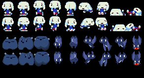
The critter's expression looks like "well if you can't figure it out, I'm not going to tell you"
 
Aug 20, 2010 at 12:06 PM
Pirate Member
"Heavy swords for sale. Suitable for most RPG Protagonists. Apply now!"
Join Date: Dec 26, 2007
Location: Lithuania
Posts: 1946
Re: King: Strife and Sacrifice (old was King's Story)

I'm probably going to sound like a texan right now, but the bat has a weird mouth. As if it shouldn't be opened that much from that perspective if you know what I mean.
 
Aug 20, 2010 at 7:57 PM
Banned
"Master using it, and you can have this!"
Join Date: Jun 23, 2009
Location: Anywhere but here
Posts: 75
Age: 28
Re: King: Strife and Sacrifice (old was King's Story)

The critter: Change the face, his nose looks like a mouth.
The mimiga: Looks good, the pawpads on the feet should be moved over a pixel, it makes him look like he's walking awkwardly, his whole foot wouldn't be facing your (the players) direction.
The bat: He looks like he's making a :D face. But in all seriousness, make it smaller, as woodenrat said, the perspective makes it look weird.
Nice job though.
 
Aug 20, 2010 at 11:18 PM
inactive user
"All your forum are belong to us!"
Join Date: Feb 13, 2010
Location: undead parish
Posts: 625
Re: King: Strife and Sacrifice (old was King's Story)

UltimaLink said:
The critter: Don't change the face, his mouth looks like a mouth.

Fix'd .
 
Aug 21, 2010 at 12:33 AM
In my body, in my head
Forum Moderator
"Life begins and ends with Nu."
Join Date: Aug 28, 2009
Location: The Purple Zone
Posts: 5998
Pronouns: he/him
Actually 6ty, I'm pretty sure that was supposed to be a nose.
This'll be the last round of modifications to these sprites I'll post, I tried to address most of the things mentioned.
p82853-0-batscritmimi3.png

I wasn't really sure what to do about the critter so I didn't change it much, except move the nose up a bit and change the eyes, and add another level of depth to the shading
The bat I gave a bunch of shading improvements and made the mouth smaller
The Mimiga I changed the feet (Also have the three other frames that I got lazy and cut off last time, but they're not even going to appear in game so it doesn't really matter anyway...)
 
Aug 21, 2010 at 1:21 AM
inactive user
"All your forum are belong to us!"
Join Date: Feb 13, 2010
Location: undead parish
Posts: 625
Re: King: Strife and Sacrifice (old was King's Story)

Noxid said:
Actually 6ty, I'm pretty sure that was supposed to be a nose.

I dunno, I always saw it as a mouth. It's kinda hard to change one's perception of such things...... Anyway, the sprites are looking EPIC. They don't really need changes.

Maybe someday, when you finish King's Story, you can 2x res Mimiga Army?
 
Aug 21, 2010 at 2:56 AM
Banned
"Master using it, and you can have this!"
Join Date: Jun 23, 2009
Location: Anywhere but here
Posts: 75
Age: 28
Re: King: Strife and Sacrifice (old was King's Story)

sixtyseconds said:
I dunno, I always saw it as a mouth. It's kinda hard to change one's perception of such things...... Anyway, the sprites are looking EPIC. They don't really need changes.

Maybe someday, when you finish King's Story, you can 2x res Mimiga Army?

Pretty sure you can do this yourself, actually.

Though, I personally wouldn't do it, due to the restrictions you guys put on it. Which I don't blame you for, I'd do the same thing since you could get in some serious legal trouble if you let people do whatever they want with it.
 
Sep 14, 2010 at 9:39 PM
In my body, in my head
Forum Moderator
"Life begins and ends with Nu."
Join Date: Aug 28, 2009
Location: The Purple Zone
Posts: 5998
Pronouns: he/him
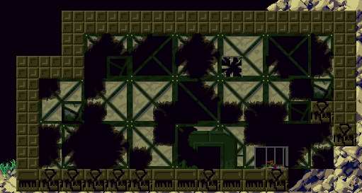
A little attention to detail goes a long way, don't you think?

p82856-0-bettershack1.png
 
Sep 14, 2010 at 11:45 PM
Only Love, Maximum Love, Forever
"Life begins and ends with Nu."
Join Date: May 6, 2009
Location: somewhere new
Posts: 2135
Age: 29
Pronouns: he/him
Noxid said:
A little attention to detail goes a long way, don't you think?

p82856-0-bettershack1.png

Excellent as usual o:

I like the opened/spilled cabinet, with the bottle and such.
 
Sep 15, 2010 at 12:04 AM
Not anymore
"Run, rabbit run. Dig that hole, forget the sun."
Join Date: Jan 28, 2010
Location: Internet
Posts: 1369
Age: 34
Pronouns: he/him
Noxid said:
A little attention to detail goes a long way, don't you think?

p82856-0-bettershack1.png

The torn fabric of the walls gives off a decent soft feel. Quite well done.
 
Sep 15, 2010 at 9:00 PM
Pirate Member
"Heavy swords for sale. Suitable for most RPG Protagonists. Apply now!"
Join Date: Dec 26, 2007
Location: Lithuania
Posts: 1946
I'd be lying if I said it doesn't look great.
 
Sep 15, 2010 at 9:29 PM
Banned
"Master using it, and you can have this!"
Join Date: Jun 23, 2009
Location: Anywhere but here
Posts: 75
Age: 28
I like it, but if there were burn marks on the walls/fabrics it would look more like the aftermath of an attack.

Unless I'm wrong about the Killer Robots weapons.
 
Sep 15, 2010 at 9:45 PM
In my body, in my head
Forum Moderator
"Life begins and ends with Nu."
Join Date: Aug 28, 2009
Location: The Purple Zone
Posts: 5998
Pronouns: he/him
That's a good point. Shouldn't be too hard to emulate I think.
Also, thanks for the kind words guys.
 
Sep 15, 2010 at 10:06 PM
http://imgur.com/EuvCtsQ
"In Soviet Russia, graves keep YOU!"
Join Date: May 2, 2010
Location: beverly hills is where i WANT to be
Posts: 743
Age: 30
Pronouns: he/him
Noxid, we wouldn't flatter you if it weren't true.
 
Sep 16, 2010 at 3:44 PM
Only Love, Maximum Love, Forever
"Life begins and ends with Nu."
Join Date: May 6, 2009
Location: somewhere new
Posts: 2135
Age: 29
Pronouns: he/him
Noxid said:
A little attention to detail goes a long way, don't you think?

p82856-0-bettershack1.png

One thing I noticed:
the window in the upper middlish area, it seems to stick out from the rest of the room, possibly because it has no shading, while everything else has a softer look to it o:
 
Sep 17, 2010 at 2:29 PM
Been here way too long...
"Big Joe Tire and Battery Restaurant! Opening Soon! Eat at Big Joes!"
Join Date: Sep 16, 2009
Location:
Posts: 519
It stands out because it eats into the green supports
 
Sep 19, 2010 at 7:25 PM
Senior Member
"Master using it, and you can have this!"
Join Date: Oct 20, 2009
Location: Kansas
Posts: 84
Age: 27
Pronouns: he/him
cultr1 said:
One thing I noticed:
the window in the upper middlish area, it seems to stick out from the rest of the room, possibly because it has no shading, while everything else has a softer look to it o:

And it has some blockage on the other side of it.

It doesn't fit at all.
 
Sep 20, 2010 at 1:42 AM
In my body, in my head
Forum Moderator
"Life begins and ends with Nu."
Join Date: Aug 28, 2009
Location: The Purple Zone
Posts: 5998
Pronouns: he/him
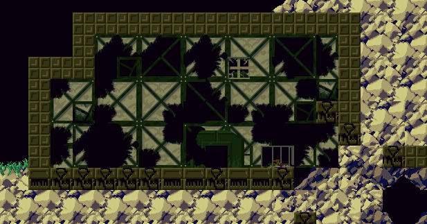
Mkay, so one, I tried to fix the window. Two, Ultima said maybe it should look kind of 'burnt' because of the nature of energy weapons and explosives and stuff, so I tried that. Is this what you meant? Or should I just stick with what I had before?

p82866-0-burnyshack.png
 
Sep 20, 2010 at 1:44 AM
http://imgur.com/EuvCtsQ
"In Soviet Russia, graves keep YOU!"
Join Date: May 2, 2010
Location: beverly hills is where i WANT to be
Posts: 743
Age: 30
Pronouns: he/him
I'd go with that version, for sure. The burn marks look awesome :3
 
Sep 20, 2010 at 3:12 AM
Banned
"Master using it, and you can have this!"
Join Date: Jun 23, 2009
Location: Anywhere but here
Posts: 75
Age: 28
Yeah that's what I meant. It looks more like the aftermath of an attack.

Everything looks good so far.
 
Back
Top