Nov 11, 2012 at 10:51 PM

Join Date: Sep 20, 2011
Location: Rialto
Posts: 337
Age: 29
Pronouns: he/him
Jenn's Journey is my first game project. My first foray into Game Design. What I wanted is finished for now.
Jenn's Journey Download Links:
Dropbox Links:
 www.dropbox.com
- The Finished Version
www.dropbox.com
- The Finished Version
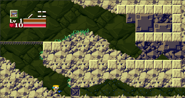
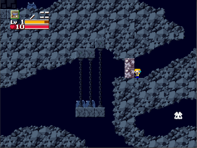
Some Background Information
This takes place several years after Cave Story's Good Ending. At this time, the Humans actually live on the Island's surface just for several environmental reasons. That's all I have to say for now.
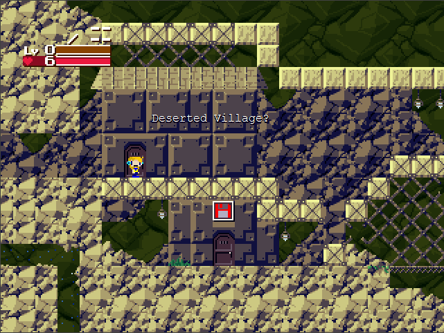
The Synopsis
Jenn is a young human woman who wakes up to find herself in some damp cave. She comes across an old lady asking her if she can look for her lost daughter. Everything after that just rolls along in her journey.
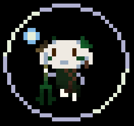
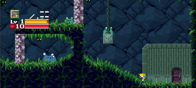
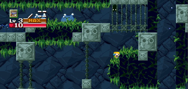
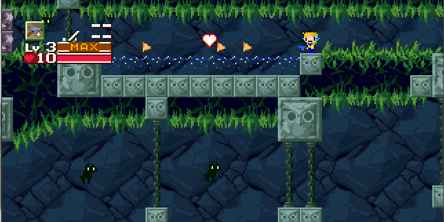
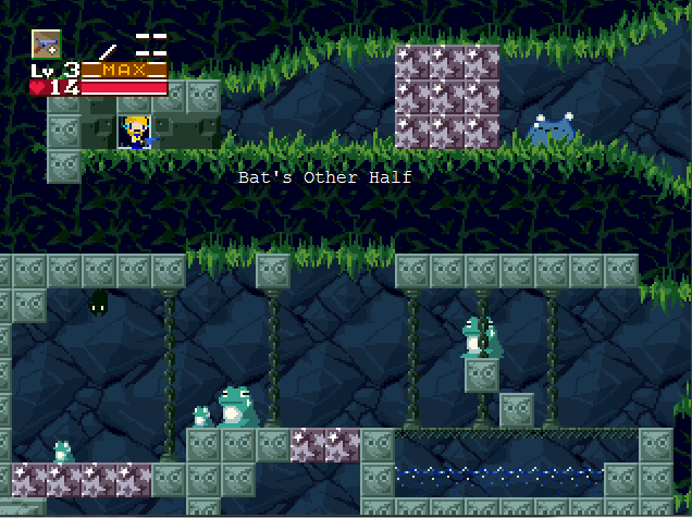
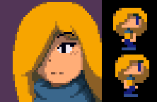
This is you in fact
Jenn's Journey Download Links:
Dropbox Links:
Dropbox
www.dropbox.com
Some Background Information
This takes place several years after Cave Story's Good Ending. At this time, the Humans actually live on the Island's surface just for several environmental reasons. That's all I have to say for now.
The Synopsis
Jenn is a young human woman who wakes up to find herself in some damp cave. She comes across an old lady asking her if she can look for her lost daughter. Everything after that just rolls along in her journey.
This is you in fact
Last edited: