-
Please stop embedding files/images from Discord. Discord has anti-hotlinking logic in place that breaks links to Discord hosted files and images when linked to from anywhere outside of Discord. There are a multitude of file/image hosting sites you can use instead.
(more info here)
You are using an out of date browser. It may not display this or other websites correctly.
You should upgrade or use an alternative browser.
You should upgrade or use an alternative browser.
Unnamed mod - New Screenshots!
- Thread starter Nothing
- Start date
Feb 13, 2013 at 12:08 PM
Join Date: Aug 20, 2006
Location:
Posts: 2874
Age: 35
Pronouns: he/him
A few (very) short notes:
-There are a lot of doors missing a <PRI
-The Steamer is interesting, but Lv3 feels kind of like a downgrade. Rather than speeding it up, though, an interesting idea might be to make it a slower weapon in general. The name also needs capitalising in the game menu.
-Some type of proper game opening would be nice
Like the look of what's upcoming

Feb 13, 2013 at 11:02 PM
Join Date: Aug 20, 2006
Location:
Posts: 2874
Age: 35
Pronouns: he/him
I meant the name "Steamer"
Feb 22, 2013 at 4:27 PM
Join Date: Jan 21, 2013
Location: :
Posts: 133
Pronouns: he/him
A couple updates:
-You are no longer a robot. Robot's can't show much emotion and anyway it looked like the original CS.
-HP/XP bars look different - also lifes and XP look different.
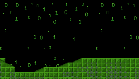
-New Theme!

That backround moves btw.
-You are no longer a robot. Robot's can't show much emotion and anyway it looked like the original CS.
-HP/XP bars look different - also lifes and XP look different.
-New Theme!

That backround moves btw.
Feb 23, 2013 at 2:10 AM
Join Date: Aug 9, 2010
Location: Greener Pastures
Posts: 1188
Age: 32
Oooooooh. Neato. I hope you create some background elements too, like some posts or something. Me likes the theme.
Feb 27, 2013 at 7:33 PM
Join Date: Dec 31, 2011
Location: United States
Posts: 2323
Age: 29
Pronouns: he/him
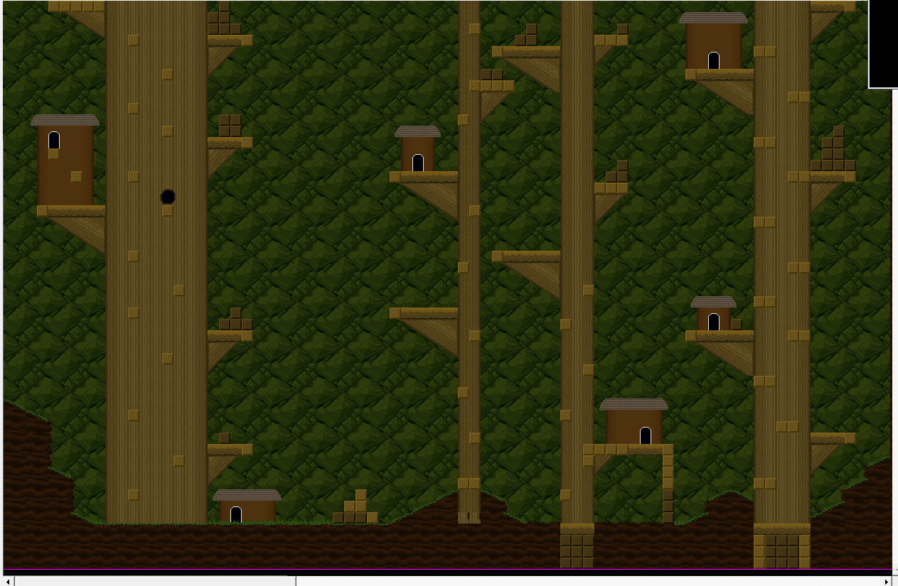
I really like your roof effect, that looks pretty good. I also like what you did for the structures of the houses. Although it looks a bit bland when it stretches over a bunch of emptiness like in the center left house. Maybe you could add some extra texture to it of some sort. I don't have this problem with any of the other houses though, save for the bottom half of the house on the far left. Not sure what's going on with the boulder on the center left house, but I'll bet it's there for a reason. The network of upper platforms also looks pretty good.
Two problems that jump out at me are that the level looks a bit flat in a specific area close to the top left corner of the open space where it looks kinda flat, and on the right side of that ditch with water it looks a bit flat there. If there aren't the necessary tiles in the tileset to make these areas more visually appealing, then it's usually worth it to make your own.
Two problems that jump out at me are that the level looks a bit flat in a specific area close to the top left corner of the open space where it looks kinda flat, and on the right side of that ditch with water it looks a bit flat there. If there aren't the necessary tiles in the tileset to make these areas more visually appealing, then it's usually worth it to make your own.
Feb 27, 2013 at 7:45 PM
Join Date: Oct 29, 2012
Location: England
Posts: 178
Age: 28
Pronouns: he/him
Played the demo and it was okay, but looking at your more recent posts I can see you have put a lot more effort in and overall it looks a lot better, maps have structure and nicer tiles and the binary zone looks cool. I am interested and am definitely going to follow this mod. Keep up the awesome screenshots, can't wait for the next demo.
Mar 2, 2013 at 3:55 AM
Join Date: Jan 18, 2013
Location: Somewhere quiet with many birds
Posts: 1118
Age: 27
Pronouns: she/her
It looks awesome! I haven't played yet due to the computer hating your file hosting, but your environments look really interesting. Good job, Anuken 

Mar 3, 2013 at 12:09 AM
Join Date: Jan 21, 2013
Location: :
Posts: 133
Pronouns: he/him
Thanks.
I'm having problems with the dialogue/story, but I'm not having any problems with maps. I basically have a bunch of random maps and tilesets that need to be connected.
I'm having problems with the dialogue/story, but I'm not having any problems with maps. I basically have a bunch of random maps and tilesets that need to be connected.
Mar 3, 2013 at 1:41 AM
Damn that's like the opposite of my problem :/Anuken said:I'm having problems with the dialogue/story, but I'm not having any problems with maps. I basically have a bunch of random maps and tilesets that need to be connected.
Mar 3, 2013 at 2:01 AM
Join Date: Jan 21, 2013
Location: :
Posts: 133
Pronouns: he/him
MagicDoors said:Damn that's like the opposite of my problem :/
Maybe we could do a collab...


