Stuff (previously Something Stirs...)

Apr 5, 2013 at 6:03 AM
Been here way too long...
Discord Group Admin
Org Discord Moderator
"Life begins and ends with Nu."
Join Date: Oct 18, 2011
Location:
Posts: 2337
I understand your point Hayden, what I was trying to say is that I'm pretty sure that Pixel never made an official statement regarding the original 1x graphics, so if Nicalis hasn't it'd be perfectly reasonable to use the 1x graphics. Of course, using the 2x graphics for a regular CS mod is not allowed, and also not possible.
 
Apr 7, 2013 at 7:34 PM
Indie game enthusiast
"What is a man!? A miserable pile of secrets! But enough talk, have at you!"
Join Date: Apr 18, 2006
Location: Forever wandering the tower...!
Posts: 1790
Pronouns: he/him
Gotta stop for now... but here's the latest :
p160044-0-teaser9.gif


Long ways to go but shaping up...
 
Apr 8, 2013 at 6:31 AM
Veteran Member
"Wacka-Wacka-Wacka-Wacka-Wacka-Wacka-Wacka-Wacka-BLEIUP"
Join Date: Aug 21, 2012
Location: At a computer
Posts: 337
X-Calibar said:
Here have some spoilers, since who knows if I'll ever finish stuff :
p160033-0-teaser1.gif

This little section I did today, it's more of a cutscene area than some kind of battle section.
I took a few cropped pics of random spoilerific things too if you want to be spoiled :
*subject to change, and some may not appear in the mod, just to keep you on your toes
p160033-1-teaser2.gif

p160033-2-teaser3.gif

p160033-3-teaser4.gif

p160033-4-teaser5.gif

p160033-5-teaser6.gif

p160033-6-teaser7.gif
These are all using the base CS+ 1x graphics. No graphic edits yet.
I'm sorry, but the landscapes in those pictures are terrible. they just look like tiles randomly mashed together.
 
Apr 8, 2013 at 6:57 AM
Professional Whatever
"Life begins and ends with Nu."
Join Date: Jan 13, 2011
Location: Lasagna
Posts: 4481
Pronouns: she/her
Actually no it's a pretty awesome map making style. Especially the tower with the Hell tiles. It's fucking brilliant and I would love to have those skills.
 
Apr 8, 2013 at 4:27 PM
Based Member
"Life begins and ends with Nu."
Join Date: Dec 31, 2011
Location: United States
Posts: 2326
Age: 28
Pronouns: he/him
While I do agree that X-Calibar has some very unique and artistic map design skills that make some amazing-looking structures, I do believe there is some validity to what Liam said. There are places in these maps where the structure of the earth looks really straight and blocky, unlike the rough appearance it should have. I've never understood why some modders let the tileset limit them and don't break down to make a few customizes tiles that blend things together, or even add textures onto the edges that are already available on the tileset. Where this really shows is in that first cave screenshot, along the ground of where the towers are in the hell area, and in the top right corner of the hell area. I will also comment that the bits of the Doctor statue in the bottom right corner of the hell area look a bit out of place.

The structures are beautiful, but some of the landscapes are pretty patchy.
 
Apr 8, 2013 at 7:04 PM
Senior Member
"I, Ikachan. The Life and Documentary of the OrigiNAL SQuiD."
Join Date: Apr 23, 2012
Location: United States
Posts: 161
Pronouns: he/him
I see what Hayden and Liam have pointed out, but I believe X-Calibar did mention that he is still working on the maps. I trust he will have things polished up when it's time to share with the community.
 
Apr 8, 2013 at 7:17 PM
Indie game enthusiast
"What is a man!? A miserable pile of secrets! But enough talk, have at you!"
Join Date: Apr 18, 2006
Location: Forever wandering the tower...!
Posts: 1790
Pronouns: he/him
^ Refer to Mosaic's post for a summed up response! ^
liammillay said:
I'm sorry, but the landscapes in those pictures are terrible. they just look like tiles randomly mashed together.
... ;-;
These are editor screenshots... work in progress pictures, not what you'll see when you play. It's proof of life for the mod. Showing these snapshots of what is being done, helps me avoid setting it aside and forgetting about it.

Let me address the images individually :
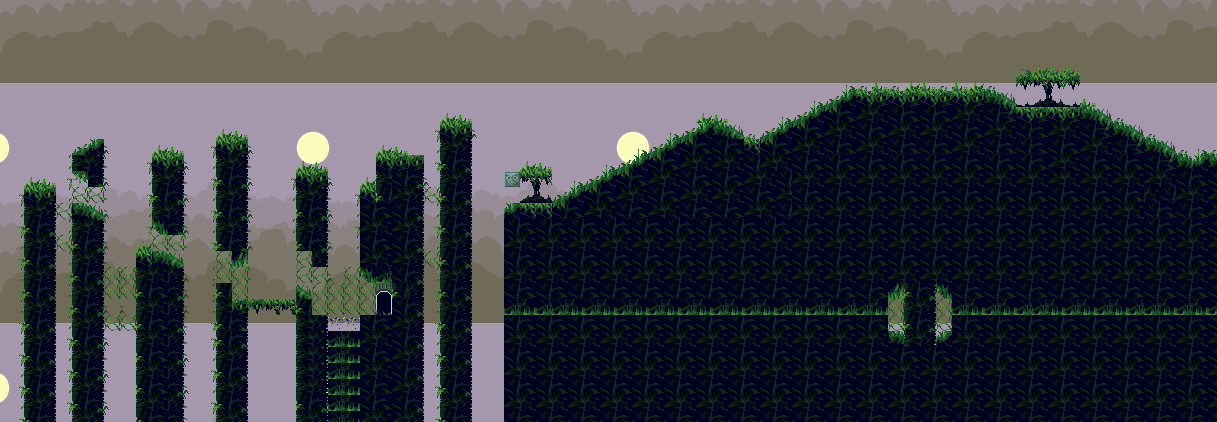
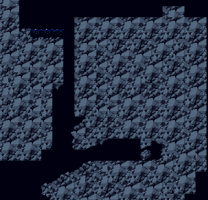
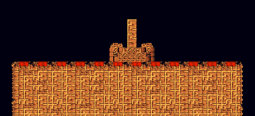
p160033-0-teaser1.gif

This landscape may be cut in half, and have water added to the left side of the hill, making the door area underwater. (Use your browser window to cut the image in half, or at the base of the hill.)
Alternatively, I might use the hill as a plateau, as is, with those tall pillars surrounding it.
It would be purposefully made then, and further mentioned in the game if that's the case.

But, I haven't decided the final look. HOWEVER I have tried it in-game, and checked how Curly looks standing behind the larger tree thing at the center of the hill, then moving slightly out from behind it to look off in the distance. That already looks good, and is what you should expect in the final product.
EDIT : Oh, and that random block, is just there to help me test it.

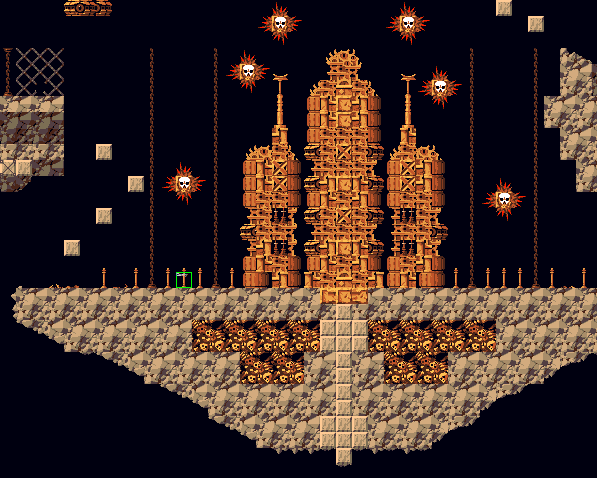
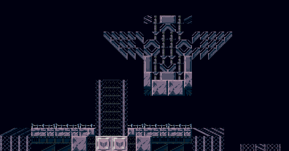
p160033-1-teaser2.gif

The only structure that is semi-finalized here, is the large altar thing. The floaty skeletons, the random background stuff... That's all there because that map is still violently under construction, and I just pasted it there for a screenshot. D:
The altar may change by the time I reach that point in the mod. It was one of the first things I made. And it is located near the end of the game D:

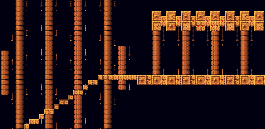
p160033-2-teaser3.gif

xD Yes, use your imagination for this a bit. I switched the palette on that, but haven't cleaned it up yet. THIS area is actually part of a collection of maps that I lost last year, this early look was one of the few early pieces that survived. This is just the basic structure.
You have a thin Lord of the Rings-like bridge that could crumble if you step on it... Above it, is where a large bridge ONCE was... Now you just see some large crumbly support pillars.
And the Doctor. ... The Doctor?! Sorry about that, that's from the palette change, not supposed to be there.
As for the black square mess and anywhere the terrain doesn't mesh properly... Issues like that will have to be graphically edited for the final game. I am not doing graphics early on, because Cloud Story progress pretty much ended when I spent a long time doing graphics.
Lastly, expect that area to change a lot for the final product. I tend to return and change stuff as it develops more.

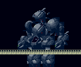
p160033-3-teaser4.gif

I'm being too long-winded, so lemme try to hurry.
This is a construction example. The stuff you see here, will be placed in other locations. It will be less boring, I assure you. Also, graphics for the door, the castle; will probably need to be edited in the end. To make it more like a castle. I'm just working with what base Cave Story offers currently.

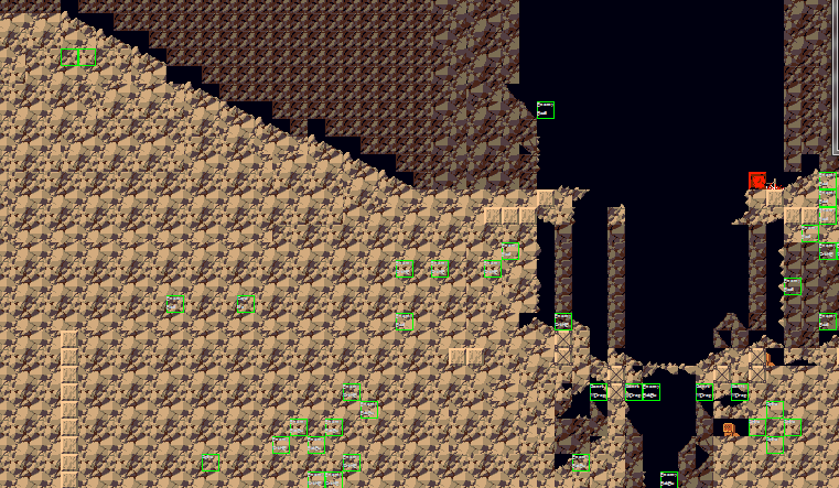
p160033-4-teaser5.gif

This is obviously unfinished, the top right section is just there. The water at the top left, is actually part of a waterfall of droplets that fall down that chute. You can't really tell without playing that area, but the door at the bottom right, is not a press-down to enter door. Your character walks past the left-most rocks, and the right-hand rocks hide the player. So basically like walking into a tunnel to another section.
This is actually me re-creating one of the sections I lost when I reformatted my computer last year and gave up for a while... [same with the altar screenshot area].

p160033-5-teaser6.gif

This is like the only finished screenshot on here lol. But, it might change before the end... You'll just have to wait and see :p

p160033-6-teaser7.gif

This is an example shot, pure and simple. You probably won't see this in-game. Though, you will see something similar...

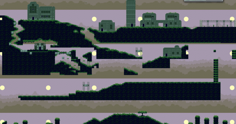
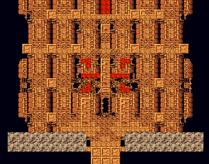
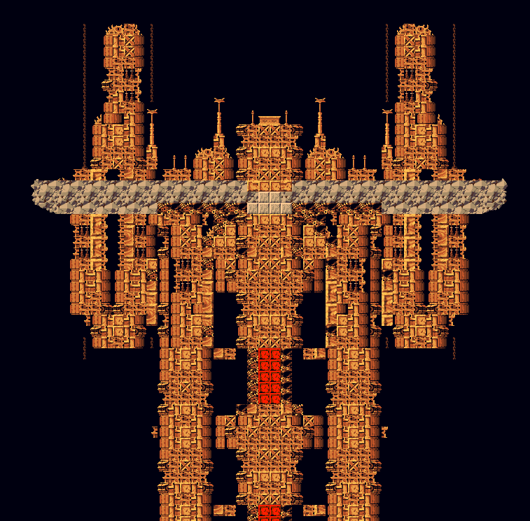
p160044-0-teaser9.gif

Finally, the only semi-completed area is the top section. But, that can still change.
Below that and to the right of the crypt-like structure, are currently being figured out. I put up pieces to test, and to try to draw out how I want it to go.

The large long path below that is unfinished, but it'll be the entrance to the map probably.

The very bottom, is the hill from the FIRST teaser screenshot... I am thinking about putting it on the same map so it can overlook the town in some manner. [like for cutscenes, or cinematic sequences : entering the town or the hill or something.]

You have to kinda use your imagination with the dimensions. Instead of the town being truly 2d, top to bottom. Being outside, it'll probably be top is furthest back, and bottom is furthest front. You enter the town on that path, and go up the hill, till you reach the top area. The hill on the bottom will be separated somehow. We'll see how it goes.

THERE! And bah, if you hate the final look... Rubbish! ;_;

@MagicDoors - <3 x Thanks x <3 I have to finish this mod ... to think how many times I've come up with a grand scheme and failed to finish it. It's not fair to those who give me a benefit of the doubt, or myself!

@HaydenStudios - I hope I answered most of your concerns in the massive spoiler above...
(Summary : I will at the very least, fix basic tileset conflicts before the first release. And all those teaser shots above, are editor/under construction shots, rather than final shots. I wanted to share work in progress, instead of keeping it to myself, and end up distracted and giving up on it.)

I will attempt to address any issues brought up, before the final release. ... And maybe I could convince a few to beta-test too... But, that's a long ways off... I haven't even named the game yet!
 
Apr 8, 2013 at 8:04 PM
Based Member
"Life begins and ends with Nu."
Join Date: Dec 31, 2011
Location: United States
Posts: 2326
Age: 28
Pronouns: he/him
Yes, I would say you pretty much addressed everything I was concerned about. Sorry for jumping to conclusions, I suppose I'm just used to only being shown screenshots of areas that are either completed, or whose change is only subject to criticism from the community. Carry on.
 
Apr 18, 2013 at 8:56 PM
Indie game enthusiast
"What is a man!? A miserable pile of secrets! But enough talk, have at you!"
Join Date: Apr 18, 2006
Location: Forever wandering the tower...!
Posts: 1790
Pronouns: he/him
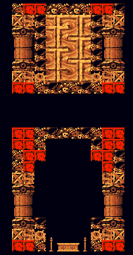
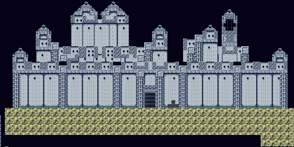
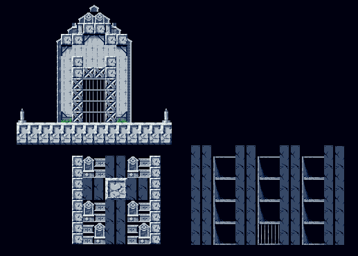
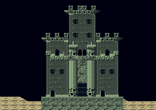
Here are a bunch of mockup things I'm working on...
Obviously unfinished, but fun to see stuff in progress!

As usual, if you don't want any spoilers at all, don't look under the spoiler~!

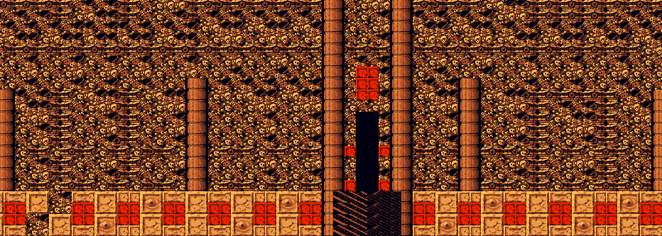
p160051-0-teaser10.gif

^ This is a tower you might see close to the end. The outside will be mostly for show, though there might be a few parts outside...

p160051-1-teaser11.gif

^ That's a lot of... Anyway, this will surely be graphically edited at some point, so it doesn't strain the eyes with your character, and will be in the BACKGRound, instead of solid blocks.

p160051-2-teaser12.gif

^ This insanity is just a mock possibility of some areas you might have to survive. Your sanity may determine what you see, and how chaotic it will be. (ignore the skulls xd)

p160051-3-teaser13.gif

^ Just your typical huge pillar.

p160051-4-teaser14.gif

^ ??? Under construction

p160051-5-teaser15.gif

^ Unfinshed by far, but maybe you get the idea I have...

p160051-6-teaser16.gif

^ Just an early, early mockup of how you might enter a large dungeon area. Ignore the large support pillars.

p160051-7-teaser17.gif

^ Another mockup... You'll have to wait for the real game to actually see what I turn these into :p

p160051-8-teaser18.gif

^ An altar.. and a...

p160051-9-teaser19.gif

^ Super early mockup of a castle. Will probably need to graphic edit to make it really look right.

p160051-10-teaser20.gif

^ Catacomb idea parts

p160051-11-teaser21.gif

^ Another castle idea possibly???
 
Apr 18, 2013 at 9:09 PM
Amaya
Discord Group Moderator
"What're YOU lookin' at?"
Join Date: Jan 18, 2013
Location: Somewhere quiet with many birds
Posts: 1118
Age: 25
Pronouns: she/her
Looks nice as usual, X, but I sort of hope you change the hell tileset color a bit. So much orange is rather dull and a bit eye-straining.
 
Apr 18, 2013 at 10:11 PM
Indie game enthusiast
"What is a man!? A miserable pile of secrets! But enough talk, have at you!"
Join Date: Apr 18, 2006
Location: Forever wandering the tower...!
Posts: 1790
Pronouns: he/him
I'll keep that in mind, especially during the in-game testing phase. :)

Btw to anyone : What kind of size/color limit do the tileset spritesheets have?
 
Apr 18, 2013 at 10:24 PM
Based Member
"Life begins and ends with Nu."
Join Date: Dec 31, 2011
Location: United States
Posts: 2326
Age: 28
Pronouns: he/him
@The screenshots
Wow, what a great way to take my breath away.

X-Calibar said:
Btw to anyone : What kind of size/color limit do the tileset spritesheets have?
The maximum size is 256x256 pixels. In other words, 16 rows.

The color limit on them if you have not saved it as a 24-bit image varies from tileset to tileset. Not sure if Booster's has this yet, but you can open up the image in Cave Editor and see what variety of colors you have for that specific image as Pixel left it. Of course, as stated above, if you wish to use (pretty much) unlimited colors, then you can simply save it as a 24-bit image.
 
Apr 18, 2013 at 10:46 PM
The Eternal Darkness
"Wacka-Wacka-Wacka-Wacka-Wacka-Wacka-Wacka-Wacka-BLEIUP"
Join Date: Feb 12, 2012
Location: The Enemy of the Truth
Posts: 314
Age: 109
Pronouns: he/him
... That. Is. AWESOME.

I especially like the third-final screenshot. That one is amazing!

And one of those areas makes me think of the area having skulls constantly fall from the top... for some reason. :o
 
Apr 18, 2013 at 11:03 PM
Indie game enthusiast
"What is a man!? A miserable pile of secrets! But enough talk, have at you!"
Join Date: Apr 18, 2006
Location: Forever wandering the tower...!
Posts: 1790
Pronouns: he/him
You guys are too kind :)
But thanks! I will keep at it!

@Hayden - Thanks for that info... (and quick response!)

Hmm...
I'm wondering : what about for background images? Do you know their size limit too?
[If the size limit is large enough, I was thinking about creating some areas through photoshop, but as a fixed background. Then through cave editor, use invisible blocks to overlay the solids. Large tilesets would have been ideal, allowing for a seperate moving background, but... This could still come in handy!]

Though if the size is small, I will just have to make do with the 256x256~

@Shane - That would be interesting xD Maybe I'll have to see what I can do about falling Ballos skulls for some part of the game...

@Polaris - Oh yeah, and don't forget all of these hell levels are just one area (multiple maps likely). So you won't be spending too much time in Hell :p
 
Apr 19, 2013 at 1:59 AM
Indie game enthusiast
"What is a man!? A miserable pile of secrets! But enough talk, have at you!"
Join Date: Apr 18, 2006
Location: Forever wandering the tower...!
Posts: 1790
Pronouns: he/him
Apr 19, 2013 at 3:43 AM
Senior Member
"I, Ikachan. The Life and Documentary of the OrigiNAL SQuiD."
Join Date: Apr 23, 2012
Location: United States
Posts: 161
Pronouns: he/him
Wow, some really fantastic material here, X-calibar! I do have to agree with Polaris, though—even though orange is one of my favorite colors, the hell areas look a little over saturated or something at the moment. I think what might be the most jarring thing for me at the moment is that I can't tell if there are separate parts of the maps that are foreground while other parts are background, especially on images #1, 2, 3, 5, and 8. But as works in progress, they look great! I'm looking forward to seeing what you're doing with all of these intriguing designs.
 
Back
Top