-
Please stop embedding files/images from Discord. Discord has anti-hotlinking logic in place that breaks links to Discord hosted files and images when linked to from anywhere outside of Discord. There are a multitude of file/image hosting sites you can use instead.
(more info here)
You are using an out of date browser. It may not display this or other websites correctly.
You should upgrade or use an alternative browser.
You should upgrade or use an alternative browser.
NoStoryJustCave (V.2.2) - A *Complete* mod made in 5ish days.
- Thread starter Polar✪
- Start date
Feb 19, 2014 at 3:39 AM
leader of the meme team feat. tom, snaf and polad

"Wacka-Wacka-Wacka-Wacka-Wacka-Wacka-Wacka-Wacka-BLEIUP"
Join Date: Jan 24, 2014
Location: Polar✪
Posts: 301
Pronouns: he/him
NoKutsuJustDou flows off the tongue better, and really, it's just an alternate name for the .exe, the current name doesn't urgently need to be changed.
I suppose I COULD change it though. Maybe. Maybe if a new bug is discovered and I need to upload a version V2.3
I suppose I COULD change it though. Maybe. Maybe if a new bug is discovered and I need to upload a version V2.3
Feb 19, 2014 at 3:55 AM
Senior Member

"This is the greatest handgun ever made! You have to ask yourself, do I feel lucky?"
Join Date: Dec 10, 2011
Location: South Florida
Posts: 91
Age: 25
Pronouns: he/him
a really superb mod you have here. although, there are some graphic oddities that are presented. one of them that i noticed is in your tile set.

it should be the one displayed on the right. i also included the chie sprite that you were missing. there are also some clipping in the first area when going through some slopes. ill probably edit this post more tomorrow if there are any other weird things.

it should be the one displayed on the right. i also included the chie sprite that you were missing. there are also some clipping in the first area when going through some slopes. ill probably edit this post more tomorrow if there are any other weird things.
Feb 19, 2014 at 4:05 AM
leader of the meme team feat. tom, snaf and polad

"Wacka-Wacka-Wacka-Wacka-Wacka-Wacka-Wacka-Wacka-BLEIUP"
Join Date: Jan 24, 2014
Location: Polar✪
Posts: 301
Pronouns: he/him
Oh, so that's the original character sprite.recolorme said:a really superb mod you have here. although, there are some graphic oddities that are presented. one of them that i noticed is in your tile set.

it should be the one displayed on the right. i also included the chie sprite that you were missing. there are also some clipping in the first area when going through some slopes. ill probably edit this post more tomorrow if there are any other weird things.
I feel like changing the sprite to match would ruin the joke, though. I dunno...
And as for the rock and stone in general, I feel like the current tileset is fine...? That kind of tile should be reserved for its own tileset, I feel, since the current one fits the needs of this one nicely.
Feb 19, 2014 at 7:26 PM
Sincerity will always triumph over irony.
Modding Community Discord Admin

"What're YOU lookin' at?"
Join Date: Apr 23, 2013
Location: In a cave above the surface.
Posts: 1099
Age: 27
Pronouns: He/They
Gender Notes: More info at a later date.
So I played your mod this morning, start to finish, and I have to say that I think it was a great experience considering it took only five days of work. Below are my overall thoughts [obvious spoilers to those who haven't played yet]:
I think new modders can learn some things about this mod, particularly that it shouldn't last a couple rooms and feel like it was made in a couple hours.
The good:
- Use of an original tileset (I know it's from the beta, but from stitching together all the tiles used into a single sheet, I have to give you props.)
- The maps aren't generic, it looks natural and you have random things in the wall (instead of just using the same four tiles the whole time). This is something that I loathe in mods released now-a-days.
- You combined exploration, parkour, battling, and puzzles all into one, so it's not the same thing all the way through.
- Your mechanics for the final boss are intuitive script-wise. Nice to see that others can use workarounds instead of using a cookie-cutter "kill the boss" ending.
- Exploiting the save file to lock out ERROR after you die, that was neat.
The (actual) bad:
- The first two maps were relatively easy, while ERROR was hard to figure out (regarding the Missle Launcher), and Arid Grotto was difficult until you figured all the sections out/didn't mess up something and die. Maybe I'm just bad at it, but it felt different compared to the earlier areas.
- If I talk to Sue enough times, she teleports me to a dark room.... Am I supposed to fall through the floor?
- err... Actually that's it other than personal nitpicks.
The (personal nitpick) bad:
- I thought I had to level up my Missle Launcher on the go, and then you surprised me with huge XP containers later on in the map. You are evil.
- The "final boss" profile you attached in the zip gave the impression that it was going to be harder than the actual game, but it's really just a save at the very end of the game. INFACT, that save actually had more health than me, so I must have missed a capsule somewhere.
- "NoReadme.txt"
Feb 19, 2014 at 9:55 PM
Senior Member

"This is the greatest handgun ever made! You have to ask yourself, do I feel lucky?"
Join Date: Dec 10, 2011
Location: South Florida
Posts: 91
Age: 25
Pronouns: he/him
see, the thing is that the current one doesnt really match with the slopes. they are both entirely different if you look closely. you can use the rocky looking one for tiles that dont really utilize slopes.PolarStarGames said:And as for the rock and stone in general, I feel like the current tileset is fine...? That kind of tile should be reserved for its own tileset, I feel, since the current one fits the needs of this one nicely.
also, for the chie sprite, maybe you can have her back to her original sprite when youre about to leave the room?
Feb 19, 2014 at 10:29 PM
leader of the meme team feat. tom, snaf and polad

"Wacka-Wacka-Wacka-Wacka-Wacka-Wacka-Wacka-Wacka-BLEIUP"
Join Date: Jan 24, 2014
Location: Polar✪
Posts: 301
Pronouns: he/him
Oh, I hadn't even noticed. Problem is, the first cave has alot of slopes, but I like the look of the regular rocky tiles too. Hmm.recolorme said:see, the thing is that the current one doesnt really match with the slopes. they are both entirely different if you look closely. you can use the rocky looking one for tiles that dont really utilize slopes.
also, for the chie sprite, maybe you can have her back to her original sprite when youre about to leave the room?
Since the slopes are just the tiles carved into a slope shape, I could just manually make the slopes match the current tile. That'd work, I suppose.
And I'll do that thing with Chie.
So expect another update to fix some of the more recent issues addressed soonish.
Addressing these issues (yes, including the nitpicks [mostly]).EnlightenedOne said:So I played your mod this morning, start to finish, and I have to say that I think it was a great experience considering it took only five days of work. Below are my overall thoughts [obvious spoilers to those who haven't played yet]:
I think new modders can learn some things about this mod, particularly that it shouldn't last a couple rooms and feel like it was made in a couple hours.The good:
- Use of an original tileset (I know it's from the beta, but from stitching together all the tiles used into a single sheet, I have to give you props.)
- The maps aren't generic, it looks natural and you have random things in the wall (instead of just using the same four tiles the whole time). This is something that I loathe in mods released now-a-days.
- You combined exploration, parkour, battling, and puzzles all into one, so it's not the same thing all the way through.
- Your mechanics for the final boss are intuitive script-wise. Nice to see that others can use workarounds instead of using a cookie-cutter "kill the boss" ending.
- Exploiting the save file to lock out ERROR after you die, that was neat.
The (actual) bad:
- The first two maps were relatively easy, while ERROR was hard to figure out (regarding the Missle Launcher), and Arid Grotto was difficult until you figured all the sections out/didn't mess up something and die. Maybe I'm just bad at it, but it felt different compared to the earlier areas.
- If I talk to Sue enough times, she teleports me to a dark room.... Am I supposed to fall through the floor?
- err... Actually that's it other than personal nitpicks.
The (personal nitpick) bad:
- I thought I had to level up my Missle Launcher on the go, and then you surprised me with huge XP containers later on in the map. You are evil.
- The "final boss" profile you attached in the zip gave the impression that it was going to be harder than the actual game, but it's really just a save at the very end of the game. INFACT, that save actually had more health than me, so I must have missed a capsule somewhere.
- "NoReadme.txt"
Feb 19, 2014 at 11:02 PM
Senior Member

"This is the greatest handgun ever made! You have to ask yourself, do I feel lucky?"
Join Date: Dec 10, 2011
Location: South Florida
Posts: 91
Age: 25
Pronouns: he/him
glad to see youre fixing a lot of problems!
although, i mentioned some random clipping earlier and decided to show some screenies when i take one step.
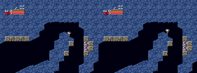
imma replay the mod again to see if there are any other weird things.
although, i mentioned some random clipping earlier and decided to show some screenies when i take one step.

imma replay the mod again to see if there are any other weird things.
Feb 19, 2014 at 11:47 PM
leader of the meme team feat. tom, snaf and polad

"Wacka-Wacka-Wacka-Wacka-Wacka-Wacka-Wacka-Wacka-BLEIUP"
Join Date: Jan 24, 2014
Location: Polar✪
Posts: 301
Pronouns: he/him
Most of the clipping I'm aware of is only what I consider a minor issue (All that really happens is you walk up a slightly steeper step then normal), and the map wouldn't look as good if those ramps weren't there, imho.recolorme said:glad to see youre fixing a lot of problems!
although, i mentioned some random clipping earlier and decided to show some screenies when i take one step.

imma replay the mod again to see if there are any other weird things.
Feb 20, 2014 at 12:58 AM
Senior Member

"This is the greatest handgun ever made! You have to ask yourself, do I feel lucky?"
Join Date: Dec 10, 2011
Location: South Florida
Posts: 91
Age: 25
Pronouns: he/him
its still possible to fix this problem AND make it look good. although it would require a lot of work for it, but it is pretty satisfying.
i decided to make a list of things i encountered and maybe some advice.
graphic oddities
suggestions
i decided to make a list of things i encountered and maybe some advice.
graphic oddities
-
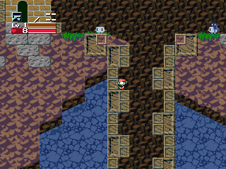
you can put your gun through the wall. some other tiles have this problem, so you should really check them out. also, something funky is going on with the tiles transitioning. maybe you can try a dithering method to fix this problem.
-
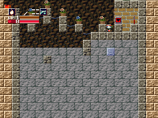
im not sure if that block was put there on purpose or not...

you can put your gun through the wall. some other tiles have this problem, so you should really check them out. also, something funky is going on with the tiles transitioning. maybe you can try a dithering method to fix this problem.
-

im not sure if that block was put there on purpose or not...
-maybe you should replace the bats with the mini balrogs found in this screenshot:
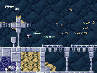
-maybe different colored mini balrogs can be present. each one being stronger or weaker than the other
-plants (and maybe some cacti) should be replace the save or health refills
-it would be cool to see more npcs maybe? it feels pretty empty in this mod
-maybe you should get the fireball from the blue guy in the beta (link: http://www.cavestory.org/images/beta/sc011116.gif)
-maybe change quote to the old one?
-separate the maps more. arid grotto shouldnt be that big of a map where i cant even use the map system.
-it would also be very rad to see the level up chip things to be replaced with the cion currency that was used in the beta of cave story
-i think this was addressed before, but more guns would be cooler
Feb 20, 2014 at 1:13 AM
leader of the meme team feat. tom, snaf and polad

"Wacka-Wacka-Wacka-Wacka-Wacka-Wacka-Wacka-Wacka-BLEIUP"
Join Date: Jan 24, 2014
Location: Polar✪
Posts: 301
Pronouns: he/him
I think I know the issue for the "gun through the wall" problem.recolorme said:its still possible to fix this problem AND make it look good. although it would require a lot of work for it, but it is pretty satisfying.
i decided to make a list of things i encountered and maybe some advice.
graphic oddities
suggestions-
you can put your gun through the wall. some other tiles have this problem, so you should really check them out. also, something funky is going on with the tiles transitioning. maybe you can try a dithering method to fix this problem.
-
im not sure if that block was put there on purpose or not...
-maybe you should replace the bats with the mini balrogs found in this screenshot:

-maybe different colored mini balrogs can be present. each one being stronger or weaker than the other
-plants (and maybe some cacti) should be replace the save or health refills
-it would be cool to see more npcs maybe? it feels pretty empty in this mod
-maybe you should get the fireball from the blue guy in the beta (link: http://www.cavestory.org/images/beta/sc011116.gif)
-maybe change quote to the old one?
-separate the maps more. arid grotto shouldnt be that big of a map where i cant even use the map system.
-it would also be very rad to see the level up chip things to be replaced with the cion currency that was used in the beta of cave story
-i think this was addressed before, but more guns would be cooler
As for the suggestions...
I like them. Although seperating the Arid Grotto unfortunately would require remaking it completely, which would be quite the undertaking (I can't copy chunks of levels in Boosters Lab, since Copied Tiles don't cross over between tabs).
I'll attempt to make some more Mini-Balrog enemies.
For the Fireball suggestion, maybe. If I decide to also change the save and HP stations, I'll change the Fireball chest too.
Problem for more NPC's is that having multiple NPC sets is funky. Like for Muddy Cavity, the second NPC set doesn't work for whatever reason, something to do with the first one. I could add some to ERROR, though.
I miiiiiiiiiight change Quote, but I kinda like him as he is.
I'll replace the Level Up chips for sure.
Edit: Although don't expect a mod update soon, as it's sort-of being put on the backburner for awhile. I consider it "complete", but who knows, maybe there'll be an update someday to make it way better

Feb 20, 2014 at 3:07 AM
Sincerity will always triumph over irony.
Modding Community Discord Admin

"What're YOU lookin' at?"
Join Date: Apr 23, 2013
Location: In a cave above the surface.
Posts: 1099
Age: 27
Pronouns: He/They
Gender Notes: More info at a later date.
(This is a topic I'm going to address in my upcoming tutorial videos, as it isn't [visibly] mentioned elsewhere)PolarStarGames said:Problem for more NPC's is that having multiple NPC sets is funky. Like for Muddy Cavity, the second NPC set doesn't work for whatever reason, something to do with the first one. I could add some to ERROR, though.
The gist of how they work (for ALL new modders out there):
- The NPC sets are slot-specific, So certain entities (Like the SandZone enemies) will always read from the first set, while others (like Omega) will read from the second.
- "Regu" and "Sym" are always loaded, so entities that read from there will always display correctly.
- NPC.tbl is where this data is located, and Both CE and BL can edit this to change from where an entity will read graphics from.
Feb 28, 2014 at 7:34 PM
Join Date: Aug 9, 2010
Location: Greener Pastures
Posts: 1188
Age: 32
You're mod is aesthetically pleasing for the most part but the level design leaves something to be desired.
Feb 28, 2014 at 11:17 PM
Join Date: Jul 10, 2009
Location:
Posts: 1006
Age: 41
Pronouns: he/him
The screenshots look promising.


