Why is there no readme? At least have one for credits.
Music's cool; I'm assuming you didn't make it (this is your first mod), but it builds a spoopy atmosphere.
You have the Map System from the start...? There's no indication that you have it. I only found it from pressing W just in case.
First area is okay. Very First Cavey, but this *is* the first cave. There's even a semi-secret Life Capsule.
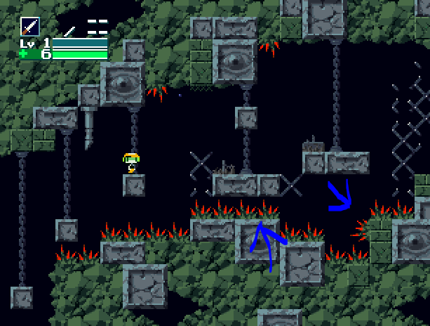
That said... too many spikes. I dunno how hard you want this mod to be, but there's gotta be a better challenge than just putting spikes all over the floors, walls, and ceilings. It's rather unforgiving, too; if you take any damage from the mushrooms, the spikes will instakill you.
In some places, the spikes add a little extra challenge. But sometimes they're a bit hard to notice, since only the tips are red.
This section is particular is just overkill. Not only does it punish you pretty hard for a couple slip-ups, but having spikes on *every* bit of ground just looks tacky. Particularly with the ones the blue arrows are pointing to; there's no gameplay-based reason to have them there.
Another thing, the mushrooms' movement is too random for the first area, especially with 6HP, and
especially with all these spikes. In Vanilla, the mushrooms were only in a nearly-flat level. There's quite a few times where a mushroom to randomly walks right under you as you're about to land.
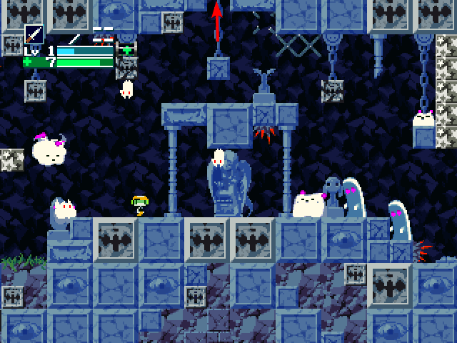
Cool detail in the tiling. Lotsa tileset mixing and cool little alcoves and blocks.
But, it gets a little cluttered. Raichu's house is fine, since you only see some parts. But in the caves, with a bunch of block patterns, eye-blocks, and little alcoves that you can't reach... these details don't serve much of a purpose. There's a reason why almost every indie game has background areas like that fade out, or a bland endless pattern. That way, the player's attention is drawn to what they can interact with; every unique object, detailed pattern, or alcove stands out.
It's not that distracting when playing the mod. The pathways are clear the whole time. So it doesn't really matter to the player... which makes it kinda pointless.
Just don't get carried away and waste hours of development time on tiling environment details. I know I have. IMO, background patterns and unique tiles (like the eye-blocks) should serve the atmosphere, not just for details' sake.
Then again, lots of people probably like that detail. Take it with a grain of salt.
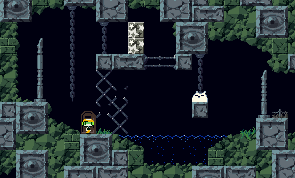
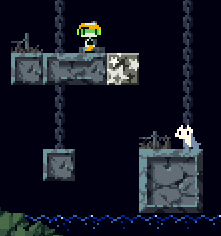
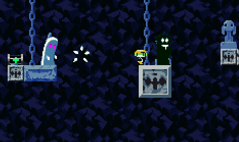
Why are the star blocks here? Like, I see a cool platforming challenge: Jump on the platform with the star blocks, break them, and drop down to the platform with the critter. But it's way faster and easier to just walk through the water.
The chains don't have those little hooks for the bottom, and the fences just get cut off. That stuff is definitely intentional, it just looks strange.
HOLY SHIT ROVING TANK FROM MOTHER 1!!
you are after my heart
Puu White jumps in midair when entering. That's cool if intentional, but he never does it again, so maybe not?
Puu White is a bit of a damage sponge if your Blade is Level 1.
Er sorry, "Ghost Foo"
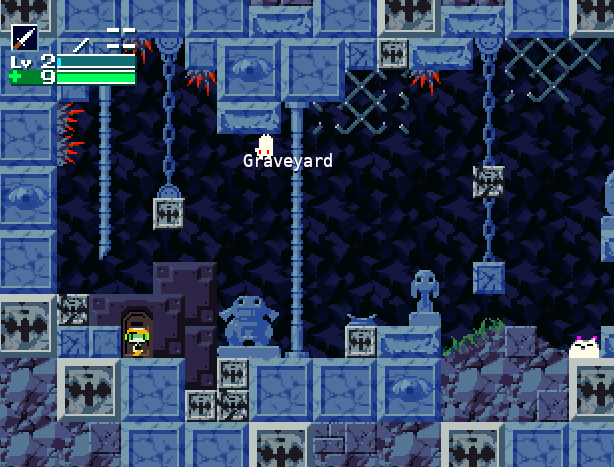
Those big grey blocks have that distinct "smooth pixel art upscale" look and it clashes with the rest of the graphics. Also, the super-cracked blocks seem misleading. In Vanilla, you go through those blocks, and most other games have cracked blocks break when you stand on them.
I don't like the Blade here. It the damage of a LV2 Polar Star, with an equal (or even shorter) range as the original version. The main problem is that LV3 doesn't change
anything. Like, the Vanilla LV3 Blade is super situational at best, but there's not even a damage boost or increase in range.
On the upside, Grasstown's enemies are actually a threat now.
The Blade's range is so short, you just can't hit this Mannan. And it seems near-impossible to jump over it.
Power Critters do weird things when when hit ceilings.
Puu Black But White (AKA Ghost Huu) got changed for the... better? Normally his balls fall so fast you can't react to them. But since you took that away, he doesn't have any real attacks aside from stomping on you. You just spam Blade and walk left/right every few seconds.
The Outer Wall is pretty cool; especially when you go deeper into the wall for a bit of platforming. Nice touch with the Hoppers in the Inner Wall; I almost didn't notice they had normal gravity. And I like the fight with the Piece of Soul. The changes to Ballos make him manageable with your not-so-good weapons.
"rised from their graves"
it's "rose"
And that's the demo. Yay for credits!


