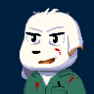
The mychar please, thx!
-
Please stop embedding files/images from Discord. Discord has anti-hotlinking logic in place that breaks links to Discord hosted files and images when linked to from anywhere outside of Discord. There are a multitude of file/image hosting sites you can use instead.
(more info here)
You are using an out of date browser. It may not display this or other websites correctly.
You should upgrade or use an alternative browser.
You should upgrade or use an alternative browser.
-
I LIED
[ - Decrease brush size
] - Increase brush size
I think holding shift makes it go 5 at a time instead of 1Fun fact: Paint.NET was originally developed as a replacement for the default MSPaint image editing software to be packaged with Windows Vista, but the idea got scrapped and now it's just this one guy who develops it. Version 4 is coming out soon, I think.
Also, there's a bunch of user-made plugins you can Dl' for the Effects tab. I have a whole bunch because I like lots of different effects, and one in particular that's wicked helpful in game-art-stuff is the Seamless Texture helper (It cuts and moves the image around so the edges go in the middle.. if that makes sense.)
Also also I promise these are possibly the last shortcuts I'll give you for now
ctrl-d - Deselect all
ctrl-a - Select all
I can't think of any more that I have used frequently.Yeah. Once you get used to them, it is a huge time-saver. Some more useful shortcuts:
ctrl-b - Fit to Screen (useful for quickly zooming out)
x - Swap colour 1 and colour 2
s - Selection tool (press multiple times for the different modes
o - line/box/circle tool (press multiple times to cycle, again)
Selection tool tips:
With area-selection modes, holding shift constrains to a regular shape (Square for instance)
holding ctrl for selecting multiple areas
hold alt for de-selecting a selected area
With the wand tool, holding shift selects all pixels of that colour (like fill). The above buttons also affect the wand.
I should stop nowI am not aware of any such setting to fix change that, my solution is usually to select the bucket tool (hotkey f) and shift-fill the transparent with desired colour, which will replace all of the transparent.
When I do pixel art, I have the settings as such: antialiasing disabled and overwrite blending, 0% tolerance, mainly sticking to a size 2 brush or using the replace tool. Tolerance 0 replace is pretty much one of my favourite things, because it'll only brush over a certain colour which is great for shading. Also the hotkeys are great. I use these most commonly:
z - Zoom
f - Fill
b - Brush
r - Replace
k - Colour Select tool
p - PencilYou have done good by the project. If I only had a cookie to give you.Definitely starting to shape up. I made a few tweaks because I'm just really bad at explaining things.. I hope you don't mind D:
I know you said it's not finished..
 -throws you some $20s-
What program do you use?I just saw lunarsoul's new avatar. I envy your talent! Is there any particular way you sprite/any tips?thanks.it doesnt have to be heavy duty spriting just a few wounds or something telling the enemy "You're gonna pay for that".hey could you make me a death signal sprite for my char please?Not set in stone but he looks kinda emo, black hair styled like older misery's, Red eyes, cape like a vampire's and thats pretty much all. If you can think of something better let me know. thx!Well hi, lunarsoul said i should come to you for spriting help because a character in my mod is pretty much a dude misery and i liked how well you did with the young misery sprites. VM me if you are interested, thx!It looks like a pretty good start from what there is to go by. I actually do all my Anti-aliasing by hand in my pixel art (at least, the ones where I bother with it) and it's just something you develop a style for I suppose.
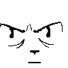
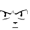
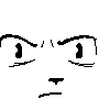
As for the lines under the eyes, I'm not sure how to describe this so I figured a visual example would be best


The one on the left looks older, the only difference between them is the lines under the eyes. They should be close together and more horizontal, I suppose. Also, the furrowed brow adds to the look I think. If you could make him look sort of "Wicked" that'd be good, that's something I am not very good at. Also, I sketched another one and I just liked the expression so yeah

A bit of blood would be good, for sure. And he definitely should look kind of scruffy, too.The friend request is accepted. I find that good spriters tend to be fun people.Oh, it is a fine amount. Thanks. -
Loading…
-
Loading…
-
Loading…
-
Loading…

