I come up with bad titles.
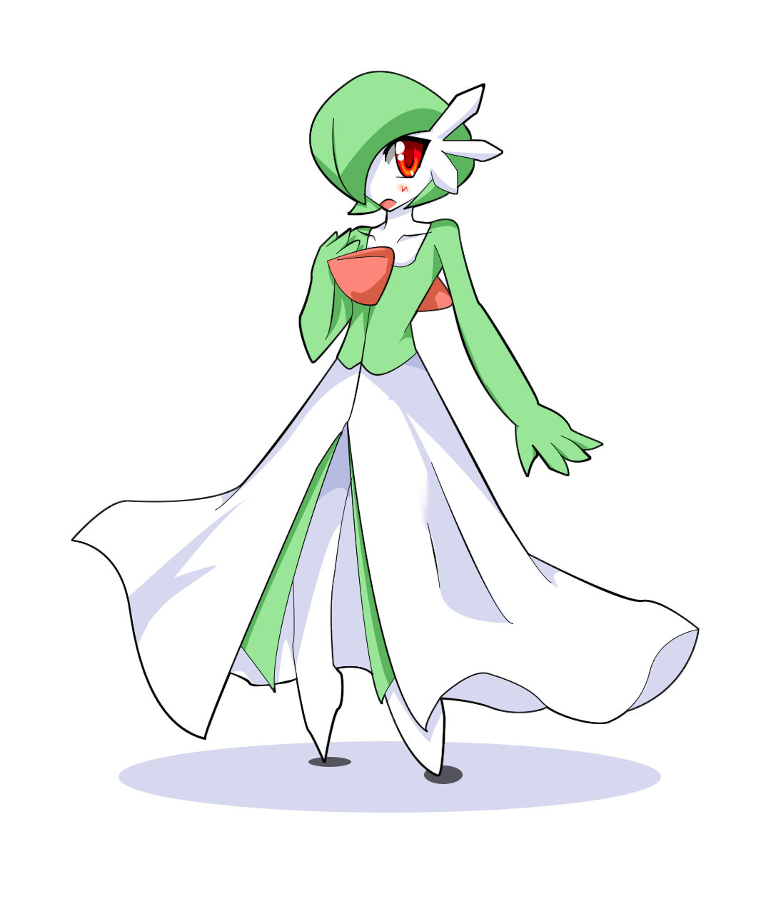
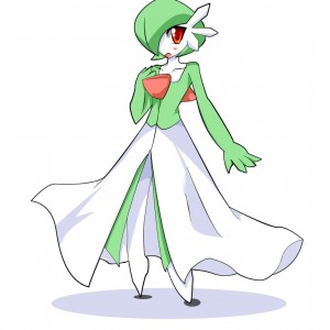
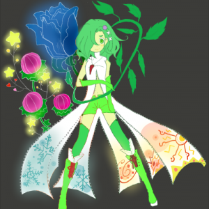
This is not new information, but I feel the need to at least try to explain this one! This drawing has a clean, simple, distinctly blocky look to it, especially at the ears. It reminded me of the sort of "modernity" you'd see in, say, Windows XP, and that got me thinking about Times New Roman somehow, and because that's an awful title I settled on the other ultra-generic font. Arial probably isn't particularly blocky, but it will have to do because it's well past midnight and I need to get to bed. ^_^;
Given that I've apparently come up with almost 500 distinct titles at the time of this writing, maybe I'm not so bad at them after all.