MonoStory: Cave Story in Black and white! V1

Jul 20, 2015 at 6:35 PM
Deliverer of Sweets
Bobomb says: "I need a hug!"
Join Date: Jul 20, 2015
Location: Under sea level or something
Posts: 802
Age: 26
Pronouns: 菓子
MONO STORY
Cave Story in B&W!


This is my first mod(although it's more of a mini-mod), so I hope everybody likes the idea behind this..

This mod is simply the same as the original Cave Story, but with one difference:
Everything is in black and white!
Everything in the mod does not have any color any more, this includes the whole game, but also the icons for the EXEs.
Some things use full black and white, and don't have any shade of grey.

Here are some screenshots to show some stuff.
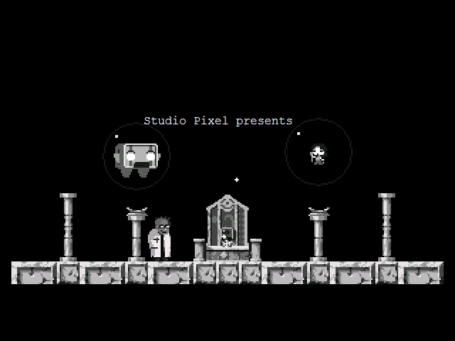
p203886-0-x2al2xv.png

Title screen, not much to say about it.
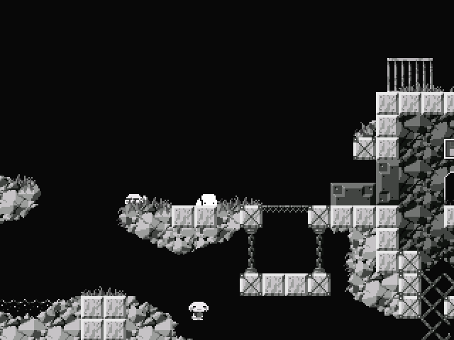
p203886-1-eoppwsi.png

Mimiga Village with the new black background.
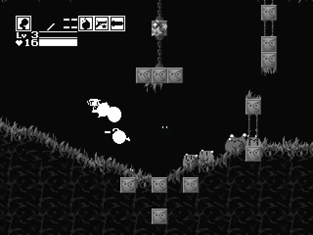
p203886-2-09s14ea.png

Grasstown/Bushlands with the new black background.

Download link
Version 1.0: Download link

Changelog
==========V1==========
•Most things should now be fixed, and there should only be minor problems about choices of several things. The major reason it is 0.9.5 is that there are is a slight chance of several small things that might still be transparent.
•Some less intense flashing, including hearts.
==========V0.9============
•Fixed blue transitions fully, hooray!
•More transparency fixes
•Black backgrounds for even more awesome experience! Normal backgrounds in grey shades still included in the data folder.
•Experience triangles now are white with black outlines to fit the black background.
•Better cursor for YES/NO thing.
==========V0.8.1==========
•Fixed certain things being transparent on fullscreen.
•Fixed blue background for quite some areas.
==========V0.8============
•Inititial version, not much to say


There might still be issues including very rare blue backgrounds and unintentional transparency in fullscreen, please note them so I can fix those.

Feel free to use the sprites used in this mod for your own, I won't mind.
 
Last edited:
Jul 20, 2015 at 6:42 PM
In my body, in my head
Forum Moderator
"Life begins and ends with Nu."
Join Date: Aug 28, 2009
Location: The Purple Zone
Posts: 5998
Pronouns: he/him
I think it would be cool if it was REAL black and white, like Hero Core. But that would be hard because you'd need to redo the assets pretty much for it to look okay.
 
Jul 20, 2015 at 9:16 PM
Deliverer of Sweets
Bobomb says: "I need a hug!"
Join Date: Jul 20, 2015
Location: Under sea level or something
Posts: 802
Age: 26
Pronouns: 菓子
True, that was what I first had in mind, and it can still be seen in some things like quote, the weapons and the interface items, as I started with those.
I only had some problems concerning transparensy and visibility when I was working on Outer Wall(which I started on after some things), that's why I decided to use shades of grey.
I might once work on that sometime though, but after I fixed some minor things.
 
Jul 21, 2015 at 2:09 AM
Mrs. Policewoman
"Wacka-Wacka-Wacka-Wacka-Wacka-Wacka-Wacka-Wacka-BLEIUP"
Join Date: Oct 24, 2011
Location: Canada
Posts: 330
Age: 26
Pronouns: she/her
Cool idea, I hope to see you complete it.
 
Jul 21, 2015 at 2:32 AM
Administrator
Forum Administrator
"Life begins and ends with Nu."
Join Date: Jul 15, 2007
Location: Australia
Posts: 6224
Age: 39
Pronouns: he/him
You should use #010101 as your black colour so that your black colours aren't transparent if needs be. Using some black outlines and fills for interface elements such as health, exp., level weapon icons, etc. would help them stand out from the background regardless of what colour it is. This needs to be done if you really, really want to pursue the 2-colour look. Also all backgrounds should be solid black (or #010101 in this case).
 
Jul 21, 2015 at 3:39 AM
The "C" in "college" is for "crippling debt".
Bobomb says: "I need a hug!"
Join Date: Nov 12, 2014
Location: East Coast America
Posts: 759
Age: 24
Pronouns: he/him
Wow, this really makes the game feel vintage.
 
Jul 21, 2015 at 3:50 AM
Neophyte Member
"Fresh from the Bakery"
Join Date: Jul 16, 2015
Location: Earth
Posts: 4
Age: 25
Ahhh I feel such a retro feel when I play this. Reminds me of many side scrollers I played on my old Game Boy. Thank you for making this.
 
Jul 21, 2015 at 8:26 AM
Deliverer of Sweets
Bobomb says: "I need a hug!"
Join Date: Jul 20, 2015
Location: Under sea level or something
Posts: 802
Age: 26
Pronouns: 菓子
andwhyisit said:
You should use #010101 as your black colour so that your black colours aren't transparent if needs be. Using some black outlines and fills for interface elements such as health, exp., level weapon icons, etc. would help them stand out from the background regardless of what colour it is. This needs to be done if you really, really want to pursue the 2-colour look. Also all backgrounds should be solid black (or #010101 in this case).
I am already using #0A0A0A for the black colors on the things that should be black but not transparent (and the stuff that is not greyscaled like the interface elements and Quote), I noticed #010101 can become transparent in fullscreen, so that's why I'm using #0A0A0A.
I'm going to think wether it is really needed to make the background fully back, as that would make some things not really visible(Polar star and the normal Missile Launcher).

hate9 said:
Cool idea, I hope to see you complete it.
SuperJaws100 said:
Wow, this really makes the game feel vintage.
DoctorCocktor said:
Ahhh I feel such a retro feel when I play this. Reminds me of many side scrollers I played on my old Game Boy. Thank you for making this.
Thanks for the support, I really appreciate it.


Edit:
I updated the mod to v0.9, this one features fully(non-transparent of course) black backgrounds, the original ones in grey colors is still in the memory, for those who want to use those.
 
Jul 21, 2015 at 11:53 PM
Veteran Member
"Wacka-Wacka-Wacka-Wacka-Wacka-Wacka-Wacka-Wacka-BLEIUP"
Join Date: Sep 21, 2014
Location:
Posts: 341
Age: 23
Pronouns: he/him
This looks cool. Good concept. Not much else to say.
 
Jul 22, 2015 at 3:09 PM
Deliverer of Sweets
Bobomb says: "I need a hug!"
Join Date: Jul 20, 2015
Location: Under sea level or something
Posts: 802
Age: 26
Pronouns: 菓子
Well, thanks to the help of quite some people here on the forums, I finally got rid of all minor problems, and now call this as good as complete!
There might be some small things I may have forgotten, if you see any unintenional transparency or areas with blue backgrounds, please notify me.
Again, thanks for all the help.
 
Aug 15, 2015 at 5:27 PM
Senior Member
"Master using it, and you can have this!"
Join Date: Dec 24, 2013
Location:
Posts: 79
Pronouns: he/him
https://www.youtube.com/watch?v=1KH-Xl4G2dk
It reminds me of this for some reason.
 
Back
Top